ARTG 10 - AESTHETIC DESIGNS
Module 3 - Color + Texture

From Josef Albers Interactions of Color
3.1 Introduction to Color + Texture in Games
Color and texture are incredibly important aspects of a game or interactive artwork's overall visual aesthetic. Together these visual aspects can be used to define a huge amount of a game's overall visual tone and atmosphere, through the game environment and/or playspace, the colors and textures assigned to character designs or highly visible parts of an installation or animation, the use of light and shadow in both digital and physical playspaces or places of interaction, the colors assigned to a game's interfaces and menus, the texture and weight of a set of cards, etc. Additionally, there are many games and interactive artworks that are about color and/or texture, or contain mechanics or interactions driven by color and/or texture.
In all of these examples, the use of color and texture is intentionally and thoughtfully planned out, prototyped, and refined by a designer or artist. A major goal of this module is to serve as a starting point for intentionally thinking about color and texture, and exploring how choices about color and texture can influence a game or artwork's visual aesthetic. It will introduce some of the physical properties of color and texture, and some organizational concepts and techniques, but this module will mostly focus on surveying a collection of examples of how artists and designers have worked with texture and color in artworks and other expressive media.
3.2 Physical Properties of Color

Color theory is a vast area of study and research that organizes and classifies some of the "physical" properties and techniques of color {and to a big extent, light, but in a less literal way}. It creates a system or framework for understanding the physical aspects of color - which can be helpful as a starting point for color design in artworks and games - but, much like game design frameworks, this theory cannot account for all the different ways colors and combinations of colors, along with the applications of light and dark, lack of color, and/or contrast, will be interpreted or experienced by viewers.
There are many modern and contemporary artists who focus on the ways in which our eyes see and our brains interpret color on a physiological level. Some of these artists worked directly with color theory principles. In many instances, these practices and resulting artworks further expand the general scope of knowledge surrounding color and color theory. Color is a topic where art and science overlap extensively - Sir Issac Newton developed the first color wheel, and many pre-industrial painters throughout the world needed to employ chemistry and experimentation when developing pigments and paints.
The concepts, terms and properties below are mostly being presented to help establish a vocabulary for talking about color and one starting point for thinking about color in games. Describing these concepts a bit more will also be useful when exploring the way different artists work with color in the examples presented later on in the module.
Color Wheel Basics
The color wheel below is a common way of understanding and navigating a color spectrum. It shows the relationship between primary, secondary, and tertiary colors, and also describes the difference between warm colors and cool colors. A color's position on the color wheel, in relation to another color, is used to develop color relationships that are often then used in color schemes and in color combinations and color mixing.
Hue
Hue is another term for color-name on the color wheel. The primary hues are red, blue and yellow, the secondary colors are the mixes of two primary hues, which are green, orange and violet, and the tertiary/intermediate hues are mixes of a secondary with a primary hue.


Warm and Cool Colors
The warm colors are on one half of the color wheel, and include the range of red-violet to yellow, and the cooler colors range from yellow-green to violet. To many people, warm colors appear brighter and come forward visually, while cool colors are less bright and recede visually, but, as I will argue throughout this module, there are always exceptions to these general color properties.


Color Wheel Relationships and Combinations
There are 3 common relationships utilized in art and design on the color wheel. Analogous - three colors together, Complementary - the two colors directly opposite one another - and Triadic - the 3 colors that form an equilateral triangle.


Many artworks demonstrate the properties of warm and cool colors, as well as complementary, analogous and triadic color schemes, and in some cases these relationships are used intentionally to produce some intentional visual meaning, however, these concepts alone do not usually carry meaning alone. Often times they are used to either explain how and/or why some aspects of a visual design are highlighted, or stand out in a certain way, or why something might be visually appealing, after it has been designed and created, especially with older artworks.


Utilizing this color wheel alone, also, is limited, as it is based on a "subtractive" color model, and on color pigment and mixing based on paint technology {yes, paint is for sure a technology}. Some designers work with different color systems, such as the Cyan, Magenta, Yellow + Black {CMYK} ink system in printing, and the Red, Green and Blue {RGB} additive color system for working with light-based colors, such as those in monitors.

CMYK is still directly related to the color wheel above, where the combo of all colors produces black on a printed page - this is classified as "subtractive" color, but since it is not economical to combine pigment to produce black, black was introduced as its own "key color". This inclusion of black as a "primary" ink, thus required the primary hues to be as bright as possible, shifting them to yellow, magenta and cyan.
RGB is different from the painting color wheel and CMYK systems because it is working with color as light. This type of color system and mixing is additive, where the combo of all 3 primary RGB color at full brightness produces white. I think there are some actual physics and science to all of this, which I do not nearly understand, but I did want to be sure to highlight the difference. I believe that some folks are able to design thinking more in an additive color system, but most digital tools and programs still use a default color selection based on the visible color spectrum and the traditional color wheel.
Visual Attention + Definition Via Contrast
I would argue that the use of contrast, especially as it relates to value, saturation and definition, is a physical property of color and light that drives visual attention and focus more than simply selecting colors based on their position on the color wheel. The concepts and terms below all still relate to physical color properties, but these are a little different than most of the ones above as they are less related to a position on a color wheel or a property of mixing, and are more related to the context of the visuals being interpreted, and/or how they are being perceived by a viewer. These properties can also be a little more universal - as a designer, you might not know how everyone will respond to the color red, but you will know that a bright red square in a field of black will definitely draw the viewer's attention.
Contrast

Contrast is essentially the visual definition of one aspect of an image compared to another aspect of an image, or frame, when working with images in motion. While a seemingly simple concept, contrast is incredibly important in so many aspects of design and creative art-making, which very much includes games. Without contrast between the player character, enemies, items, and/or the game world, most games will not be playable, no matter how fine-tuned the controls, mechanics, and animations might be.
Outside of fundamental usability, contrast is a very helpful tool in directing player or viewer focus. When considering games that work with color or texture as a primary mechanic, it is often actually contrast that is the core driver of the gameplay goals. The terms below all relate to contrast and color, and are often used in visual design when considering the artwork's / game's overall visual color or texture space.
Value + Saturation

Value can be defined as the brightness of a hue when mixed with pure black or pure white, until the hue is black or white. Mixes of white are called "tints" of a hue, and mixes with black are called "shades" of a hue. Tints and shades can be used to impact overall brightness of a hue, and also contrast with other hues and colors in the frame.
Uses of different values can provide an infinite number of "colors" using only a single hue. Value is also tightly interwoven with light and shadow in games - a red item can appear bright red, and highly visible, or dark red, and barely visible, depending on if it is in shadow or full, direct light.

Saturation is the scale of a full intensity of a hue mixed with different proportions of grey {mix of white and black}. Working with saturations allows designers and artists to incorporate a range of brighter hues without attracting visual focus. It also allows designers to work with a more limited palette, especially with "cooler" colors, while still allowing the designers to direct visual focus using contrast ia color.
Definition - Color v.s. Line
Line is something used to define shapes and create contrast throughout many examples of visual media, including textual designs, interactive artworks, animations, paintings, comics, drawings and illustrations, and games. We will explore line more in the next module, but for this module, I wanted to be sure to create a different set of categories for contrast defined by differences in hue, value, saturation or texture, and the "cuts", "boundaries", and/or "limits" defined by lines and/or line work. Lines, for sure, create a contrast in visual images and designs, however, this module will focus more on the contrast between color, shade, tint, and saturation.
Definition - Considering Color Vision Deficiency
One aspect of color design tied to specific physical properties of color and how the human eye perceives color that I believe should be considered throughout the visual design process is the different combinations of colors that cannot be easily distinguished between one another for folks with color vision deficiency {CVD}. If a game's color designs rely on these specific combinations to achieve contrast and definition, adjusting the color scheme or implementing an alternative color mode or higher contrast mode would make the game more accessible for those with CVD.
3.3 Interpretations and uses of Color in Art + Film
Another critical part of designing and working with color effectively - in addition to understanding physical properties of color - is to explore how it has been and continues to be used across a range of visual artworks and other media. This is because color alone is incredibly subjective and contextual. There is a certainly a gray area {ha} with color and meaning where it begins to shift from physiological to psychological, social and emotional. As methodical as some artists and designers are with their color designs based on color theory, and the patterns and associations that surface with these concepts, I think it is still important to consider that a these affects will not remain consistent or universal across different social and cultural audiences, or time periods.
Since our media and manufactured "colorspace" is constantly changing, our psychological or emotional response to colors, and the connections and associations we might have to colors, is also very dynamic. I believe it can be helpful to see how other artists and designers use color to communicate meaning and add to an overall visual aesthetic not in an effort to directly replicate a specific color design, but to instead start to form a basic set of potential blueprints to work from. Visual game designers and game artists always look at uses of color in visual media - never limited to only other games - to inspire and inform a game's color design, especially if those games are working with color in a new way.
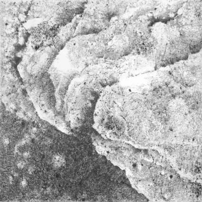
Interactions of Color - Josef Albers, 1963


The images above are physical prints by Josef Albers, from his design book Interactions of Color, first compiled and published in 1963. This book used color exercises and diagrams to explain several of the color theory principles that Albers explored - and in many cases helped define - in his stand alone prints and paintings. Many of these prints explore the contextual properties of color - how colors interact with one another, and how perception of color changes based on the colors nearby.
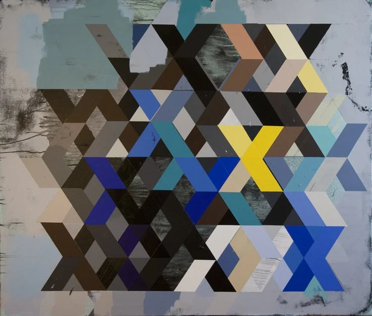
Color + Pattern
The works below all work with different repeated patterns of color and shapes. Similar to Josef Albers, many of these apply different colors to similar patterns, but none as methodical or rooted in color theory or color interaction. Ellsworth Kelly, for example, developed some of his grid patterns completely based on chance - he randomly drew numbers for each square in a grid and then applied the corresponding hue or swatch to that space on the canvas. In this examples, Kelly is using the random grid of color to express not a color theory, but to illustrate the chance operations his painting was generated by.
Piet Mondrian attempted to achieve an expressive visual harmony that had less to do with scientific color theory, and more about the balance and visual harmonics with patterns and grids of primary yellow, blue and red hues. As much as these images also rely on complex patterns and shapes to direct the eye, color is still a key compositional element that creates interactions, movement and different focal points.

Ellsworth Kelly, 1951


Color Field Paintings
Color Field painters - along with other abstract expressionist painters - created artworks that challenged a lot of expectations and definitions of art, especially outside of academic spheres.

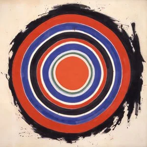


These paintings can help better understand “conceptual", "abstract" or "non-representive" artwork. For many of these artists, their work was about immersing the viewer in color - they were attempting to turn color into a subject. Instead of a painting WITH the color red, they hoped to create and communicate a sense of “red”. Scale is also an important factor - many of these paintings tower above viewers in real life. These artists were not concerned with a complex technique or making a painting that "looked" like something recognizable - their primary goal was an idea or a feeling they were trying to invoke.
Color + Light - Works by James Turrell


Many artists work with a combination of light and color. The two together can often shift a work from 2D, to 3D, to even 4D, where time is one of the driving components. Works by James Turrell, for example, place colored lights in specifically constructed spaces or environments. The three dimensional spaces themselves become a critical part of the artwork. In Turell’s “Skyspace” installations, he creates a portal for viewing the sky as a color, which constantly changes throughout the day and the night. Consider how closely these sculptural spaces resemble lighting and level design in some fantastical 3D game environments or levels.
Color + Film
Color and film is very much related to artworks that work with color and light, as well as color design in games and playable media. This is an incredibly extensive topic that can be covered by multiple courses in film programs - for this module, the video below shows a lot of great examples of effective and interesting uses of color in films from the past 80+ years, focusing on a “Top 10”.
3.4 Properties of Texture
Texture is an important and interesting component of visual aesthetics in games and playable media. Texture can certainly complicate even the most basic perceptions of "two-dimensional" artworks - as soon as the artist ads a physical layer to a canvas - whether it is a layer of paint or layering objects onto a surface with glue - it ceases to be strictly “Two-Dimensional” by definition. Physical games incorporate texture through 3D game pieces and components, but even the more "2D" components will communicate meaning via there textural properties via the weight and/or material/physical properties of the printing medium used, the printing and production process used, and other intentional design and production decisions.

Digital Textures
When considering digital formats, many digital games incorporate the use of "implied" textures. These digital textures do not contain actual, physical, texture, but aim to capture the visual essence of that texture via mostly visual reproduction or other implied visual communication. These textures can be implemented into both 2D and 3D game art assets via "mapping" - applying the illusion of the texture to the 2D or 3D surface that can then be defined by light and shadow effects, or by creating the texture via pixels or 3D objects.

Physical Textures + Digital Games
Playing most digital games still involve physical textures as well. Game controllers, even touch screens - all have a physical texture to them, and some games and playable artworks incorporate game-specific physical controllers that utilize unexpected textures - such as soft or fuzzy controllers - to communicate meaning. More commonly, many games utilize the use of "haptic" feedback via vibrations sent to the controller, which is also a form of physical texture that is very intentionally designed.


Texture + the Indexical Image
Indexical images are images that are directly connected to the place and/or subject that they capture. Examples of these images are traces of objects or traces or outlines of silhouettes. These images need to made in the physical presence of their subject. Below are some examples of indexical images.


A technique called “Frottage” or rubbings, present an indexical method for capturing textures. Most people have probably done this at some point - used crayons to rub over a paper covering a leaf or a some other textured surface to develop almost carbon-copy of that texture. These indexical images all feature a unique 1-1 ratio with their related physical textures. In some ways, they are both implied AND actual texture. The artists below work with these unique indexical properties to produce assemblages or “maps” of objects and places.
I believe that this type of texture capture is something under utilized when developing art assets in digital games and playable media. Photographs, sketches and other renderings of actual places used to generate concept art for a game can help inform so many aspects of it's visual design, including color, light, shadows and general atmosphere, but capturing textures like this can form a more complete picture of the game world and how its might actually physically feel.
3.5 Embedded Bias in Game Technology
Before looking at examples of compelling uses of color and texture in games and playable media, I wanted to briefly introduce the concept of embedded or technological bias. This is when something designed by people is unconsciously or consciously embedded with the biases of the designers. An example of this in analog art and design is that photographic film and the color-photo development process was originally engineered and fine-tuned for lighter skin and complexions. This led to photos of folks with darker complexions to contain less detail and visual expression, especially when using automatic cameras and consumer-level photo developing.

Embedded and Algorithmic {when it is tied to digital code / interactions} Bias is prevalent throughout a lot of the technology and tools used to design, produce and play games, which is important to be aware of and recognize as game designers. One example of this embedded bias that directly relates to color is demonstrated by the original palette that all Nintendo Entertainment System {NES} console game designers had to work with, which is below.

Notice that there are at least 12 tones of greens, reds and blues that designers could choose from, along with at least 8 tones of greys, but only about 4 tones of browns / beiges which could be used to convey a range of skin tones for human characters. The constraints of this system palette limited the representation of different skin tones in characters, especially darker skin tones, and also reduced the contrast options between background / environment assets and characters that might need to share the same color.
This console was by far the most popular game console in the world in the 1980s, outselling every other system by at least 5 times, with ~60 million units, which meant that this limited color palette had a far-reaching impact across the global video game landscape. Games made for this system included very few human character designs - especially player characters - with darker complexions, and while this embedded bias is not the only reason for this lack of representation, it was certainly a contributing factor.
As we continue to explore production tools and technologies used to design and create visual components of games and playable media in this course, more examples of these types of embedded and algorithmic biases will surface.
3.6 Color + Texture in Games + Interactive Media
Now that digital production technology has advanced so much that close to "photo-realistic", real-time, 3D renderings are possible in games, animations, and playable media, I believe that designers and artists will begin to push color + texture into new and interesting territories that have just started to be explored, especially in mainstream games. A huge reason why I cover games less in this module compared to other artworks is because digital games are still a very "new" form of media, with visuals that have been heavily mediated by the technology used to make them.
An example of this phenomenon can be seen with pixel art styles. Original 8-bit console games' visual aesthetics were heavily informed by the constraints of the hardware and visual output. Now that modern game consoles and engines can output images with comparatively infinite numbers of colors, details, and effects, games that still utilize a pixel-art aesthetic can communicate visuals that were not possible 35 years ago. Now that visual designers can purposely select limited color palettes, or work with pixel-art or low-poly styles as a choice versus a technological requirement, it will be exciting to see how uses of color and texture in games continues to be pushed in the next 10 years.
Interactive Artworks - Daniel Rozin
The videos below all document interactive artworks created by digital artist / sculptor Daniel Rozin. I am showing these because they are excellent examples of the visual potential of combining physical textures and sculptures with digital processes and programs. This artist could have easily stopped with a screen or projector, but by incorporating physical materials into these pieces, he adds an entire layer of meaning and material ideas for viewers to explore and interact with.
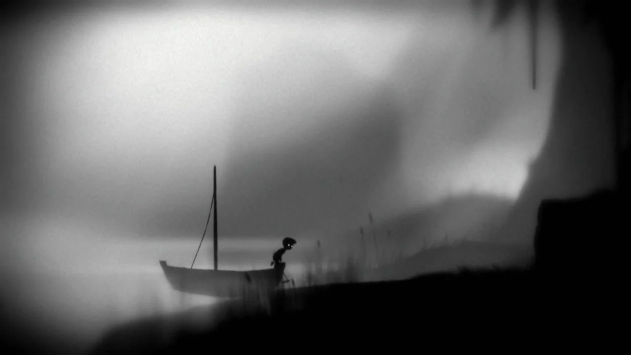
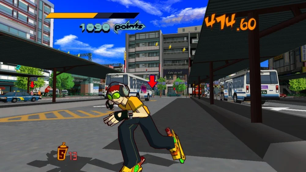
Color + Texture in Digital Games
The games below are ones that I believe worked with and continue to work with color and/or texture in new and compelling ways. When viewing the games especially, consider how many of them are now current touchstones for games that work with color, light, and/or texture in similar ways. What do you imagine the visual designers who made Journey, or Limbo, or Jet Set Radio, were inspired and informed by when imagining how their games would look and crafting their unique color and texture palettes and visual aesthetics?