ARTG 10 - AESTHETIC DESIGNS
Module 5 - Symbol + Text

5.1 Intro to Symbols + Text in games
Symbols and text are crucial parts of a wide variety of digital and analog games. Many games rely on a combo of symbols and text to explain gameplay and rules to players, build out their interfaces and menus systems, and/or communicate crucial information during play. Many games are also driven by symbols or text as part of a core aspect of gameplay. These components, therefore, are a huge part of a game's general visual aesthetic, and are another aspect that should be very thoughtfully and intentionally designed.
This module explores the connections between images, symbols and text, and introduces some of the more critical visual properties of symbols and text and their conceptual progression in visual communication. It also presents a range of artworks, designs and other forms of visual media that primarily utilize symbols and or text, ending with the use of text and symbols in games via both interface elements and primary gameplay devices.
5.2 Symbols + Meaning
Symbols are visual images that require the viewer to have some prior context or knowledge in order to fully understand their intended meaning. They can be iconic - and resemble a recognizable subject, such as a skull or a water drop, or they can be fully abstracted / minimal, like an equilateral triangle stacked directly on the points of two other equilateral triangles.


In the case of the icons with the skull and water drop, they become symbols when those images are used to communicate information beyond what they represent. In the case of the game Magic: the Gathering, these represent two different types of mana - the viewer does not understand this meaning without having knowledge of the game rules. Symbols can shift based on context as well - the same icons on a can of paint will mean something totally different {and definitely be something to look up before painting your kitchen table}. Symbols without iconic meaning are even more reliant on the viewer's prior knowledge - without an understanding of the history and myth of Hyrule, the Tri-Force is simply a triangular pattern.
Symbols are powerful visual images because they can be minimal and lightweight, and still communicate significant meaning with a clear / specific interpretation. Symbols are integrated elements of a larger visual culture and resulting aesthetic, which can also shift meaning over time - depending on both internal and external factors.
Symbols in Visual Culture
The use of symbolism and symbols is not something contemporary, and did not originate with abstraction in art + design. Using simplified visual images, characters, shapes and/or patterns to specifically communicate more complex ideas and meanings understood across a culture or people is a practice thousands of years old. Visual letterforms and written alphabets are all forms of visual symbols. Additionally, many artworks work with "symbolism" or "iconography" - where the subject{s} of an artwork, and how the subject is framed, communicate understood meaning, but the subjects themselves are not abstracted.
These types of patterns and symbols range across numerous visual cultures. They work from within rich visual cultural aesthetics - in many cases developed over hundreds to thousands of years - and are embedded with specific cultural meanings. For these reasons, and because these symbols can also feel new, unique, and especially compelling to folks outside of that culture, these are the types of symbols that can be very appealing to incorporate into games and other visual media without fully understanding them, which can be very harmful to the visual cultures these symbols and patterns originated from within.
The images below show the construction of a Mandala, a meaningful and significant spiritual and visual cultural practice for Tibetan Buddhist monks. These mandalas contain a range of symbols, and their physical construction is also a symbolic act in itself - while these are visually compelling images, to place them into games would remove them from this context and cultural meaning.


5.3 Symbols in Games
Generally, symbols are used to some degree in most games. They can be especially critical in games with more complex mechanics, where multiple gameplay mechanics, interactions and outcomes are defined, driven and/or dictated through symbolic meaning, or in games with complex menu systems, or mechanics driven by interface elements.
In many games, depending on the overall visual aesthetic, there is a lot of overlap between in-game items and objects, and symbols. The use of heart-shaped objects to symbolize "health" items in contemporary games is an example of this overlap - adding health can be represented visually in many different ways other than picking up a simplified heart-shaped item, but this has become a standard use of that symbolic action.


Maps as Symbols
Maps are highly symbolic, and used heavily in many types of games. Map design and the use of maps in artwork and design is a VAST topic, that unfortunately is a little out of scope for this course, but I needed to acknowledge it in this discussion.


Considerations + Designs
Some of the most important aspects to consider when designing symbols for games are categorization, consistency, cohesion, and differentiation. Symbols under the same category should have a consistent visual design so that they feel related, but enough differentiation between them that players can distinguish them from one another. Categories should not mix between iconic and non-iconic symbols. Symbols in different categories should still be cohesive with one another, and other aspects of the game's visual aesthetic.
All of these considerations help a player make sense of the visual and symbolic language of the game. Some games are simple enough, or work with enough understood conventions, that players are able to understand the visual language with little to no specific knowledge. Other games reveal this knowledge to players as part of the game play and/or narrative. More complex games, however, sometimes require additional knowledge in order to start playing.
Since a lot of the folks in this course are self-identified "gamers", and have a broad knowledge of games, it is probably easier to quickly pick up a more complex visual language when playing for the first time. More casual players might be completely lost in a game's visual language that is easier for more experienced players to understand immediately. This confusion is similar to the way that new Illustrator users might feel about all of the toolbox icons when using the program for the first time. These symbols are all technically iconic - and represent something from the real world - but many of them are actually very difficult to decipher without some prior experience with the program.

5.4 From Photographic, to graphic, to symbolic
Last module covered the abstraction of the "realistic" or representative image in artworks and designs across a range of cultures and visual media forms. In some cases this abstraction led to paintings that focused more on the shapes present in scenes and/or figures portrayed, and in other cases the abstraction was the the result of some other kind of expressive process - such as capturing the movement of a paintbrush across a canvas, or a visual mediation on a shape, color or form.
Other artists continued to work with recognizable subjects, but with a more abstract, stylized and expressive approach. In many of these examples, the visuals communicated both the visual meaning of the literal image, as well as a more metaphorical or conceptual meaning conveyed by the style in which it was produced. Many artworks shifted from a "photographic" portrayal of its subject to a more "graphic" portrayal - the subject was still highly recognizable, but also embedded with the art or designer's style, expression or aesthetic.
There are many different aesthetic reasons that artists might develop images that are more "iconic". In the 1950s and and 1960s, some artists working within this style were interested in the making and commodification of visual icons, how subjects/ people could be turned more into symbols. Some of these explorations were informed by the the visual aesthetic and process of print advertising, which was also saturating mainstream media and culture a the same time in the U.S.
Andy Warhol
Andy Warhol utilized a screen printing process to achieve his graphic, signature style. His work addressed issues such as reproduction, commercialism, and the commodification of culture, art and celebrity. He used the process of screen printing - at the time a mostly commercial process used to mass-produce multiple versions of the same image - to help form his visual aesthetic and to also add meaning to his prints and artworks.


Emory Douglas
Emory Douglas’s screen printed works also explored the territory between photographic and graphic and formed a very unique and symbolic visual aesthetic, but with different intentions than Warhol. Douglas created designs and artworks for The Black Panther, the Black Panther Party's newspaper, from the 1960's through 1980. The purpose of his symbolic artworks were to inform and express the party's ideology, actions, and goals and to also inspire. These images - like Warhol’s - were also screen-printed, but more as a means of production versus an aesthetic choice.
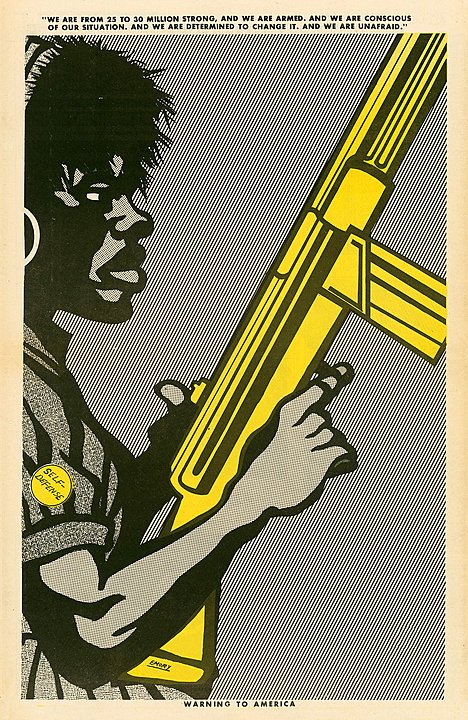


Both of these artists produce iconographic or symbolic images of human subjects. The subjects depicted in the work can be interpreted as "more" than just a person, portrait, or figure - they are representative of something, and the style or aesthetic itself adds a layer of meaning to the artwork, in addition to text and other components of the image.
I think there are very interesting parallels with iconographic images like these, and character designs in games. These designs often rely on symbolic visual devices to express different aspects of the character's story, motivations, personality and/or current state, that are often quickly and easily visually recognizable. In many types of games, characters visually reflect and/or symbolize different gameplay dynamics, and, in cases of player characters in non-third person games, symbolize a player in the game space. This is more of a connection to consider throughout the course, which will be discussed further, but I thought it made sense to introduce here as we wrap up symbols in art and design, and move into text.
5.5 Visual Properties and Definitions of Text + Typography
Text, letterforms and alphabets are all visual symbols. Together they form complex meanings via words, sentences, and written language. Their visual properties, however, also convey meaning, which this module will focus on.
Typographic Basics
The image below shows some of the basic typographic terms used to describe letterforms in design. None of these are critical to know for this course, but in general, it is important to understand how fonts are highly complex, organized, and intentionally designed systems of visual symbols. In most cases, they need to be functional, in order to clearly communicate literal meaning by forming recognizable words and sentences, and they need to be visually expressive, through their letter forms and the way that they interact with one another on the page.

It is usually font designers who decide the above. They design and construct the geometry of the letters and characters, and how they generally interact with one another. There are designers and design studios who only design fonts - it is a highly specialized design practice, which I will discuss a bit more in another section below. In most cases, when working with typography in art or design, designers are not adjusting fonts at the "letter" level, unless they are making their own font or creating their own letterforms. They are, however, selecting which fonts - or typefaces - to work with in a project, and intentionally forming a typographic system.
There are many methods for classifying and organizing typefaces - which can be helpful because there are hundreds of thousands of fonts available. A standard, general contemporary organization is Serif, Sans Serif, Script and decorative. These categories are very broad, and each contain thousands of fonts, with lots of overlap. That being said, they are still a useful starting point when designing the typographic system for a project, as these general categories can help indicate a broad visual meaning. There are also some well known standards in each of these categories that, while widely used, can still be used incredibly effectively and in unique ways.

There are many sub-categories within the Serif, Sans Serif, Script and Decorative categories. This is a link to the full graphic below, which visually describes all of these sub categories - this information will not be covered in the module lecture quiz, but it is a very helpful resource.

When implementing text into designs and artworks, designers more frequently work with and adjust the properties below. These properties affect how digital letterforms are spaced between themselves and are laid out on the page. Many of these terms are based on aspects of physical, pre-digital printing processes like the letterpress. The letterpress itself was a wild, super-advanced technology in its time that caused massive shifts in the world - probably even more significant than the proliferation of the internet and networked connectivity. This, however, is another topic for another course / series of courses. None of these terms will be covered by the lecture quiz, but are useful to become familiar with as you begin working with typographic design.


5.6 Intro: Textual, Text AS Image, Text AND Image / Symbol
When considering typographic designs for games and artworks, I find it helpful to try to generally categorize projects into three groups: Textual, Text AS Image, and Text AND Image / Symbol. Each of these categories slightly alters the approach to deciding on a typographic system to implement, which will impact the overall visual aesthetic differently. Below are game-specific examples of the three categories:
5.7 Textual Artworks + Designs
Visual designs and artworks that fit into the "Textual" category are primarily constructed with text, are driven primarily by the literal meaning of the text - versus the physical design, layout, and/or form of the letters and words - and also do not include many additional images, symbols or designs. There are many examples of this type of work in visual art across a wide variety of movements, mediums, formats etc. Many of these works will also overlap with other forms of creative expression, such as performance, poetry, writing, collage, etc.
One reason this type of visual art is so prevalent is because written language communicate both visual and literal meaning. A handwritten text on a white canvas has an aesthetic, visual quality that communicates meaning, along with the what the words themselves describe. There are many artists and designers that explore the gray area between these two forms of meaning.


The works below are by Yoko Ono, a performance-based artist. The physical pieces of the work are minimal and textual in their visual aesthetic, but still intentionally designed, in a way that communicates meaning. These works also all provide instructions that invite the viewer to engage and interact with the work, via their literal meaning. In this category, the literal meaning of the text should be the focus of the overall piece for most viewers - in these cases, the visual aspects of the texts can reinforce or support an overall aesthetic, but do not contribute the majority of the meaning into the piece.


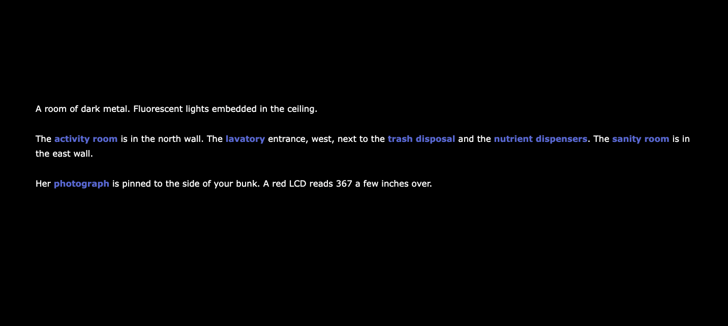
Textual Games
The games and other interactive media that fit best into this category are text-based Interactive Fiction games that do not incorporate a lot of visual components other than text, and utilize their literal narrative or the literal texts to communicate the majority of meaning to players. Even though the visual look of the text does not communicate the majority of the meaning to players, the text itself composes the entire visual system and playspace, therefore requiring a thoughtfully designed typographic aesthetic.

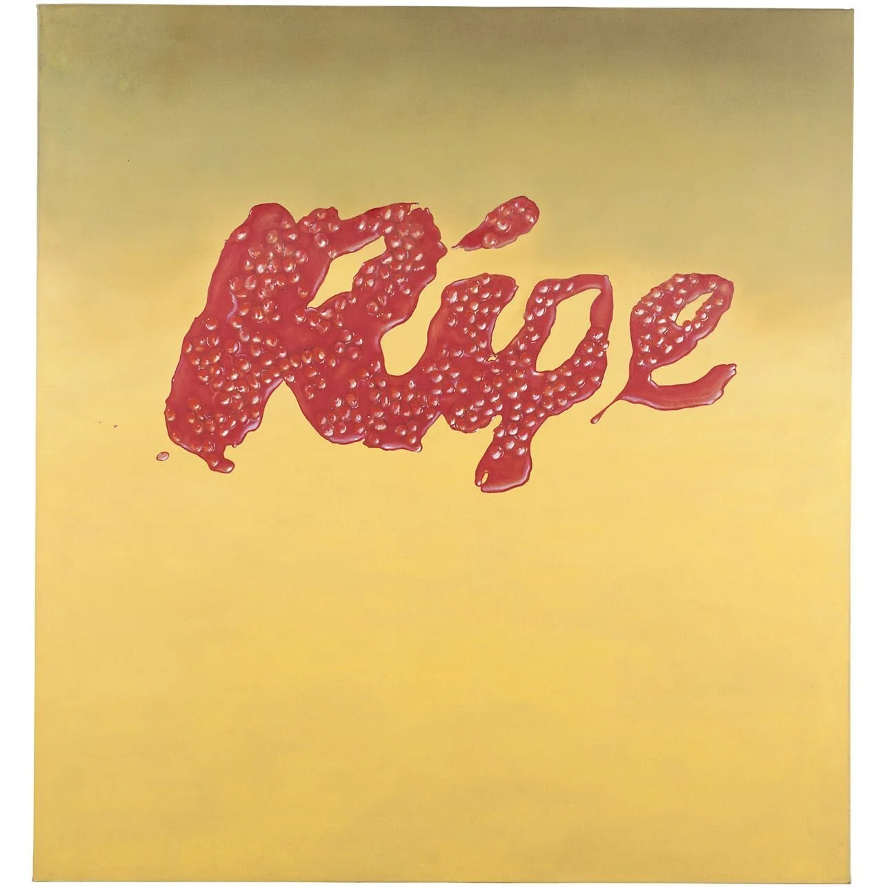
5.8 Text AS Image - Art + Designs
Art and designs fit into the Text AS Image category if their meaning is more equally driven by both the literal meaning of the text and the physical / visual construction of the text and letterforms themselves, or if these visual components inform MORE of the meaning of the work. In these examples, the visual design of the letters and their literal context are the core focus of each piece. There are no separate critical visual elements that add another layer of meaning, and only support the text's visual and/or literal meaning as a whole.
Below are pieces by artists Ed Ruscha, Wayne White and Nicole Dextras. The literal meaning of the words interact heavily with their physical construction and/or direct context. Without the visual design of the letters and words themselves, their overall meaning would shift significantly. I would also argue that even if these words literal meanings changed, the visual components would still communicate a strong set of meanings that might then be somehow associated or "connected" in the viewer's imagination. In some of these cases, the letterforms themselves are sculptural, and their physical material also communicates a strong set of meanings.


Johanna Toruno / The Unapologetically Brown Series
The works below by Johanna Toruno are excellent examples of text as image artworks and designs with a highly expressive and stylized visual aesthetic that is not tied to a recognizable visual construction or design. Turuno chooses color combinations, typeface designs, letter size and spacing to create impactful visual designs to match the literal meaning of her texts. In these cases, the visual design is not "symbolic" or representative of a subject - like the works above - but it is still crucial to the overall meaning of the piece.


Tre Seals - Vocal Type Studio
Font designers - or studios who design fonts called type foundries - are artists that purely envision and create "Text AS Image". Typefaces are designed to communicate an aesthetic meaning even when completely devoid of literal meaning. As a graphic designer and artist, I think this is one of the most challenging types of design, and it requires you to have a vast understanding of typographic fundamentals and history, and cultural context, along with the artistry and skill to execute new, unique designs.
Tre Seals is a designer and the founder of the Vocal Type Foundry, which he formed in response to the lack of racial, ethnic and gender diversity among professional designers in the US. This studio creates typefaces based on printed and other visual design artifacts connected to histories of underrepresented, marginalized and oppressed communities. When reviewing the typefaces below, consider the balance of craft, expression, function, and style that must go into each and every letter, character, number, etc, and then how that needs to be applied consistently across multiple letter and character sets.


Games - Text AS Image
Games that fall into this category are driven by the visual nature and the literal meaning of words themselves, or those that are driven primarily by visual text and textual interfaces. There is certainly overlap between this category and the other two, but the primary difference with most of these games is if the physical / visual nature of the text changed a little, it would severely impact the game's overall meaning, gameplay, or visual aesthetic.


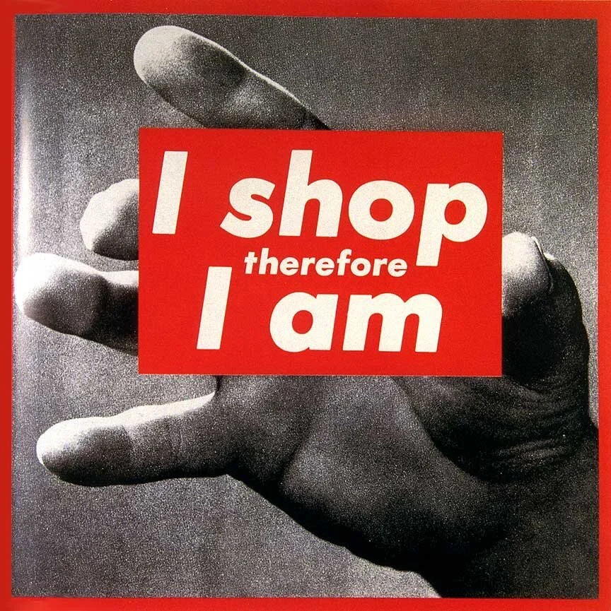
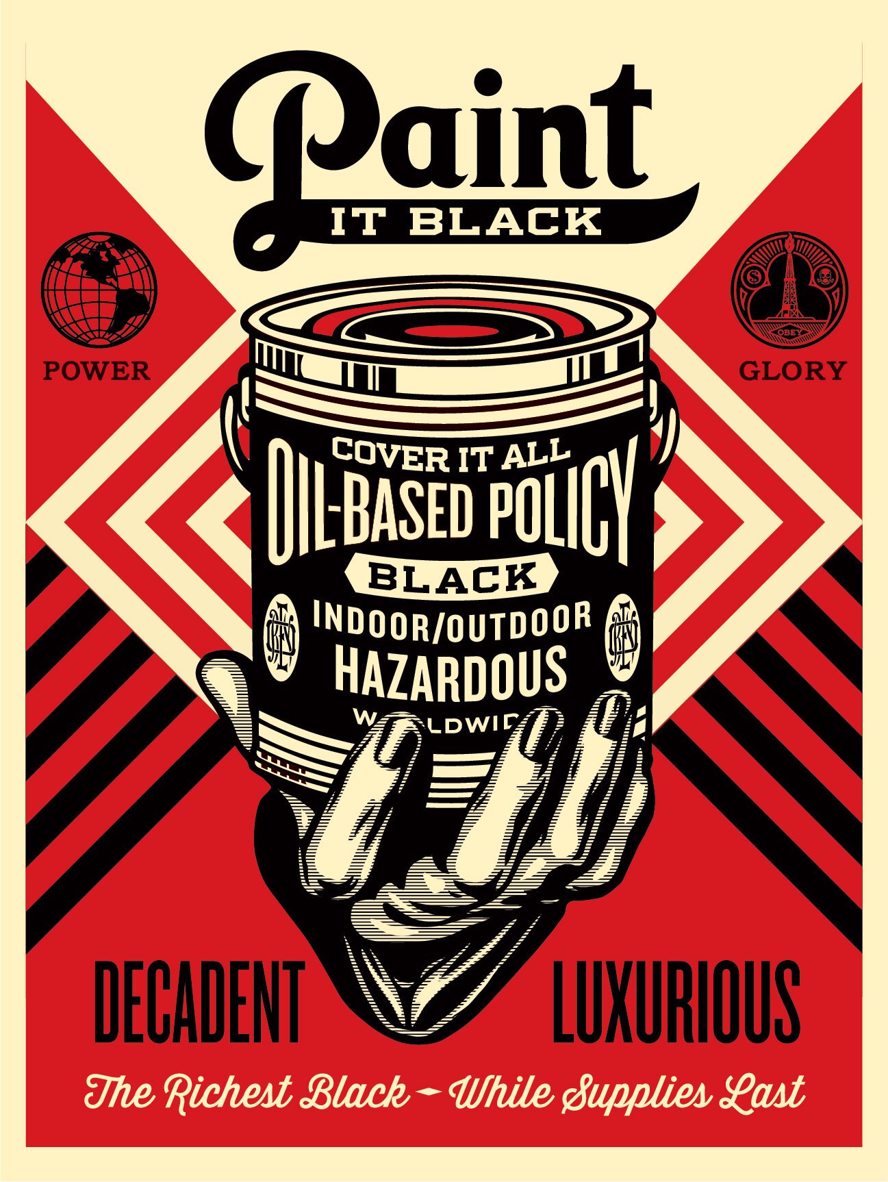
5.9 Text AND Image/Symbol
Artworks and designs that fit into this category combine text and other images and symbols to form layers of meaning in more equal proportions. In these artworks the text might contribute more or less to the overall meaning of the piece, but the removal of either the text or the image{s} would still significantly alter the meaning or exclude critical meaning or information from the viewer. In these cases, the images, symbols and textual elements work together to form a cohesive aesthetic. While the text might have less of a visual focus, it can be more challenging to select or create a typeface that supports the image's visual aesthetic if it is more complex, or vice-versa.
Some forms of visual media that often combine text and image outside of traditional art spaces are advertisements and commercial media, communications media, and other persuasive designs. Many of the artworks below either influenced 20th-century advertising aesthetics, intentionally pull from this "commercial" aesthetic for various reasons and meanings, and/or adopt a more propaganda-like aesthetic that still reflects aspects of more commercial communication styles.


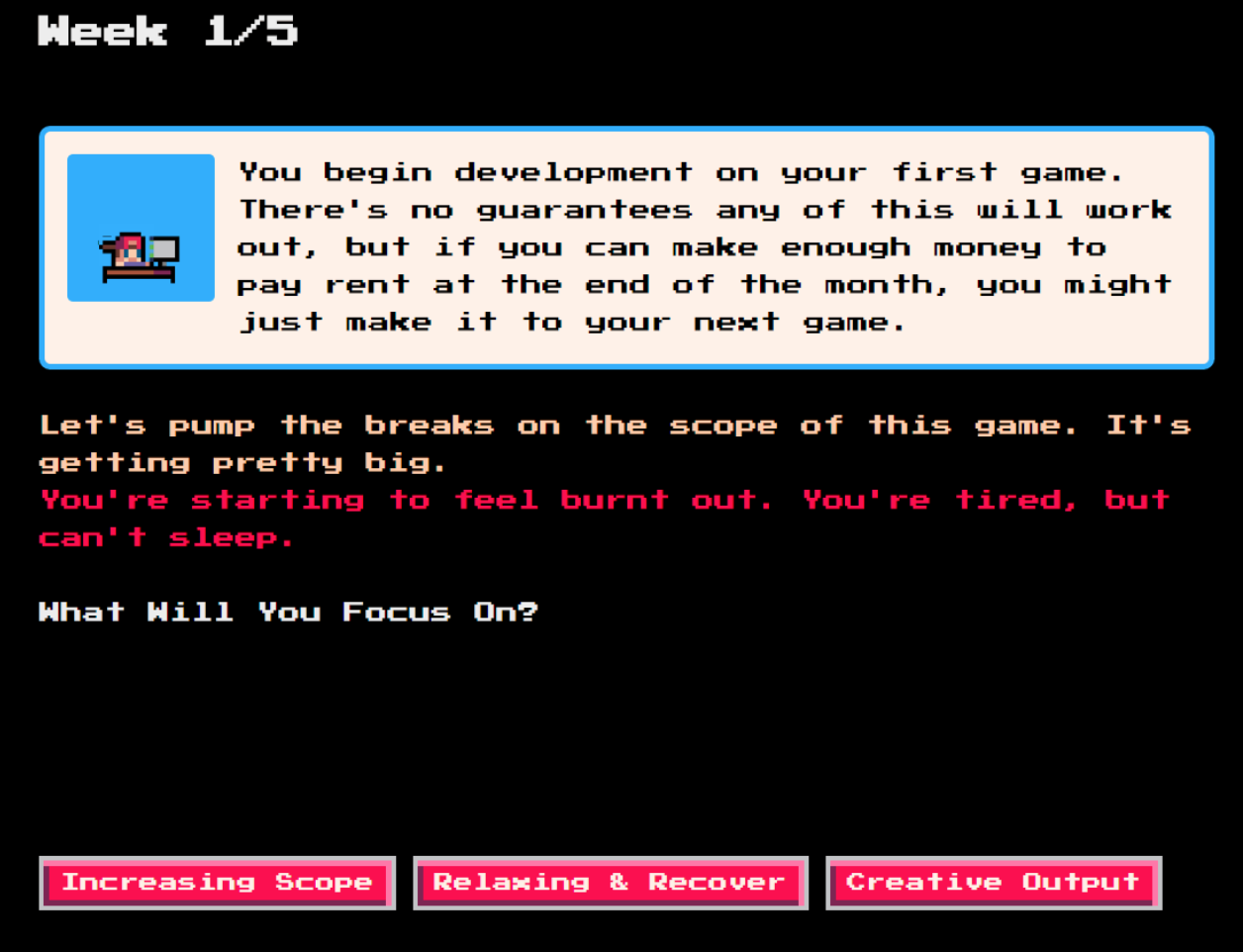
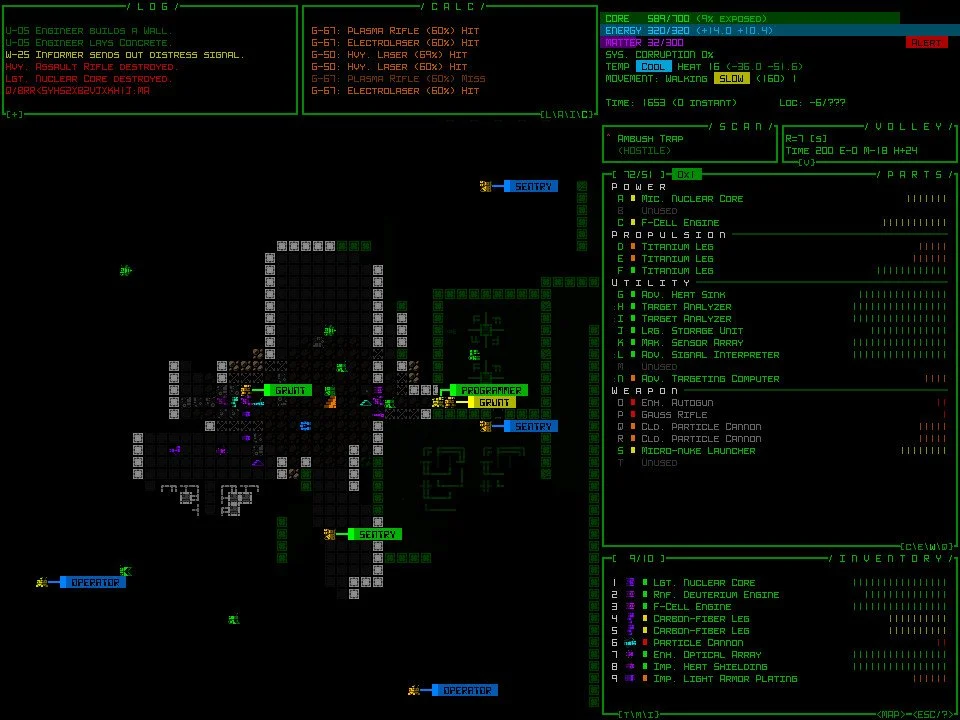
Text, Symbols + Games - Interfaces + HUDS
I consider most games - other than the more text-driven or textual examples above - to fit into this category, where text, symbol, and image are combined to form a visual language and an overall visual meaning. In some games, this mix of symbol, text and images will all occur "in-game" amid the items, objects, environment text, display-text and other symbols and images. In other designs, the text and and symbols mostly make up interface components and menus that are not present "in-game", but interact with the images within the gameplay. Board and card games also usually include more constant text combined with text and image in the gameplay cards, pieces, boards and other elements. These types of games, therefore, require even more intentionally designed components.
Since digital games still almost always have some elements of text present within the player's view {compared to other time-based mediums like film and video}, text which communicates important information, it can contribute to a visual aesthetic disproportionately. For this reason, even when text in interfaces and in-game environments is not the main visual focus, it is still crucial to intentionally design along with the rest of the visual aesthetic - including the in-game art {image} and other interface elements {symbols}.
A crucial aspect of integrating text, art assets, and interfaces into an effective visual aesthetic is to design all 3 components guided by a consistent visual language, that is always working toward the same aesthetic goal. To conclude this module, there is a short case study that introduces a range of strategies for achieving this consistency using Supergiant's Hades as an example. The readings this module will also go much more in depth on this topic from a UI/UX designer's perspective, and pull from a range of games.
Consistent Style
This consideration is geared more towards very general cohesion and consistency. The art assets and game-world are rendered in an highly illustrative, and highly detailed {high fidelity} style, which is applied to UI elements as well. This same style is evident in the character illustrations that pop-up during dialogue, or the details applied to the Boon symbols. If these dialogue boxes or symbols were more of a flat, minimal, low-fidelity style, or more basic shapes, they would feel more separate from the overall game play.


Consistent Visual Properties
The in-game art assets share visual properties with UI components. Dialogue boxes, inventory menus, and always-present HUD components like the health bar or item counters, share colors, textures, and materials also present in the game environment, characters, and items. These two sets of components appear as though they are designed with the same "materials", using the same process. This strategy keeps the UI components from feeling totally separate from the game-world, allowing for a more immersive experience.


Consistent Scale / Resolution
Text, symbols and UI elements should be designed in a scale / resolution that matches the in-game assets. In Hades, things like borders, outlines, linework, fills, shading, gradients, etc, are similar across all components. Shadows and highlights in the game world feel richly rendered, with smooth gradients and edges, which is mirrored in menus and icons. Thin, elegant linework is used to define detailed aspects of characters and the world, which is repeated in the UI symbols. If chunkier lines or more obviously pixelated gradients were used in either of these components, they would work against a cohesive visual aesthetic.


Functional + Expressive Typeface Selection
Fonts should be selected based on two factors - function / readability, how well they work together, and how well they match the overall game aesthetic. In Hades, the typefaces used subtly relate to letterforms from art and architecture from Greece, without being too ornamental and specific. They are also functional - both in terms of legibility and the hierarchy design. The titles for different menus are a consistent typeface, with a consistent size and effect applied to them, while the display text on the HUD all work with a different typeface and application.

This case study is just a single introduction to a process that requires experimentation, prototyping, and experience to understand, over the course of many games. While it might be tempting and more compelling to focus on the in-game art assets, typographic and interface design are also hugely important parts of a game's visual aesthetic, and can add layers of visual meaning, expression and immersion to a game.
Game-play + Interface DESIGN
The video below discusses how text, symbol + interaction via HUDs and other interface designs can be impossible to extract from the overall gameplay experience. This is just another example of how visual aesthetics can hugely influence the overall aesthetic of a game. This video is required, and is covered by one question in the review quiz.