ARTG 91 - LECTURE MODULE 3 - UX/UI DESIGNS IN GAMES
UX/UI {USER EXPERIENCE / USER INTERFACE} DESIGNS IN GAMES


IntroDUCTION
UX/UI is shorthand for User Experience / User Interface. These designs and components are a core part of game development, as these elements are crucial to most games’ overall functionality. We are focusing on these components in this course for a few reasons. First, they can be overlooked, especially when first developing games, and this includes their visual properties. When it comes to designing UX/UI components, their formal properties - like how they look and where they are placed - strongly influence how well they function. If a player can’t find or see a button, its going to be harder for them to use it. UX/UI components, therefore, are a key part of the visual art and designs of a game.
I also like to focus on these elements because their design and visual fundamentals can be applied to non-game specific purposes. Even the vector tools and processes that we use to build out game UX/UI components for this course can be used to produce similar components for apps, presentations or websites. So, this is a very practical art-making skill that can be useful for a lot of projects and fields, both in school and beyond.
Finally, for those of you in the AGPM program, you will be working independently or in smaller teams to develop games for many upcoming courses. If you are tasked with creating other art assets for these games, these components will also most likely fall into your domain as well. I really want this course to be an overview of these integral art production techniques and principles, so that the scope of this art/visual design role is better understood by the entire team, and so that it can be possible for one or two folks to generate most of the artwork and visual assets a smaller game might require.


Part 1 - Basic Definitions + Categories
While some use the terms User Experience + User Interface interchangeably, I like to differentiate between them slightly.
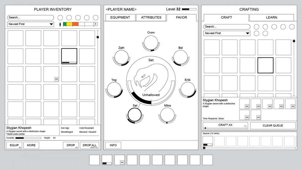
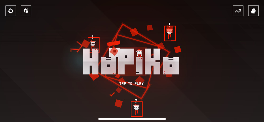
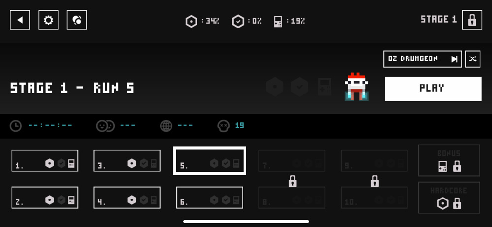
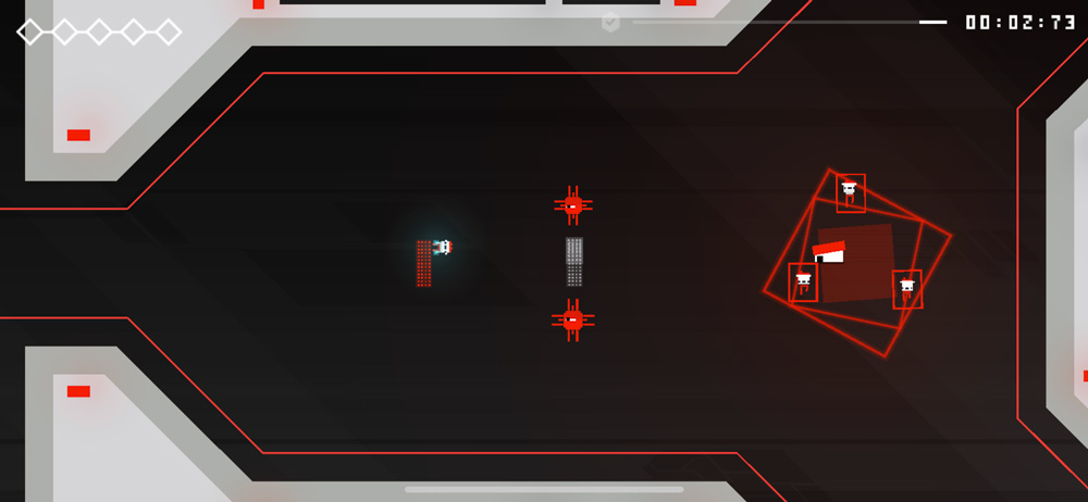
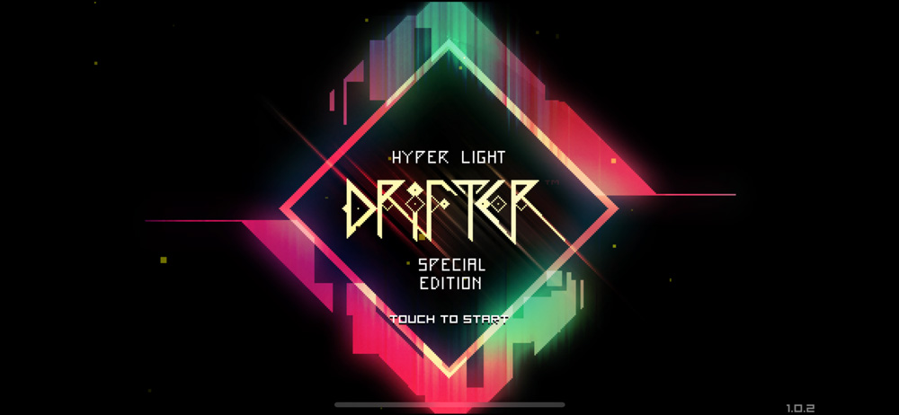
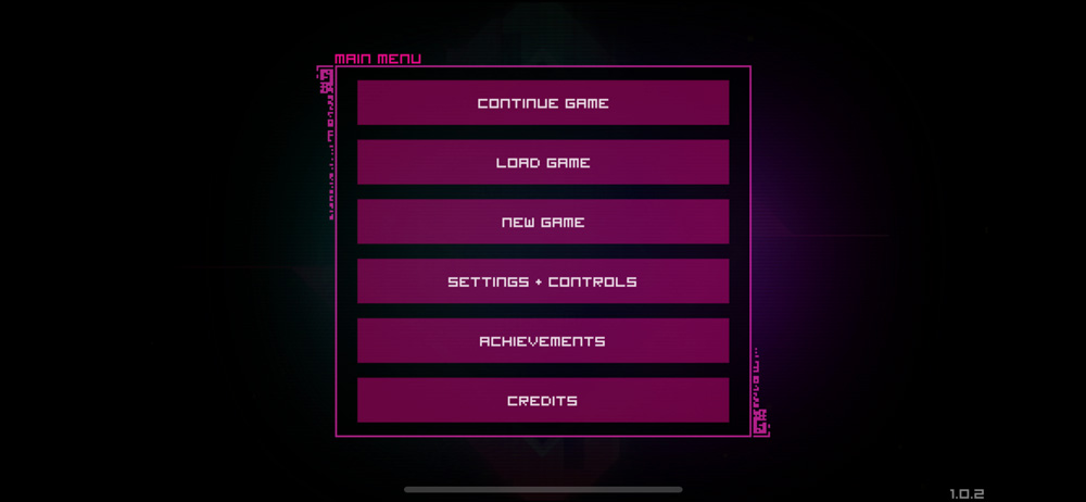
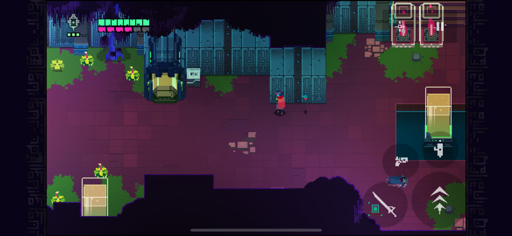
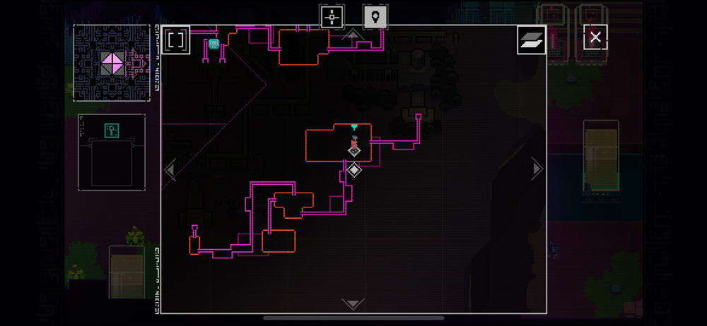
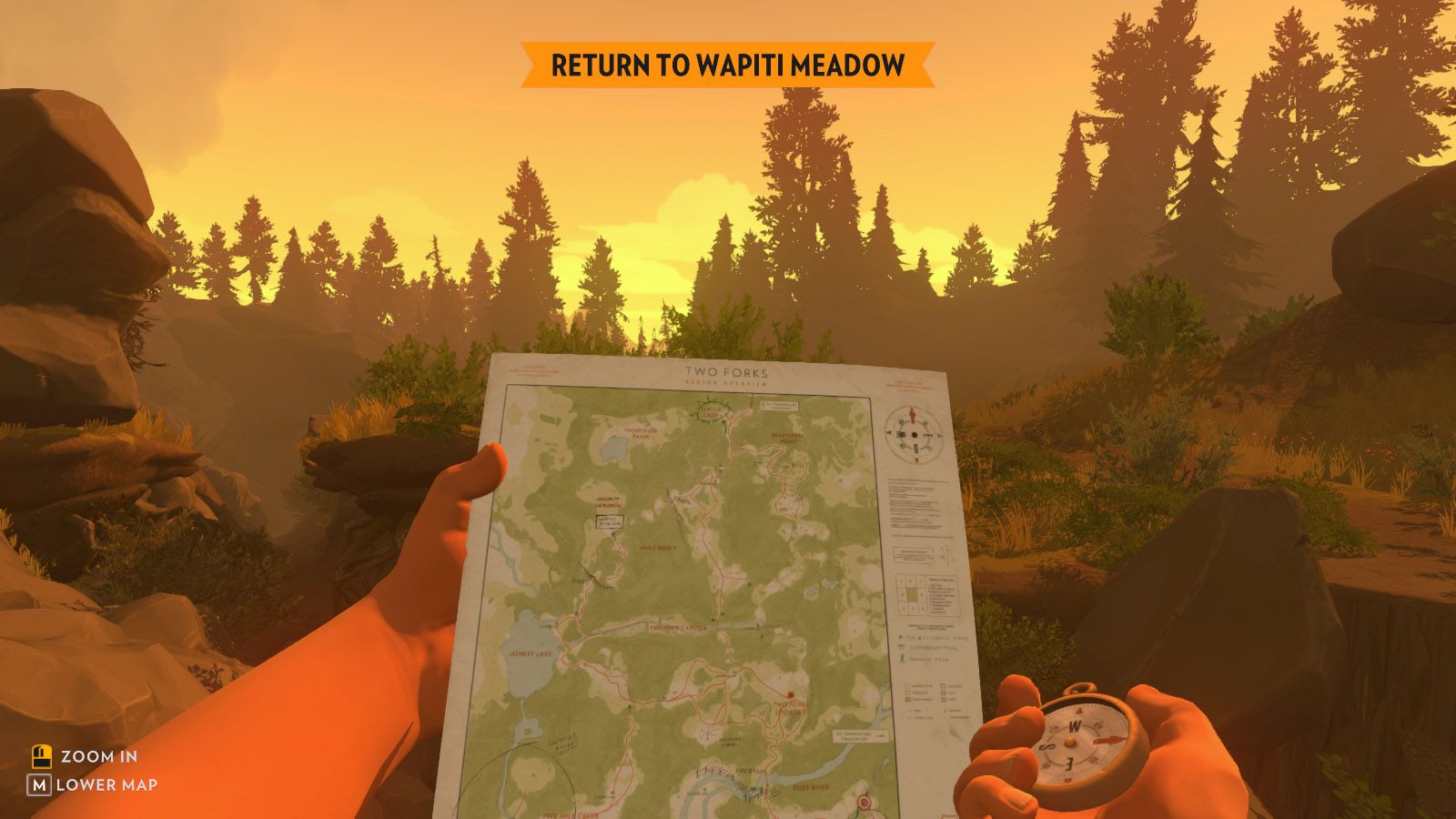
For this course, User Interface designs refer to 2 sets of interactive components - as with most things in this course, there is a lot of overlap between these 2 general classifications. In-game components include all of the tangible elements of an interface or control system used to engage with game-play mechanics: essentially any interactive or display element that is a part of the game itself. These typically include things like heads-up display graphics, inventory screens or in-game maps / way finding systems. Meta components - interactive and control components that exist outside of gameplay, include things like start screens, menus, save / load / quit boxes and lobby screens. These are the interface elements used to operate the game outside of the game space. The sketches below are of some typical user interface components.


User Experience is slightly more of a conceptual category / design system. This refers to the way a user - or, in this course, a player - experiences the game; their entire journey, from launch to exit. Designing a user experience involves all of the pathways that a player might navigate during each playthrough. While User Interface designs might dictate how to best design and place icons and other buttons on an inventory screen, User Experience considers how many options overall to place on that screen, how many steps it takes the player to access or navigate to that screen, and how the player can quickly make choices on the screen and return to play. Hopefully this example shows how intertwined UX / UI designs are - usually, a single person or team are working on both simultaneously - the concept maps below show different examples of planning out a player’s journey. These plans and workflows are more related to user experience.


UX/UI In Games
UX/UI design is a crucial part of overall game development, and can sometimes be overlooked in games compared to other systems where they are implemented. These designs are a core component of operating systems, apps and software, websites, digital / cloud based services + products, and any physical device with a screen like cameras or monitors - without them, the user would not be able to access any of these items’ functionality or features. When it comes to games, however, I believe gameplay mechanics are often prioritized, and for good reason - without these, there is no “game” to interact with. On the other hand, without a streamlined, intuitive system to access and engage with those mechanics, the player’s experience could be hindered and overall game-play could suffer. From this standpoint, it is very important to achieve a good balance of the two.


In larger studios or development teams, some aspects of a game’s UX/UI design can be developed slightly separate from gameplay mechanics and design. When it comes to in-game information architecture and navigation - such as inventory organization + allocation systems - UX/UI and game-play designs must be developed together. This is because these systems might drive core game mechanics and outcomes.
Other meta elements - like menu or setting screens - can be developed without quite as much back and forth. These designs, however, should still match the tone of game, both visually and also in terms of functionality. For example, if game play is controlled only by a single button and a simply 4-way directional controller, you do not want to introduce a complex menu system that requires precise cursor navigation.
The UX/UI components below are integral to the game play in Apex Legends. Being able to quickly and effectively access inventory items is a crucial in-game action, and being strategic with these choices tie into a core-game mechanic. The game’s “Ping” system is also very crucial for communication between squad-mates. Because these two systems are so crucial to the overall game play, the UX/UI teams and the game design teams needed to work together very closely on these designs


The screens below also exhibit some of Apex Legend’s UX / UI components. Since these elements are less related to core game play, the UX/UI designers can develop them more independently from the game designers. Note how they still match the visual tone of the other in-game elements.


Part 2- UX/UI Designs - Conceptualizing + Prototyping
Before moving on to any visual properties, it is very important to storyboard out the required UX/UI systems, both for meta and in-game interactions. This goes back to the idea of the player’s journey - think about each play-through as a branching, unfolding narrative, and sketch out these different possible pathways. This is a process that the core development team - not just the game artist or artists - should coordinate on together. On larger teams, UX/UI teams also usually include dedicated story-board artists - as a way to bring the player back into focus with these designs.
A great tool for this development + planning at any level is to work with paper-protyping and rapid iteration. When envisioning a series of required interactions, it can be helpful to start organizing these interactions into paper “screens”. Without worrying about any kind of visual design, think of each piece of paper as a screen, and begin to draw in and label rectangular “buttons” with their corresponding functions. This can quickly help you plan out navigation and basic functionality options, and the corresponding framework needed to access these functions.


This process also helps you get a sense of how many screens and steps a player will be needing to access different options. Working like this, you can start to quickly refine and shape this “User Experience”, by combining screens when there are too many steps to get to each function or by making additional screens when there are so many functions crammed into one screen that the player cannot navigate them quickly enough.
Wire-frames
Once you have these paper prototypes relatively solid, you can begin to work digitally with wireframes. This is essentially drawing out the paper prototypes in a digital - preferably vector - format, still using only simple rectangles and text labels. Visual layout can begin to be further developed in this phase, however, by working with accurate dimensions / aspect ratios and using these rectangles to estimate general scale of UI components. Vector-based programs also make the repositioning and alignment of interface components very streamlined to experiment with, and more graphical components can also begin to be integrated at this point. This process can further inform decisions about general functionality and also be good defining phase for general layout structure.
For example, 24 inventory slots on one screen seems manageable for the player in the paper-prototyping phase. However, once they are roughly composed in the wireframe with the other inventory functionality components included, the icon size appears to small to identify quickly, posing another issue for the player with the fast-paced game-play dynamic. At this point, the UX design could be revised to include a scrolling system, or a large inventory grid with multiple pages


In-Game Prototyping
After the wireframes for the meta and in-game interactions are complete, they can be integrated into the game development platform for further prototyping and testing. This step is similar to “grey-boxing” game environments, where rough placeholders are used instead of finished graphics. This testing-phase allows developers to further refine functionality as needed and gauge how the UX/UI system meshes with the game-play overall.


Part 3 - UX/UI Designs - Core Visual Considerations
Once wireframes are complete and the basic UX/UI system is at least roughly defined, the visual design process can begin. Below are some of the core visual considerations that UX/UI designers and game art directors conceptualize and then use to guide UX/UI component production and integration. On larger teams, there might be multiple roles collaborating on these decisions - the UX/UI designers will work with the art team to create interface assets that fit with the game’s overall visual theme and style, and then these style guides will be used by a production team to actually build out these assets. As you are developing games in future courses, you might be the one taking these designs from idea to asset - and might be addressing any or all of the aspects below.
Style + Tone
It is very important for the style of UX/UI components to match the game’s overall art direction in terms of mood + tone. These elements should work to either reinforce the meaning or ideas that the game’s tone is working to communicate, or at least be neutral. It is not ideal for a game’s interface to conflict with its other visual components, as this can create different sets of meanings for a player to navigate. The result of conflicting UX/UI components can usually make these interactions feel very separate from game-play, which can be a confusing experience for players. Additionally, it can make a player feel as though they are navigating two different systems, which pulls them out of the play-space. The images below all exhibit games and corresponding UX/UI elements that complement and match one another very well in terms of tone + style. What kind of player experiences do you think this cohesion can produce?


Below - Short Video about the very unique UX/UI design for Alien: Isoloation - CW - Age Restricted Video, only available to watch on YouTube, some mild horror/sci-fi violence.

Watch on YouTube
UX/UI Readability + Visual Language
As important as it is for UX/UI components to match the game’s art direction, general readability and accessible designs should also factor into their overall visual look and design. This is especially important when it comes to determining things like color / contrast and scale, and designing the overall visual language you are implementing. This includes the visual construction of icons and other buttons that do not include written labels.
Every UI begins to “teach” a player its visual language as soon as the player enter the interaction space - this includes working with color and intuitive iconography to communicate meaning that words might take longer to describe. These visuals should either be easy to decipher or already recognizable, or introduced in a way that quickly catches up the player. Below is a link to a case-study article about the UX/UI design + implementation for Into the Breach. How did these UX/UI designers build a visual language? What kinds of challenges did they face? This article is required reading and will be covered by one question on the lecture review quiz.

UX/UI Cohesion
Not only should UX/UI components match the game’s core visual art direction, but the components should be cohesive with one another through the entire system. This cohesion can usually be achieved via a style guide - a set of rules that organize components and dictate how different subsets are visually composed. These style guides usually work hierarchically - they define major things first - colors, basic layouts (that include scale and proportion) and typographic systems - and then continue to define more and more specific components. For smaller-scale games, these do not have to be complex or extensive, but are still critical in ensure that these elements are cohesive throughout the entire game. Below are some examples of visual style sheets for UX/UI components.


Below, screenshots of the mostly textual UI for the game Cogmind. Note how even when working only with text and minimal graphics, the intentional design and selection of visual properties like color, spacing, line width, text-style + font choice and layout can create meaning and set a very specific tone.


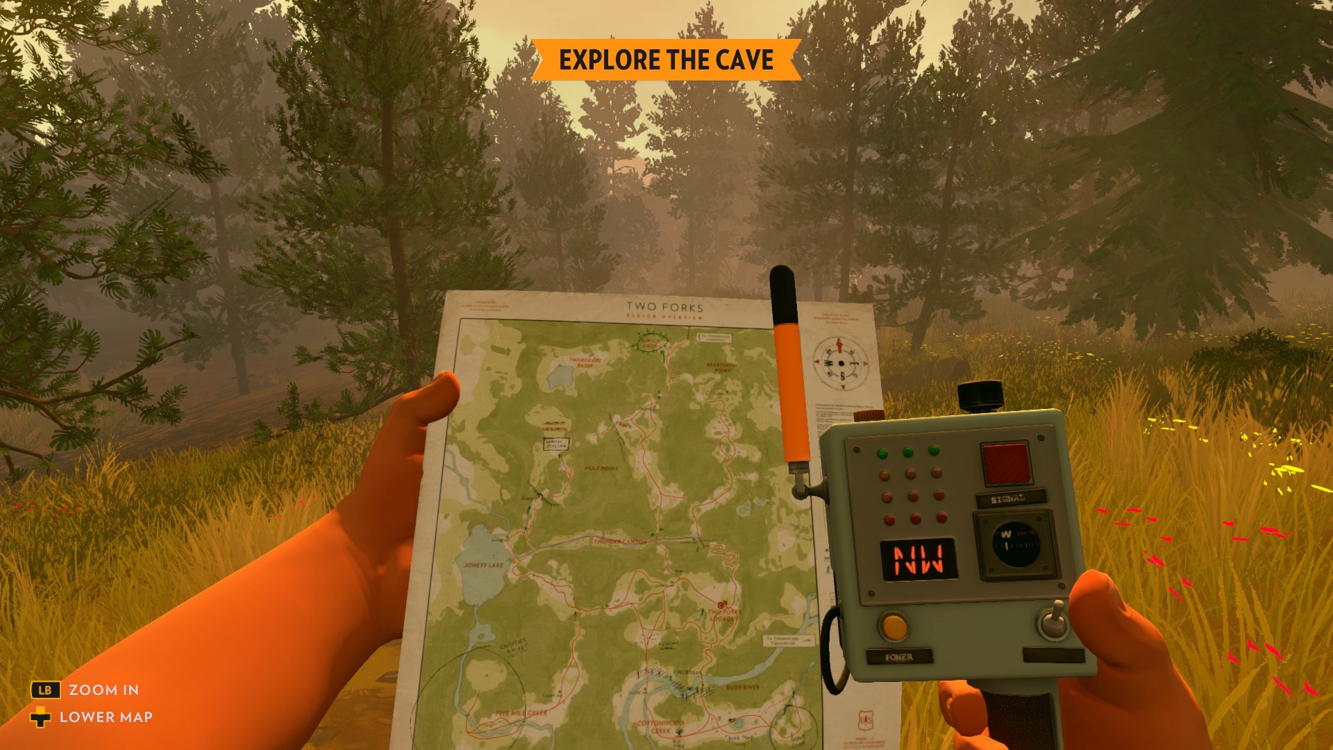
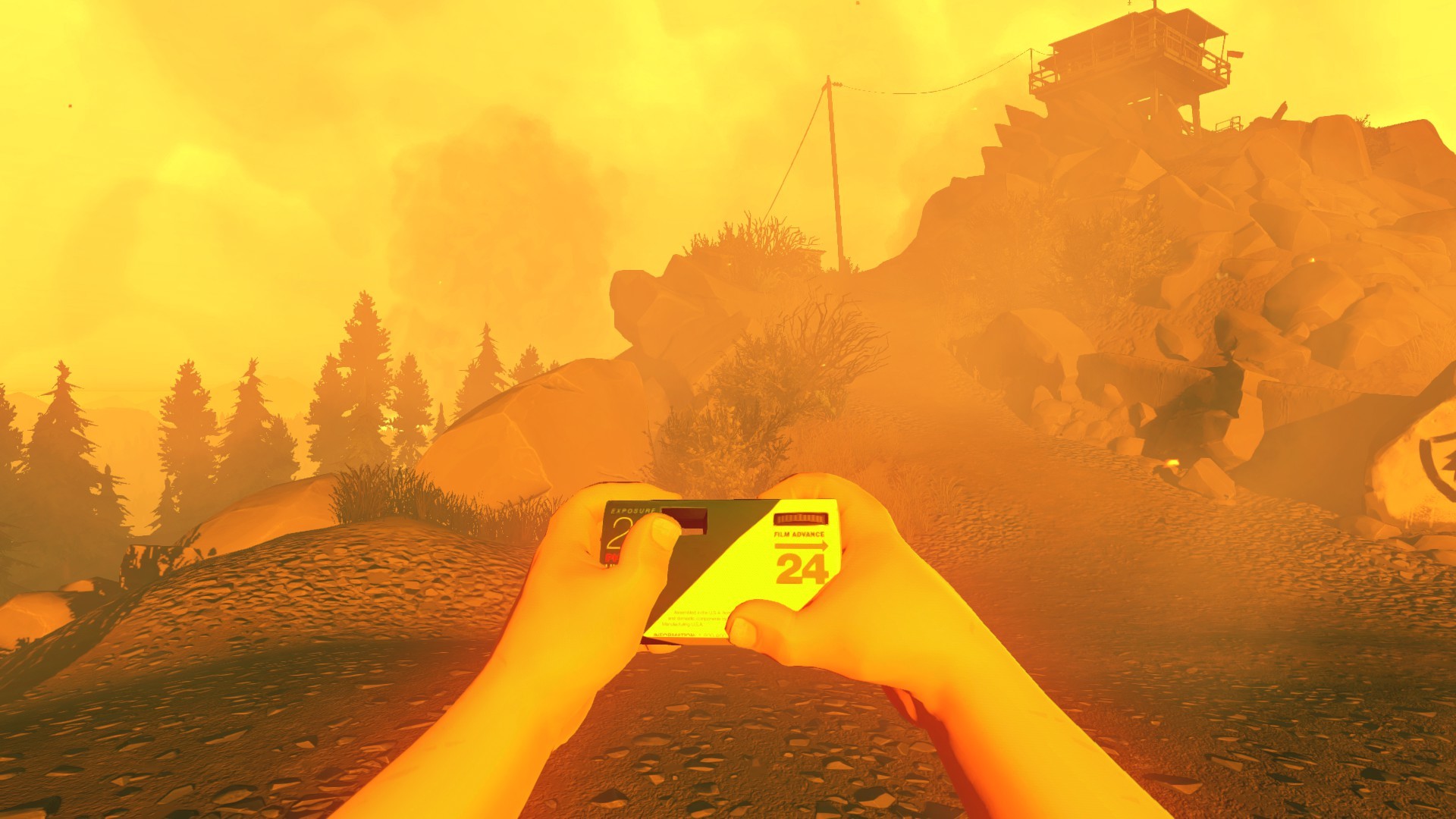
UX/UI + Game Space Integration
When developing the look and feel of UX/UI components, it is important to consider how transparent you want these elements to be amid the game-play controls and mechanics. This can be a difficult balance - you want UX/UI components to fit into the overall gameplay and not pull a player out of the game space, however, you also do not want these elements to be so invisible that they become harder to understand and navigate, thus sacrificing some functionality. Below are some good examples of games that work with more immersive, transparent UX/UI designs that are still intuitive to players and successful on a functional level. When viewing these designs, keep in mind that more complex, immersive UX/UI designs in games can require teams of people to conceptualize and implement. If you are planning out UX/UI designs for the first time, it can be good to start simply, and aim for cohesion and functionality over total immersion.
Below are two games that work with highly immersive UX/UI systems - the Dead Space series and Fire Watch. Instead of presenting separate screens or boxes on top of game play, the functionality of is either embedded into in-game assets or objects that the player character is physically holding and/or manipulating or using.
Dead Space


Fire Watch


UI Specifics - Determining features based on mechanics
When developing in-game UX/UI components, it is important that they are driven by your core mechanics. For example, you do not need to plan out a complex inventory system if you are working with a game mechanic where the player can only hold two items.
That being said, if the mechanics dictate the need for specific components, it can be helpful to assess similar systems present in other games. This is important to do after building out wireframes, to ensure that you are building in components based on your game’s mechanics (and not another game’s). At that point in the development phase, you can use this strategy to double check your design’s functionality, and to also ensure it fits the general visual language common to these systems (and understood by your target audience).
Part 5 - UX / UI Innovations
Touch Screens, VR + other non-traditional controller systems.
Before moving ahead to look at a few case studies on UX/UI designs in the industry, I wanted to discuss how recent advancements in technology - both from physical products to the programming platforms - have opened up a new possibility space for UX/UI design that is influencing gameplay overall.
Mobile smartphone technology has grown the audience for mobile games, and with this platform comes touchscreen controls. This has caused a huge shift in some game play mechanics, as well as UX/UI systems in general. These changes have impacted non-mobile games designs as well.
In addition to touch screen controls and interactions, many platforms have begun to adapt non-traditional, tactile controllers, such as the Nintendo Labo. Unlike the power glove, this controller allows the player to interact with games in completely different, tactile ways, presenting new options for designing interfaces and navigating game spaces.


VR games also require very different approaches to UX/UI designs, ND also present the possibility to create completely immersive / transparent designs (for example, to access an inventory within a game, it is possible to actually “open” a bag and a select an item). These technological progressions continue to impact and drive innovation in UX/UI designs, so, even if you are not designing for these specific formats, it is important to know what is happening in these fields.


When Minorty Report (film) came out in 2002, it featured a hybrid VR / Touch screen Graphical User Interface that captured the imagination of UI Designers at the time - these technologies seemed incredibly advanced and innovative, because this was before the iPhone had been invented, iPods were controlled by physical buttons and a giant click-wheel, and when gestural controllers - like the Wii - were just starting to be adapted for games. I think these designs are pretty incredible when you consider how closely they ended up matching what is now probably 95% possible.
Part 6 - Case Studies
UX/UI + Fortnite
Note: Turning on captions suggested, audio is low quality, but the content is very interesting and informative. This video is required viewing but is not covered by a question in the lecture review quiz.
GDC Talk - Immersing Creative Worlds Into Usable UI
This video is required viewing from the start to ~22 minute mark. It is covered by two questions in the lecture review quiz.
Narrative DRIVEN UX/UI in Hades
This video is required viewing, and is covered by one question in the lecture review quiz.
In Other Waters
Watch through the game play in both videos below - consider how this recent game integrates the UX/UI as a major element of the game-play, and its visuals, as well. How would a different style or tone applied to the interface change the overall feel of the game? How do the design and the story connect? This video is required, but is NOT covered by the lecture review quiz.
Optional GDC Video - Selecting Text for Games
I wish I could focus more on text and typographic choices in this course, but there just isn’t quite enough time. Below is an interesting video that discusses text in games, and talks about how much meaning is communicated through font choices. If this is something you haven’t worked with much before, I strongly recommend checking it out. This is video is optional to view.