COURSE PORTFOLIO + RESOURCE PAGE
VUO (LIVE VIDEO PROGRAMMING) TUTORIAL
Hey, it's your TA Simon. Now that we've wrapped up all our main video content for this class, I want to share a tutorial I made previously with everyone.
We've covered animation and video editing, but what if you want to manipulate video and images in real-time, such as during a performance or a video DJ set? There are a number of software options for live video programming such as Apple Quartz Composer (no longer updated) and Isadora, but Vuo is one of the more affordable options and one that I've enjoyed learning to use. Vuo is a node-based visual programming environment, which means you don't need to write code to create interactive visual compositions. It also lets you generate and animate 3D graphics, though I've never attempted this.
I've posted below a video tutorial that I made to introduce the basics of Vuo. It's worth mentioning that I made this video for a job interview, so it's a bit over-edited beyond what's necessary to communicate what I was teaching (I wanted them to hire me so I was showing off some editing skills). If you're interested in this software or in video programming in general, feel free to email me at sboas@ucsc.edu. I'd love to hear from you.
Student project showcase
We've dedicated some space to feature what we feel are some outstanding student projects.
Here are some great examples from week 5:


And here are some of the Illustrator artist self-portraits:


It was especially exciting to see how different images could be even when based on the same photograph:


And here are some outstanding midterm projects. Great work everyone!


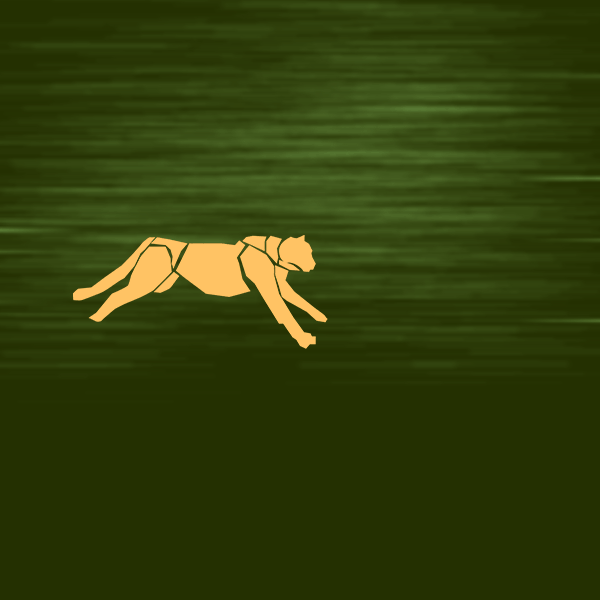
Below are some super cool gifs! I was impressed by so many, it was hard to choose. Be careful because this gallery might make you a little dizzy, but it sure is impressive. I chose projects that the student had put a little extra care into, whether it be a background that contextualized the animation, or a really well drawn animal. I also looked for those that captured a realistic sense of the animals movement. Finally, as always, I looked for a color scheme that cohesive and thoughtful.-Kelly


Below are some outstanding mid-term projects. Each of these use multiple techniques with care and creativity. There was a aesthetic direction that is cohesive and compositions are thoughtful. There was a visual or conceptual theme that was explored through the imagery. I was very impressed with how much you all have learned in so little time! Keep up the good work! -Kelly


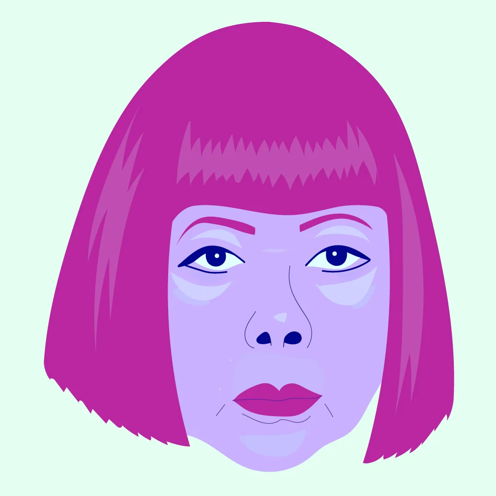
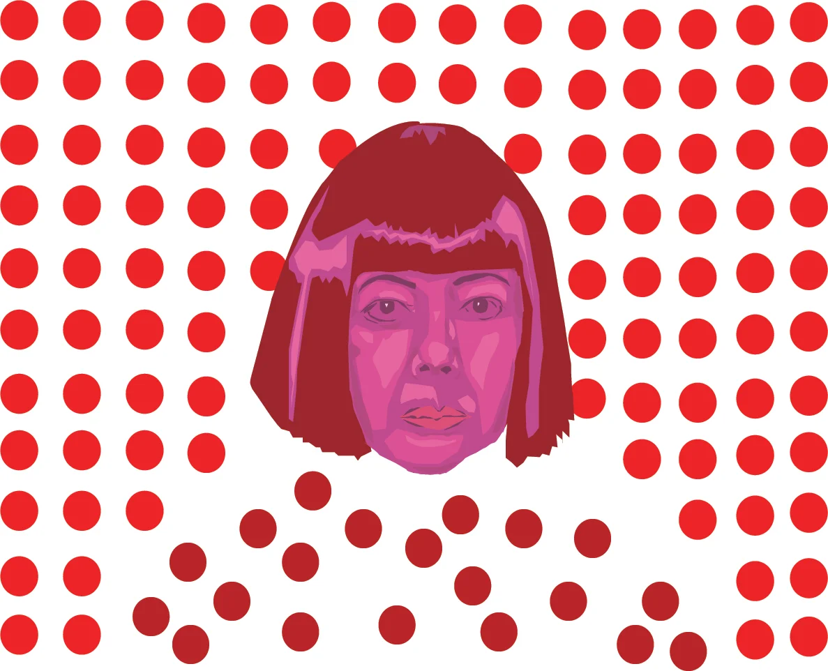
To start off with, I thought I'd share some of the self-portrait exercises from the beginning of the quarter that I found most compelling. I think it speaks to the intrinsic properties of portraits and self-portraits, but even simple alterations to images of the human face can generate potent emotional responses in the viewer. We spend so much time looking at and identifying with faces, it's really hard not to see these images and read a bunch of content into them-- what you see and whether it matches what the maker had in mind probably varies wildly.
In these works, the layered, repeated and offset images create both an uneasy physical sense of motion, but also suggest a jittery, shifting or unsettled mood.


Unexpected use of high contrast elements in the works below suggest a heightened or supernatural subject, while extensive, careful use of mid-tones and repeated and overlapping geometric forms in the bottom row seem to point to ideas of identity, obscured and revealed. Overall, I loved seeing everyone's explorations modifying, mutating and celebrating their own familiar face.


Jumping ahead to the Op-Art Illustrator work from Exercise 4... this was such an exciting series of work to review!
I really enjoyed the rich, mind-bending landscapes that emerged, combining careful color choices with optically convincing use of patterning and geometric forms.


Other compositions favored more monumental and mandala-like forms. Overall, I was impressed with work that considered the entire composition and took into account the ways the various forms and colors interacted with each other.


Lastly, amid all this psychedelic mayhem, I was also really impressed with images that used a limited or achromatic pallet. The use of simple black contour lines in each of these pieces creates an illusion of movement and volume, managing to create a fulfilling composition with a more minimal approach. Great work, everyone!
-Ann


Another impressive body of work with this assignment. I was looking for layouts that were creative and unusual but not overly busy (gave key graphic elements room to breath). I also was drawn to designs with strong focal points, and/or interesting layering of photographic imagery. I also felt that cohesive and thematic color schemes really help strengthen the presentation ( check out Adobe Color CC for help making nice color palettes!) . -Kelly


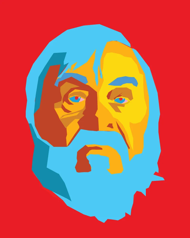
This project turned out incredible! There were even more then displayed here that I loved. In general on this one I looked for coherent color schemes that were creative and work together well. I also looked for a good sense of the various highlights midtones and shadows being represented well, showing that the artist was able to see abstract shapes and override the natural tendency to make things look like you think they are supposed to look, insteadt of how that actually look. Lastly I looked for details in the eyes, like reflecting light, creasing and eyelashes since the eyes bring so much character to the portraits, and bring them to life in a sense. Good job on this one class!!-Kelly


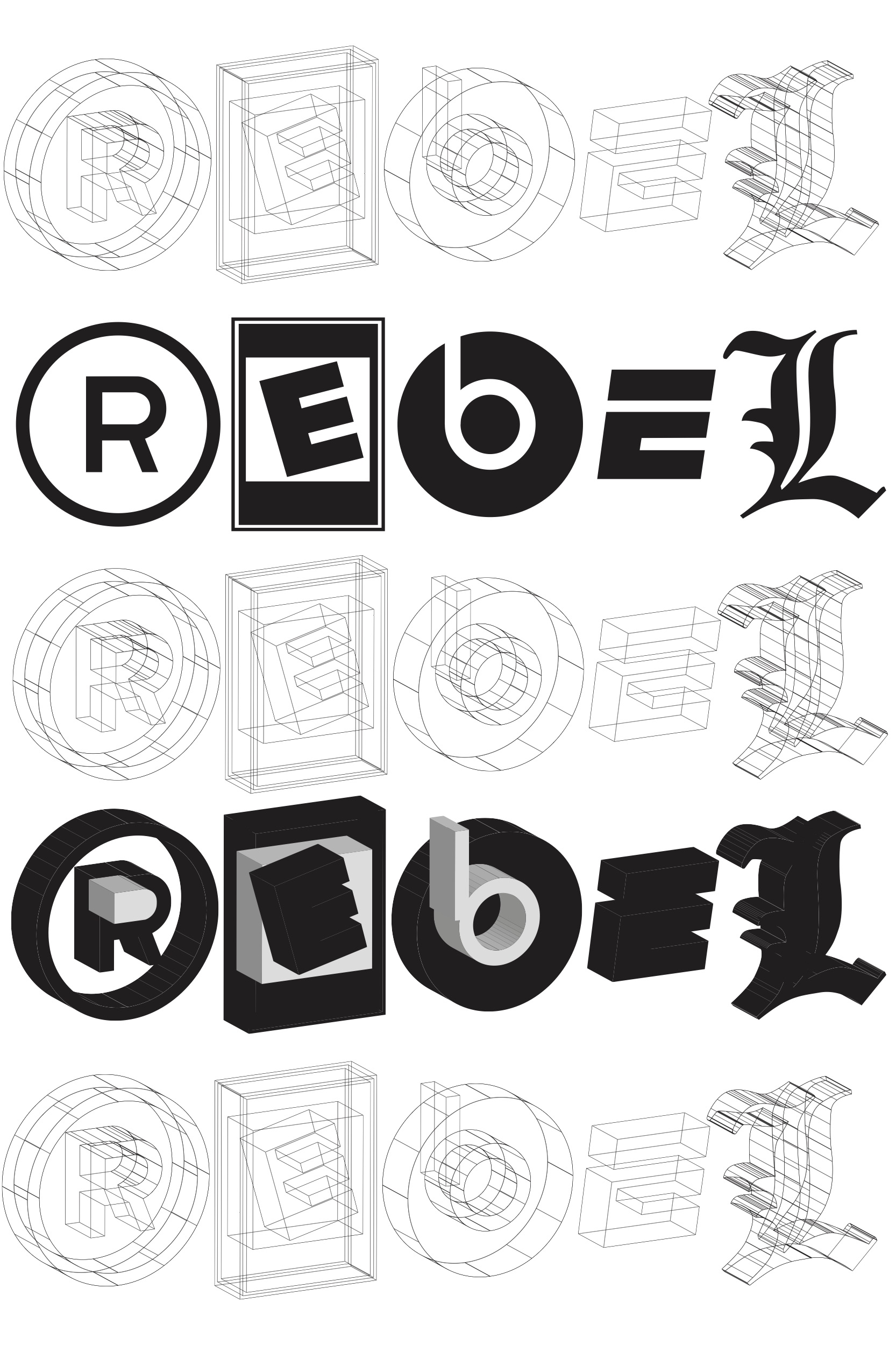


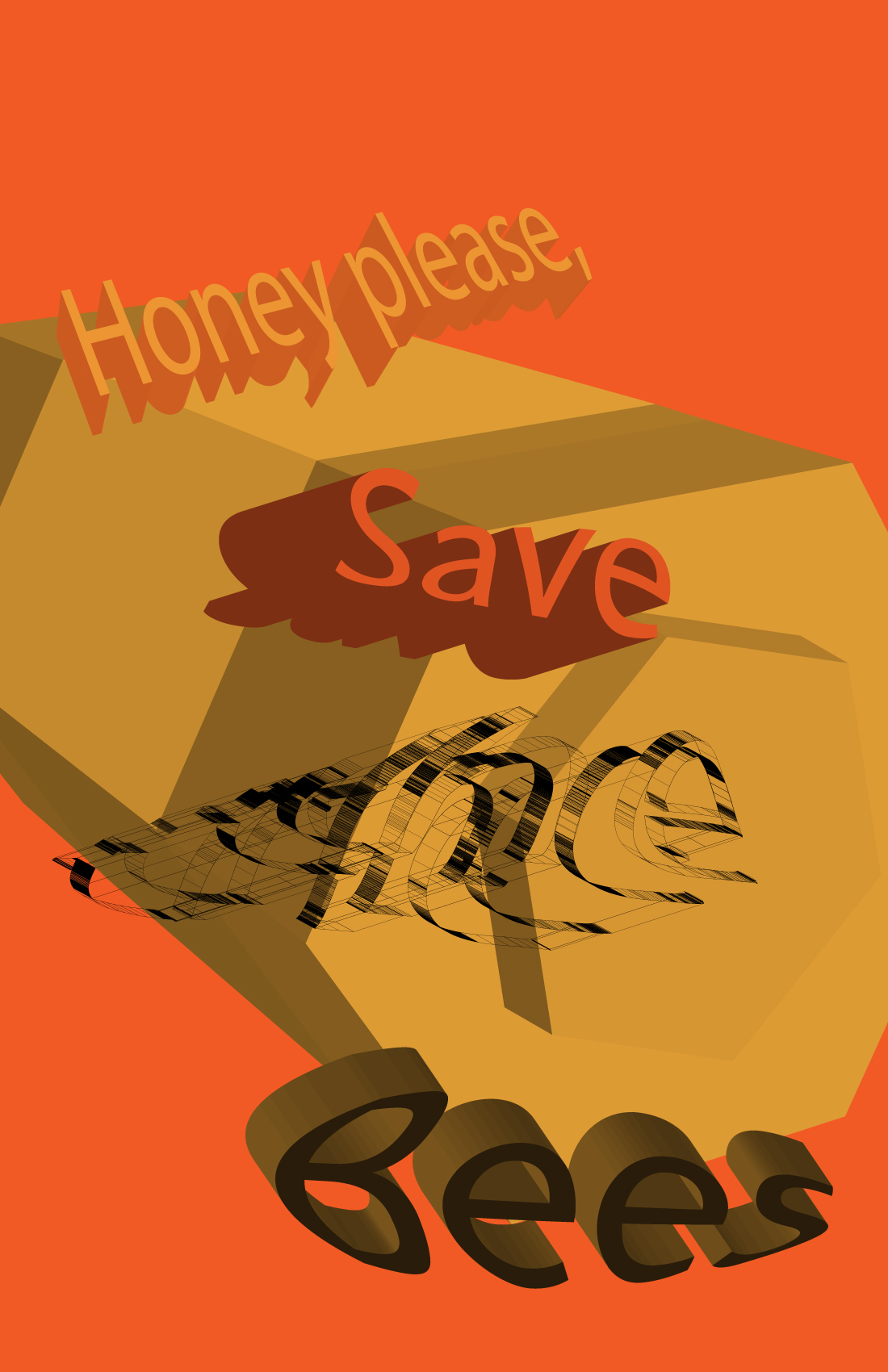
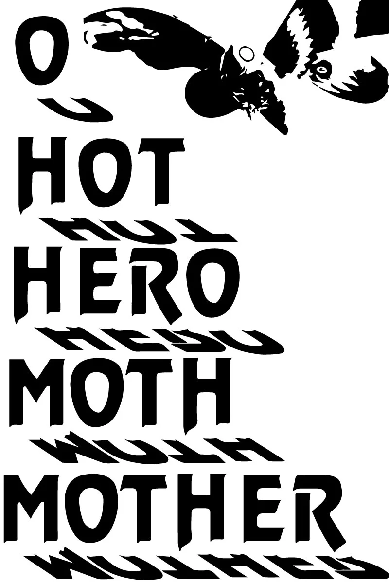
On this text as image assignment, a few things stood out for me. The first was I was drawn to meaningful conceptual ideas that then were executed using stylization of the text that somehow enhanced the underlying message. I also looked for interesting treatments of the text that were really out of the box (literally) and worked toward text as form. Lastly I was drawn to exercises that had a thoughtful overall composition, instead of floating words randomly placed. -Kelly


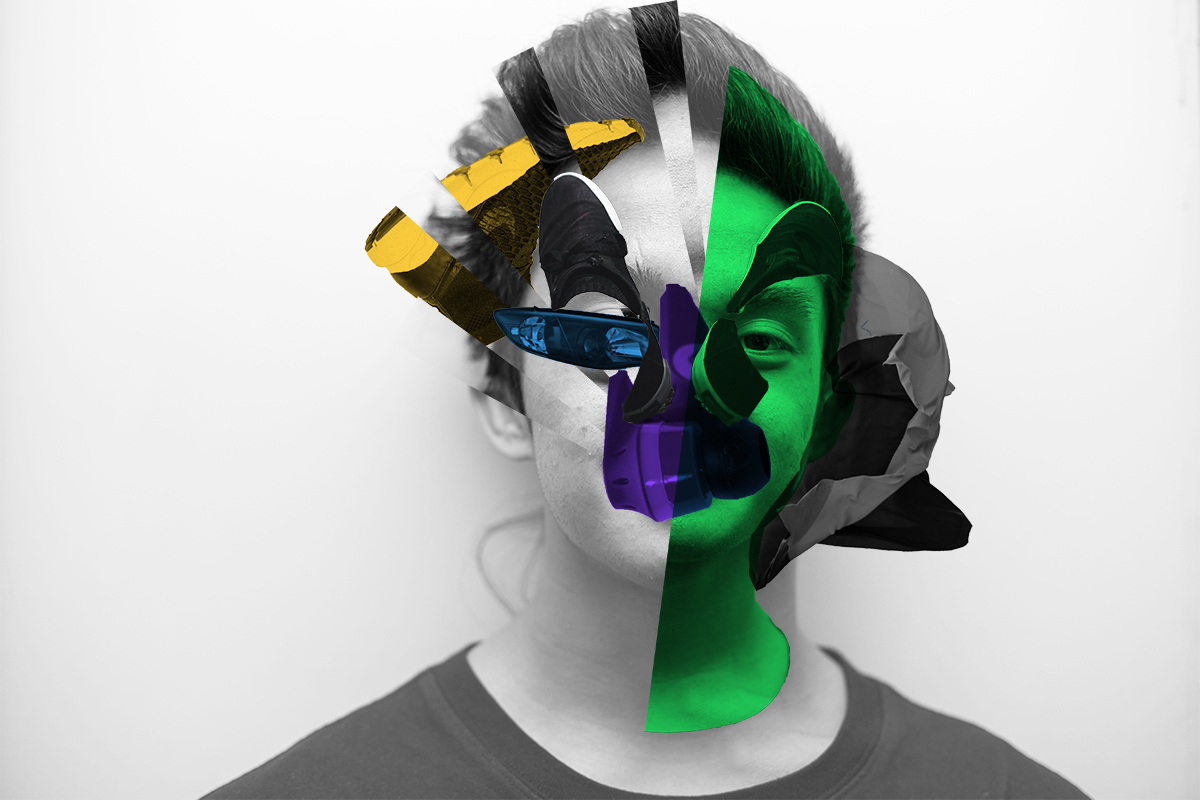
There were so many interesting variations on this one! Radical compositions of all types :) The ones I chose to share had a good compositional balance, and chose objects that give a sense of the maker's personality. I loved the strange collaged elements working together to surprise the viewers and at the same time hint at some underlying narrative. It was wonderful to see how creative people were at choosing the collaged parts of each image, i found myself drawn to those that had a connecting theme of some kind to give the composition a tone that was both wild and cohesive simultaneously! -Kelly


For this set I looked for images that really got the graphic look. I also looked for good use of color in the sense that it was applied thoughtfully to different aspects of the image, following the contours of the area with some precision and forethought. I also found myself drawn to bright playful color palettes. -Kelly


I was really impressed by this project, so many students really pushed themselves to create really interesting optical effects. I looked for projects that had two interacting layers that complimented each other in terms of both color palette and the optical illusion. I also chose images that played with unique shapes. Lastly I found that the images worked better if the composition was full and felt as if there was a grid guiding the patterns. Overall I was so impressed!
-Kelly
9 May, 2017
While the projects I've featured below are in no way meant to be the only projects I found compelling from the students whose work I've recently graded, I feel these show a strong understanding of the lecture and tutorial materials. They show thoughtful use of color and composition in collage elements as well as careful consideration of how the collage elements interact with the selfies form which they are made. I also simply find them visually appealing.
- Simon Boas


Resources (From way back)
NEw PHOTOSHOP UPDATE RELEASED
This video explains the new features and tools.