CT 10 - MODULE 5 - TEXT, TYPOGRAPHY AND DESIGN
UNDERSTANDING DIGITAL DESIGN
MODULE 5 - TEXT, TYPOGRAPHY + DESIGN

I.Introduction
This module will explore a crucial aspect of visual and digital design - typography and text. It will also dive into the relationship between visual and literal meaning, especially in text-driven or text-centered design. Something to keep in mind throughout this module - especially in relation to this class in general - is that written language, text, typographic design and textual production {both physical printing and digital media} are ALL technologies that have had enormous historical, cultural and creative impacts.
From a more “zoomed-in” perspective, this module will also introduce and explore vector graphics, which are by far the more optimal format for working with digital text and print design. The project will use Adobe Illustrator as a creative tech to develop text-driven designs and artworks. In this async lecture content, we will define some basic definitions and properties of typographic design, introduce some type-centered concepts relevant to the course, and also discuss many designers, movements and artists that have greatly influenced typographic design and/or continue to push the role of text in contemporary art and design, as well as larger cultural media.
1. Visual Properties + Definitions of Text + Typography
Text, letterforms and alphabets are all visual symbols. Together they form complex meanings via words, sentences, and written language. Their visual properties, however, also convey meaning, which will be the focus of this module, along with old and new creative technologies used to design and design-with typography, text, text-based images and letterforms.
1.1 Typographic Basics
The image below defines some of the basic typographic terms used to describe letterforms from a visual design perspective. None of these definitions need to be memorized for this course, but in general, it is important to understand how letterforms - usually described as “fonts” or “typefaces” in contemporary digital design - are highly complex, organized, and intentionally designed systems of visual symbols. In most cases, they need to be both visually legible in order to clearly communicate literal meaning by forming recognizable words and sentences, and they need to be visually expressive, through their letter forms and the way that they interact with one another, and other visual elements in media.

It is usually typeface designers who craft typefaces or fonts, and who are striving for that balance between visual expression and legibility. They design and construct the geometry of the letterforms and characters, and how they generally interact. There are designers and design studios who only design typefaces - it is a highly specialized design practice, which I will discuss a bit more in another section below. There are other designers who might create a custom font to include in a larger series of artworks or designs. In most cases, when working with typography in art or design, designers are not adjusting fonts at this "letterform" level, but they are, however, selecting which fonts - or typefaces - to work with in a project, and intentionally forming a typographic system that communicates visual meaning.
1.2 Typeface Organization
There are many methods for classifying and organizing typefaces - which can be helpful because there are hundreds of thousands available. A standard, general contemporary organization is Serif, Sans Serif, Script and Decorative. These categories are very broad, and each contain thousands of fonts, with lots of overlap. That being said, they are still a useful starting point when designing the typographic system for a project, as these general categories can help indicate a broad visual classification. There are also some well known standards in each of these categories that, while widely used, can still be applied to design projects and artworks effectively and uniquely.

There are many sub-categories within the Serif, Sans Serif, Script and Decorative categories. This is a link to the full graphic below, which visually describes all of these sub categories - this information will not be covered in the module lecture quiz, but it is a very helpful resource.

1.3 Layout and Print-Design Definitions
When implementing text into designs and artworks where more than a few letterforms or words, designers more frequently work with and adjust the properties below. These properties affect how digital letterforms are spaced between themselves and would be visually organized within the page or other media form. Many of these terms are based on aspects of physical, pre-digital printing processes like the letterpress, which used physical letterforms to print multiples of text-based designs.
Kerning, Tracking, and Leading


LEADING is a typography term that describes the distance between each line of text. It is pronounced ledding {like sledding without the s}. The name comes from a time when typesetting was done by hand and pieces of lead were used to separate the lines.
The letterpress itself was a wild, super-advanced technology in its time that caused absolutely massive shifts in the world - maybe even more significant than the proliferation of the internet and digital media, which is another huge paradigm shift in media and visual culture and design. This, however, is another topic for another course / series of courses.
1.4 Distinctions Between Visual Meaning and Literal Meaning
When designing with text, there are two major categories of meaning to consider - the visual meaning, and the literal meaning.
Literal meaning is a little easier to describe or delineate - it is the understood meaning of the letters, words, sentences, phrases, etc - the meaning of the text itself, including the written or cultural context {if applicable}, but nothing else associated with the visual appearance of the text.
The visual meaning is the meaning communicated by the text itself as a visual image or design, including the visual construction of the letters, their color and texture, their spacing and relationship with one another, the rhythm they communicate, and the visual contexts associated with their overall designs. Looking at the examples below, how does your interpretation of the phrase “Dirty Baby” shift or change based on the font in which is it expressed? Hopefully this is connecting back to film montage and collage principles as well.


I would argue that it is impossible to completely separate literal meaning from visual meaning, which is why typographic design is so crucial when working with text. Successful typographic design can be utilized to create more expressive and effective artworks. Unfortunately, the inverse is also true - unintentional typographic choices can confuse overall meaning, or create direct tension between the literal and visual meaning of an artwork or design. This is why it is incredibly important to understand and always consider the relationship between visual and literal meaning when working with text in designs and artworks - which we will be exploring in-depth in this module.
2. Typographic Creative Technologies
Written language, alphabets, text, letterform and typeface design, and printing, are all technologies that can be used for creative expression. As discussed above, these technologies and their progression / advancement have had massive global and historical impacts that are way too vast to cover in a single course, let alone a single module in a course.
This module will instead introduce typographic design concepts, foundations, and technologies from the past ~150 years, with a focus on contemporary typographic designs and artworks that are relevant to other topics discussed in the course, and our current media environment and culture. This section will therefore explore typographic-centered creative technologies and emphasize the digital technologies that many of you will engage with and navigate as artists and designers, to incorporate text into a variety of artworks, and/or to create works that center around typography and text.
2.1 Typeface Design, Type Foundries + Fonts
Typeface designers design the typefaces - or fonts - and typeface families, which is an incredibly specialized visual design field that constantly navigates the tension between form, function and meaning.
As a visual designer, I truly believe that these artists and designers are in an artistic class of their own - there are numerous challenges and considerations that come with developing a complete digital font-family, both big picture - such as balancing visual meaning and expression with legibility - to incredibly detailed and technical - such as determining letter-spacing for different combinations of cases and styles of the same family. Typeface design requires a vast understanding of typographic fundamentals and history, along with specific cultural contexts, in addition to the artistry and skill to execute new, unique designs.

EMIGRE TYPE FOUNDRY
Type foundries are studios dedicated to designing fonts - these could represent the work of an individual designer, or a team of designers, usually working along a visual theme or design aesthetic. Type foundries are different from marketplaces or repositories, such as dafont, myfonts, or fontsquirrel. These platforms work with many different designers and foundries to either sell or distribute fonts, but do not design their own fonts. Some foundries, such as the example below, only sell their typefaces through their own studios, while others will work with these larger marketplaces to reach a wider audience and consumer base.
I encourage folks in this course to familiarize themselves with the typeface designs coming out of smaller, more independent studios, while also understanding that these typefaces are usually more expensive to purchase / use. If needing to conserve costs, I suggest starting with smaller studios to get a sense of a particular project’s typographic goals, and then looking for similar lower cost or free options on a larger marketplace or distribution site.
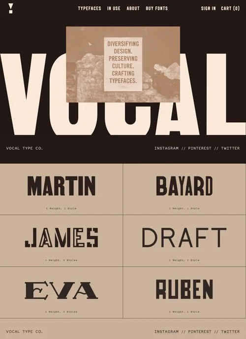
Tre Seals and Vocal Type Foundry
Tre Seals is a designer and the founder of the Vocal Type Foundry, which he formed partially in response to the lack of racial, ethnic and gender diversity among professional designers in the US. This studio creates typefaces based on printed and other visual design artifacts connected to histories of underrepresented, marginalized and oppressed communities. When reviewing the typefaces below, consider the balance of craft, expression, function, and style that must go into each and every letter, character, number, etc, and then how that needs to be applied consistently across multiple letter and character sets.


Adobe Fonts + Other Font Distribution Platforms
With free Adobe CC access, everyone in this course also has access to the Adobe Font platform. This platform includes 100s of fonts that can be immediately synched to Adobe programs. I encourage using this platform for this module project, and other projects as you continue working within the Creative Technologies program. Expanding beyond the default fonts available in creative apps is a crucial part of developing unique and expressive designs for projects that are tailored to an artistic vision or specific design goal - the default fonts are not meant to represent all of the options, or even the best options available.
2.2 Vector Graphics Editors
Vector graphics are a type of graphic that works with objects constructed of points - or vertices - and lines, with different properties assigned to them. These types of graphics are very different from raster or bitmap graphics, which are composed of pixels as the single building block. These differences will be discussed more in the next module, but for now, understand that digital typographic design is best explored using vector-based creative technologies and programs.
Adobe illustrator is a vector-based creative production technology that we will use for this module’s project. While Adobe Photoshop has some typography tools and processes available, and it affords some of the same vector editing options as Illustrator, Illustrator offers much more flexibility, control and type-specific processes, especially when it comes to working with complex layouts of text, multiple layers of text and/or transforming letterforms or constructing new letterforms or text-like designs.

Typefaces or fonts are installed on a computer or available via a cloud server {a collection of files available via an internet connection}. Different programs use and access these files, and their file-type is more closely related to vector files than pixel-based images. Because of this similarity, the software designers developing Illustrator, or other vector editing programs, build more tools and functions that work directly with text. Working with text in Illustrator also streamlines major format or scale changes - a text-heavy vector logo that is originally sized to fit a business card can be enlarged to poster size without losing any quality with a simple transform operation, and multiple layers of text can be selected and changed at the same time.
In my time as a graphic designer, I very very rarely use text tools in Photoshop or other pixel-based image editors. I will use vector graphics even when I am only overlaying a single word or sentence on top of a pixel-based image, such as the album artwork below.

For this design project, I developed the image in Photoshop and the text in Illustrator, and used a low-res version of the image file as a placeholder in Illustrator. In the final step, since this was a screen-based graphic, I imported the text files into the Photoshop file, and exported as a PNG file.
The above might be a bit extreme, and is partially informed by my own personal preference and creative design practice. From an optimization standpoint, I would suggest using vector-based programs when working with any kind of text-driven digital design, unless only working with a few words, and/or there is a specific reason that an image editor must be used - such as combining text within multiple layers of pixel-based images, and needing to apply raster-effects to that text.
When I need to develop images with both text and photographic images, my usual strategy is to work with both an Illustrator file and a Photoshop file, designed in tandem, using low res draft layers in each for visual composition development. In the finalization stage, I will overlay the two graphic-types in one program or another, depending on the final output and a few other considerations.
3. Text AND Image
The artworks and movements below discuss the use of text in art and design from a standpoint of Text AND Image. This categorization - which is mostly defined for this course, and not a broadly recognized design term - loosely describes artworks and designs where the text and images combined are the focal point of the piece.
In these examples, typographic design is incredibly important, and the work depends on the text to communicate critical meaning, paired with images, symbols, and other visual elements that also independently communicate critical meaning. In most cases, it is more effective if these meanings are intentionally designed to reinforce one another, however, some of the artists and designers below explore the tensions between textual and visual meanings.
3.1 Aesthetic Roots of Persuasive and Expressive Text
The designs, artists and movements below all incorporate text and image in ways that pushed typographic design and print design into many of its contemporary forms. Dadaist text collage, German Bauhaus designs, and Eastern European - primarily Soviet / Russian - Constructivist artworks and designs explored the ways in which text and textual layouts could be transformed to communicate persuasive and/or more effective messages. Many of these artists were working with the tension between the literal meaning of text and the visual meaning of composition, layout and letterforms themselves.
While some of the artworks below incorporate text only, they laid the groundwork for movement that explored the persuasive combination and integration of text and images. This type of persuasive design was first observed in propaganda media and artworks, and other forms of art and design that had clear messaging goals. Modern consumer advertising, promotion, and marketing design adopted many of these persuasive techniques and forms, which makes sense given the goals of each media form. When viewing the works below, all made between ~1910 and 1950, consider how they compare to modern persuasive media.
Dada-ist Collage and typographic design - 1920s


Bauhaus Design - Germany 1910s- 1930s


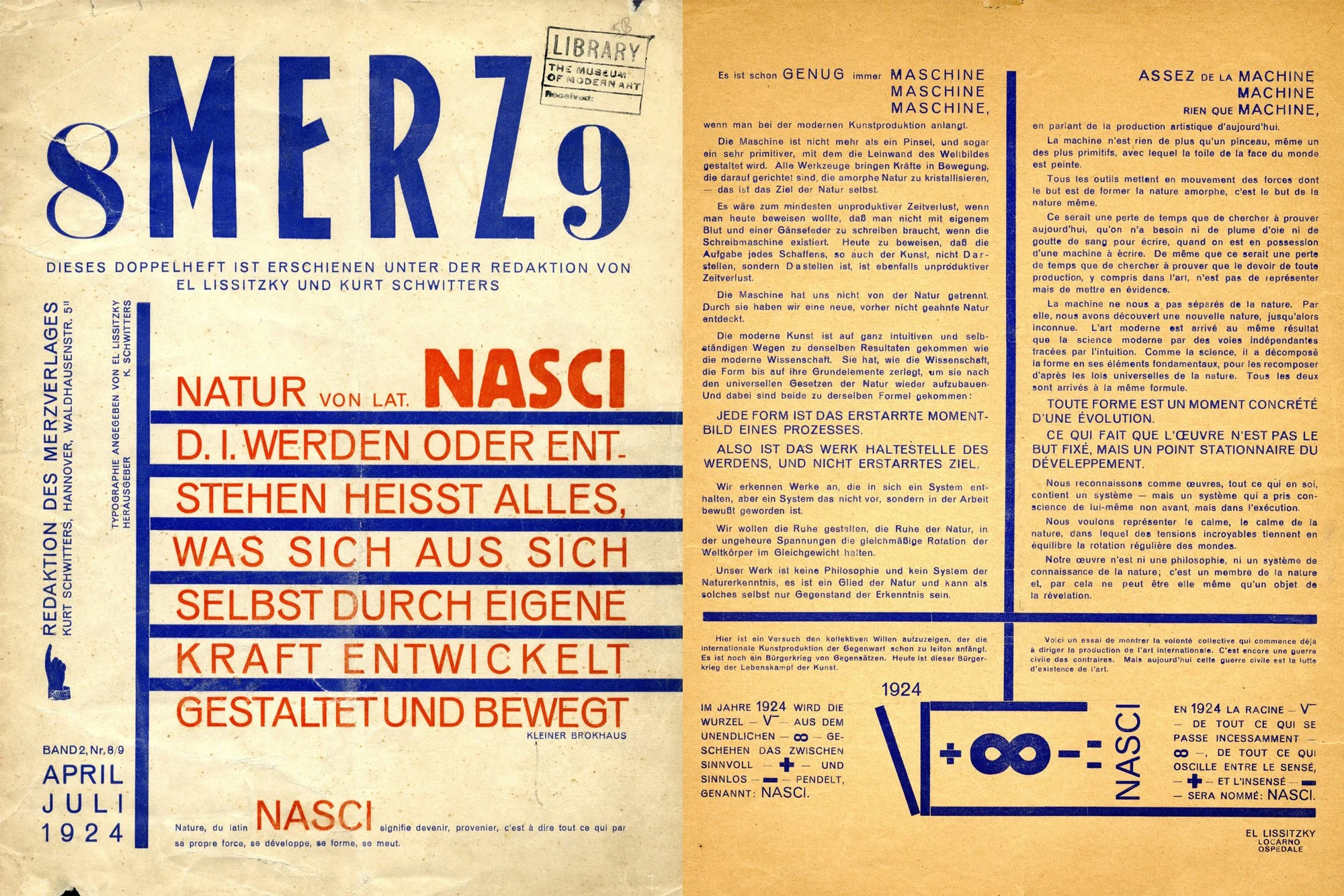
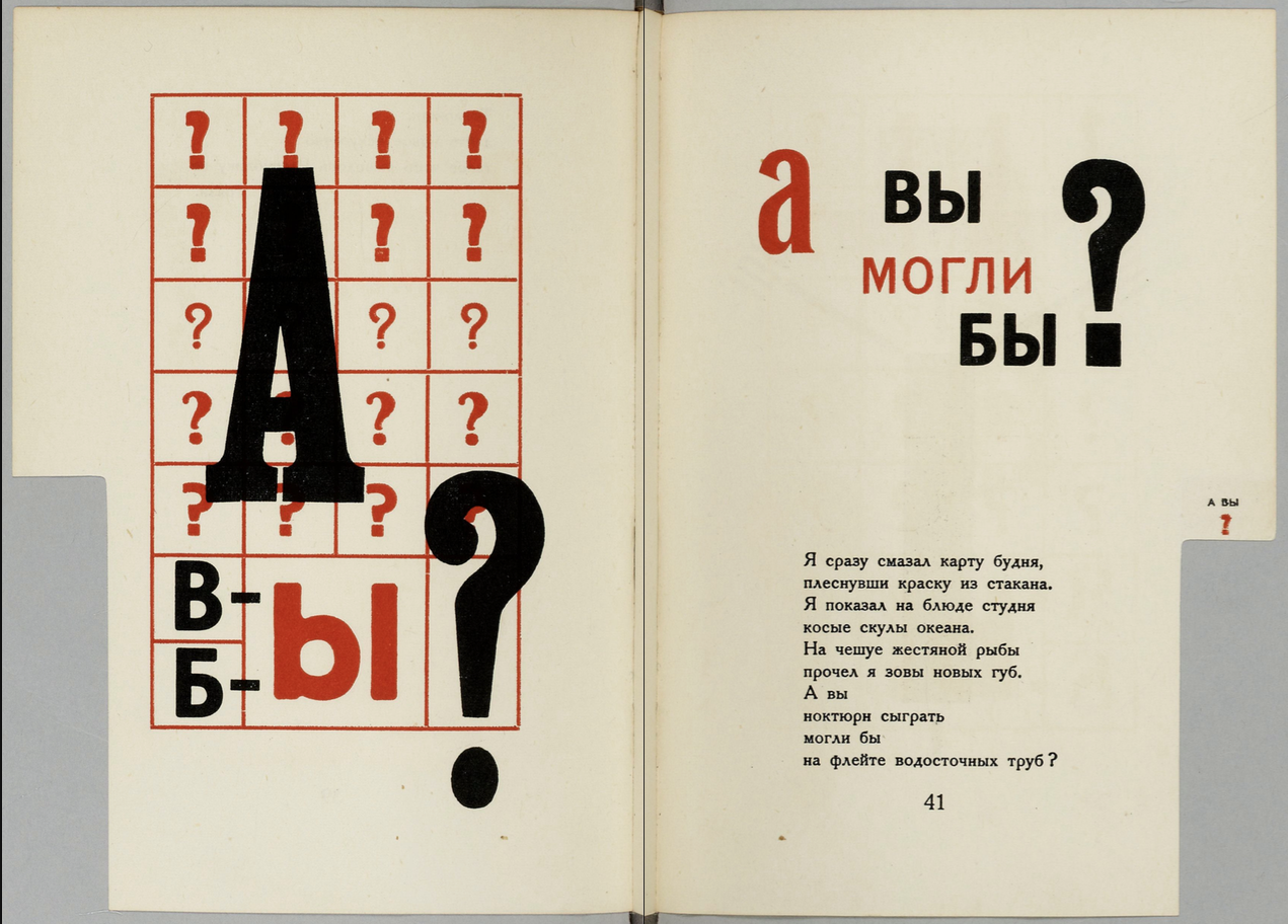
Constructivism + European Avant Garde - El Lissitsky’s Typographic Design for the Book For the Voice - 1923


Constructivism - Aleksande Rodchenko 1910’s to 1930’s


3.2 Contemporary Persuasive Typographic Art + Design
While we will not go into contemporary marketing or advertising design in this module, the contemporary artists below create artworks that are in conversation with advertising and propaganda methods and approaches. Each of these artists explore these visual forms of persuasion to challenge these conventions and expectations, point these strategies out to the audience / viewer, and/or and communicate their own ideas utilizing these aesthetics.
In all of these cases, the artists are not designing advertisements, but are using the visual language of advertising and propaganda to expressively communicate their ideas to viewers.
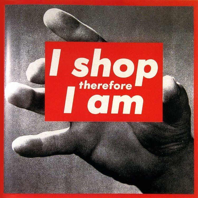
Barbara Krueger


Shepard Fairey


Jenny Holzer

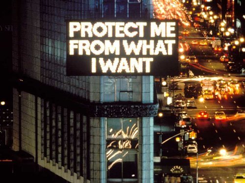


Sean Hart


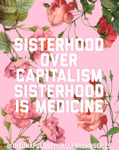
3.3 Text AND Image Tensions + Experimentation
As with most of the categories and classifications in this course, these definitions should be considered on a spectrum. In many cases there is a lot of overlap between Text AND Image and Text AS Image. The artists below work within this gray area, and also explore the tensions between visual meaning and literal meaning. It is important to note that these artists are working very intentionally, and are knowingly playing with known visual contexts, audience expectations / understanding, and conventions. While the focus of these artworks and designs are the texts themselves, I am still placing them just within the “Text AND Image” category because the images and/or other visual elements are still crucially important to the understanding of the work. If those non-textual elements were removed completely, the remaining textual works might fully shift in meaning or be understood very differently by the same audience.
By operating within these spaces, these artists are carving out space to form new meanings and invite viewers to also consider ideas from a different perspective or framework. While the two artists below approach this in very different ways, and work with very different subject matter, this intentional “play” can be a very compelling and effective way to communicate ideas - instead of changing up the information, they are instead changing the viewer’s way of thinking about the presented information.
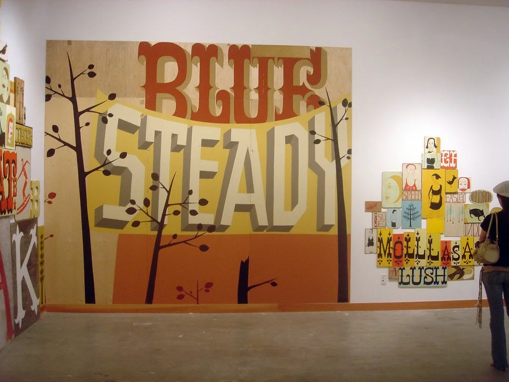
Wayne White


Johanna Toruño + The Unapologetically Brown Series


4. Text AS Image
The artworks below fall into the second category for this course - Text AS Image. These artworks all utilize text as the central element of the piece, to communicate both literal and visual meaning and information. For these works, if the non-textual elements were altered or changed, it might influence the overall meaning of the piece, but if the textual elements were changed - either literally or visually, the entire meaning would shift so drastically that it might read as a completely different artwork or design.
As discussed in the section above, there is overlap between these two categories - I try to classify artworks in this category, vs the Text AND Image category, using the following two criteria:
1. Would changing the visual design or appearance of the text / letterforms in this artwork significantly change its’ overall meaning?
and/or
2. Would removing the text or changing the literal meaning of the text significantly change the understanding of the other non-textual components?
4.1 Experimental Fonts and Digital Technologies
In the mid to late 90’s and early 00’s, digital technology expanded the options available for designers working in text-heavy graphic design fields like print design and typographic design. These new digital tools and technologies made experimentation with text-layout and letterform and typographic design much more accessible, flexible, and easier to reproduce and print.
Designers like David Carson and Ed Fella, who had been working in the typographic and print design industries during this shift from analog to digital, began to experiment with typeface design and designing the visual aspects of letterforms to communicate meaning. These designers pushed the boundaries between visual meaning and legibility, and also created new spaces to understand just how much information and meaning can be communicated via the visual aspects of typography and letterforms alone. These types of designs greatly influenced the use of typography in visual media and digital typographic design, especially in digital media and culture in the early 2000’s.
David Carson


Ed Fella


4.2 Graffiti
Graffiti and street art is another subset of Text AS Image artworks, since these artworks and designs are completely dependent on the physical design, construction and aesthetic of the letterforms. In this case, this visual aesthetic also includes the sites where these letterforms are painted or otherwise displayed, and the individual artist creating it.
As with many of these sections, this is a huge topic that couldn’t even be covered by an entire course, let alone a section in one module. That being said, graffiti and street art have had and continue to have such a huge impact on visual culture, art and design, that I needed to at least mention it in the Typography Module. The two artists below are not even the most influential street artists or graffiti artists working, but each of their individual creative practices is linked to a specific aspect of this course and the Creative Technologies program.
Tempt One
Tony Quan, also known as Tempt One, was a graffiti artist who was at the forefront of developing unique letterform styles in the 1980s and 1990s. In 2003, Quan was diagnosed with ALS, and lost control of most motor functions and abilities. In the early 2010’s, family and community members reached out to artists and engineers to design a method for Tempt One to be able to create again. The team developed a new creative technology, the “Eye-Writer” - a device and program that tracks eye movements and outputs them to digital files and process, which can then be projected onto architectural surfaces.


The artworks Tempt One painted via this process are a record of tiny movements scaled up and projected in large physical spaces using light, motion tracking, and image projection technologies. The action of graffiti writing is a significant part of its' overall visual aesthetic, which is tied to its’ meaning, and Quan was able to continue this practice with his eyes. These new creative technologies are groundbreaking on so many levels: they offer a completely new technique for authoring images, they make physical creation possible for people with limited mobility, and, on top of this, they visually expand the boundaries of graffiti art and expressive typography.
Margaret Kilgallen
Margaret Kilgallen’s visual works - which center around typography - share visual properties and styles with graffiti letterforms, and also include hand painted, unique typefaces that are integrated with other images. Similar to other graffiti artists, Kilgallen was interested in the connection between artwork and artist that forms when incorporating hand-drawn elements, especially with more recognizable symbols such as text and letters. From this standpoint, her artworks exhibit several layers of meaning, including the literal meaning and the artist’s signature style or aesthetic that also fully changes the way those words might be understood or interpreted - especially for viewers who recognize that artist’s style.
When viewing these works, think about these different layers of meaning, and how designers might incorporate their own style into text-driven works when working with digital creative technologies. Are there methods for communicating this very personal, expressive style when working with fonts made by another designer? What other design choices can be used to individuate fonts and typefaces, other than working with handwritten typography?


As a side note, Kilgallen was a core member of the group of artists in the 1990s and early 2000s {she passed away in 2001} who helped push skate, surf, and “street art” styles into more traditional art spaces and conversations. Alongside artists such as Evan Hecox, Barry McGee {TWIST}, Thomas Campbell, Stephen Powers {ESPO}, Clare Rojas and many more, Kilgallen’s artworks expanded cultural and critical notions of street art and graffiti as a “serious” creative practice. As a designer working in the surf and skate industry at this time, this shift was very tangible and inspiring - I remember seeing artworks like this in galleries and then larger museums for the first time, and it was a noticeable shift in larger visual cultural and the art world.
4.3 Textual Constructions
The artists and designers in this final category construct visual images, paintings, sculptures and forms out of texts, or construct texts out of other visual elements that are directly related to literal meanings. These artworks communicate distinct literal meanings that are impossible to separate from their visual meanings, and, I would argue, the visual meaning overtakes the literal meaning.
Another way to think about these artworks is that their final, visual forms, which include visual aspects of the text, communicate more meaning than the literal meaning of the words themselves. In these artworks, the text IS part of the image or visual presence of the piece, and viewers might form new LITERAL meanings and associations based on these visuals.
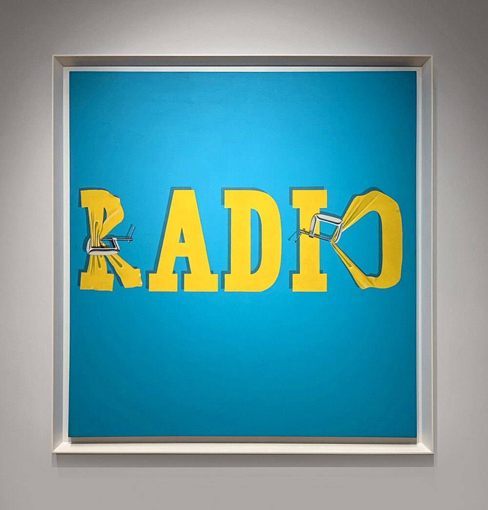
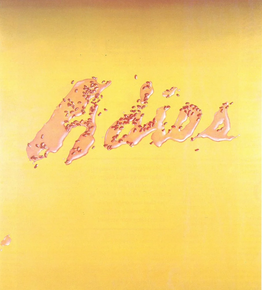
Ed Ruscha


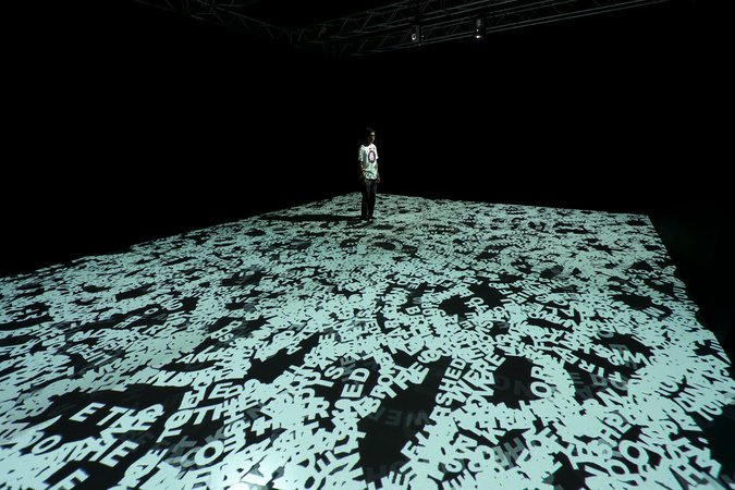
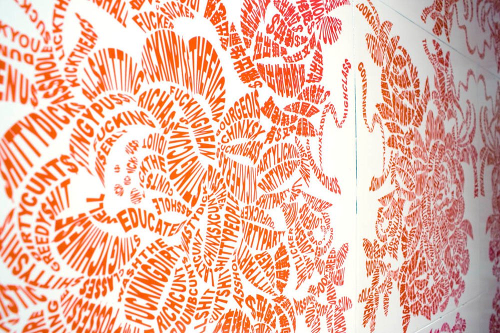
Tsang Kin-Wah


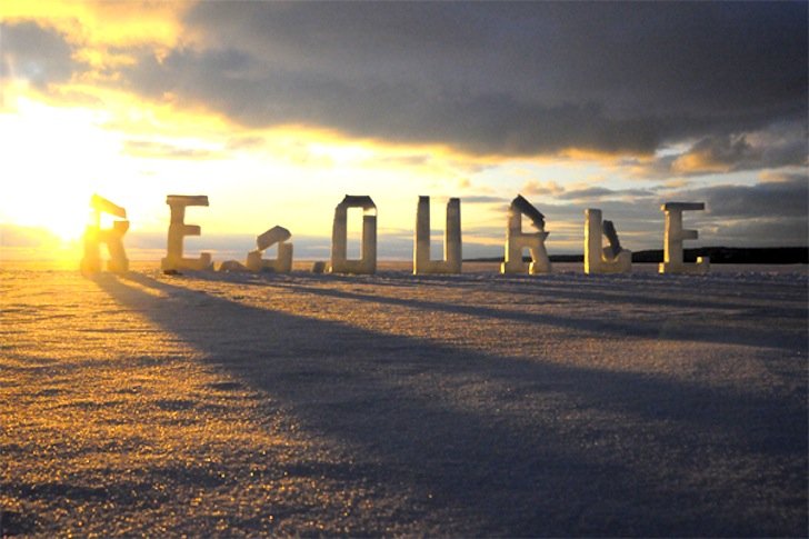
Nicole Dextras


5. Module Wrap Up
To conclude this module’s async content, if I can leave any one bit of information with folks, it is that typography is a critical aspect of understanding digital design that can often be overlooked, even though it is crucial for communicating information. As you are working on a variety of projects, both in this course and other courses, personal projects, and projects for a job or client, always try to be intentional about the typefaces / fonts you select to work with - how do these choices reinforce your overall design and/or messaging goals? Are these fonts unique, and tailored to the vibe, theme and/or purpose of the larger work? Do these typographic choices work against your expressive goals, or confuse the larger meaning?
For some levity, and also to understand that even the most accomplished, effective and successful artists and designers sometimes forget about typography, please review the two short SNL clips:
