MODULE 1: IMAGE ADJUSTMENTS, COLOR CONSIDERATIONS + EXPLORING THE GRAPHIC
1.1 INTRODUCTION
This week in our tutorials we will be exploring image editors like Adobe Photoshop CC . The majority of image editors are pixel-based, meaning that they (for the most part) apply operations to the pixels that construct bitmapped images. Most digital images - photos you take with your phone, images, graphics photos posted on the web, images that you scan to digitize - are bitmapped, meaning that their smallest unit-of scale is a single pixel, in most cases a square with a designated color assigned to it. Bitmapped digital images are grids composed of thousands to millions of pixels.
Image editors are excellent tools for adjusting images, working with color within images or applying new colors to images, and combining different digital images. They can be used to develop unique digital images or graphics as well, but in this first week, we will be primarily exploring the different processes that you can apply to your digital photographs.
Towards the end of this module, we will begin to explore the shift from adjusting images to using images as the foundation for unique graphics. There is an interesting, infinite space between a photographic image and a graphic image, and this is a space that many artists operate within when developing images, including those who's work predates digital tools like Adobe Photoshop.
1.2 High Contrast Photographs
Many photographers use image editors to adjust the levels of relative lightness and darkness in their photographs. This can be related to a photograph's contrast - if there are different areas of an image that are very dark and very light, it is considered high contrast. Images with more mid-tones and less extremes of dark and light are low contrast. Below are the images of several photographers who were working in the early to mid 1900's. The contrast levels in these photographs were achieved strictly in-camera and/or with traditional analog darkroom + developing processes - along with intentional subject matter and framing choices.

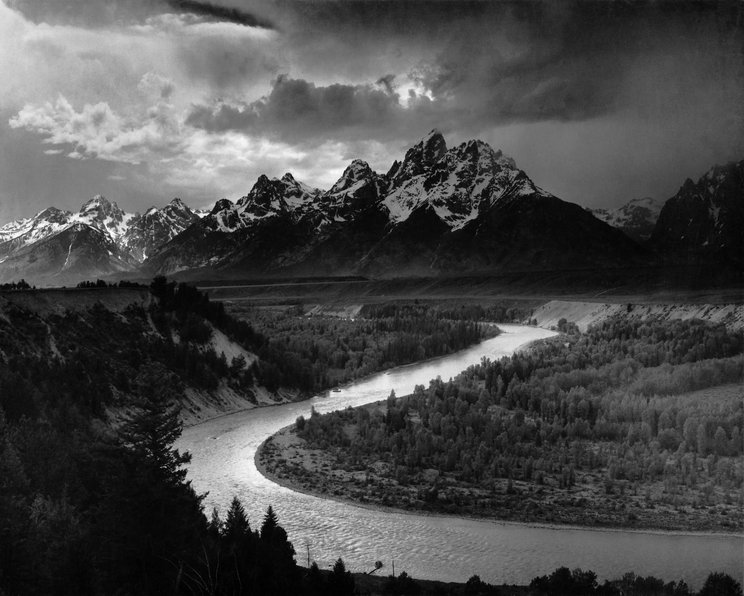


These are all excellent examples to explore how contrast can add to an overall composition, direct the way our eyes flow through an image space and attract or deflect attention. The tension created by the difference in the shades create a sense of visual drama, that can be used to influence or even construct meaning. This technique is definitely not new to artists. Below are oil paintings done by Baroque Painter Michelangelo Merisi da Caravaggio ( 1571 - 1610). He employs an effect known as Chiaroscuro - using high contrast to develop the illusion of depth - in his work to not only breathe life into his figures but infuse the narratives with a sense of drama.


1.3 Portraiture in a snap
All of the exercises you will be completing this week will be working with a self portrait as a base image. The reasons for this are both practical and creative. This being an online class, I have less opportunities to interact with all of you, which is how I am usually able to get to know students. These self-portrait exercises will literally help me put a face to a name.
On top of those more logistical reasons, Self-Portraiture and Portraiture is a very frequently explored process by artists across cultures and time periods. The act of capturing one's own - or an others - image can bring up a lot of different questions and considerations, among them:
Authorship: who "created" the image? The photographer, or the person posing for the image?
Ownership: Who owns the image? Who has rights to reproduce the image? Does that change if someone is selling the image?
Narrative + Identity: What information is the artist trying to communicate with this portrait? Is there a narrative that the portrait constructs in the viewer's mind? What type of meaning might a viewer infer about the subject, and how much of this is objective v.s. subjective? In cases of self portraits, what kinds of information or, possibly, misinformation, is the artist trying to communicate?
There are many other reasons why artists are interested in portraiture, which also change over time and within different cultures and artistic practices. The work we will be looking at will be primarily from the modern and post-modern era, but there has also been a monumental shift in the practice of portraiture in the past 15 years with the adaption of digital photography, social media, and, not to be forgotten, THE SELFIE. For example, contemporary artists are just starting to ask why there is such a demand for technologies (front facing cameras, selfie sticks) and tools (Snapchat, Instagram) for capturing, editing, adjusting, effecting, sharing and promoting these self portraits, or what it means that so many of these images are so widely distributed.

Marguerite Kalhor Selfie Collection
SCIENTISTS TRYING TO CREATE THE PERFECT SELFIE
Again, these are only a few of the questions that artists are trying to answer with their work in this field - I wanted to mention it since it relates to a prominent theme that will resurface repeatedly throughout this course: how different digital tools and processes both assist with artistic production, and also generate ideas that artists create work about.
1.4 COLOR, LIGHTING + PROCESs in photography
Below we will examine how different photographers use color, lighting or other processes to influence the meanings in their photographs. While most of these artists are dealing with portraiture, these basic concepts can be applied to visual aesthetics across different subject matter, not to mention mediums. I'm choosing to show portrait photography because this subject matter directly relates to what you are doing with your exercises, but, these principles are not in any way limited to only photography or only portraiture. Try to explore each example first in terms of what techniques were employed and then how they impacted the visual feeling of each piece. In the exercises for the module, we will then be learning how to apply these different techniques and process to digital images in Adobe Photoshop, or other image editors.
The photographers below use lighting (and the resulting levels of darks and lights) as a key component in their visual compositions. The contrast and lighting in these photos are achieved primarily via the photographers capture settings, framing / composition decisions and the physical lighting in the scenes, as opposed to processes applied using digital tools (a process sometimes referred to as post-production).


As the photographer / artist, it is your decision how much to use digital processes or post-production in adjusting things that can be achieved with different capture settings or lighting choices. For a strictly photographic output, these are all effects that CAN be mostly achieved without digital post, however, if you are intending to use the photographs as a base image - for example, if you are developing a screen print from a photo and need to up the contrast in the image - these post production tools can be an integral part of that process.
The tools and processes best used to adjust lighting and contrast in post are with the levels adjustment tools (under the Image menu in Photoshop) as well as the Brightness / Contrast adjustment. These can be applied to the whole image, a layer (using a layer adjustment tool) or to selections of an image or layer.
The next round of photographs all features color choices, adjustments and processes as a main component of their visual aesthetic. As above, some of these choices are made or shaped by the photographer during the capture process - camera settings, the type of film being used, the colors present in the scene. Nan Goldin, for example, started taking photos with cheaper "instant" cameras and easily developed films, and then started working more with stolen single-lens-reflex cameras (SLR) that she would buy at a bar - while these cameras might have been higher quality, her somewhat random method of camera selection and film choice influenced the look and color of her portraits. Other photographs below are taken with Infrared film or instant Polaroid film, or by cameras that are known to produce unique color tones such as HOLGA cameras.


I have included many of these photographs not only because they feature notable color choices, but because they exhibit color palettes and a visual aesthetic that many digital filters - such as Instagram - now apply to digital photos. This is an interesting concept to consider - what originally resulted as products of different physical processes and analog technologies are now being approximated and "reproduced" digitally. Think about how this might change the way these digital images are perceived or "read" by different viewers, and how that might change depending on a viewers age or experience with analog photographic processes. When viewing these photographs, consider how the colors attract the eye or attract different levels of attention to parts of the image. Do the photographs that exhibit features of analog process look commonplace? Do they look more or less "real" than images effected by Instagram?
Below, an excellent clip about a film shot with Infrared Film:

Link to a New "Old" camera and film technology that easily - and inexpensively - produces Infrared-Esque photographs, the Lomochrome Purple
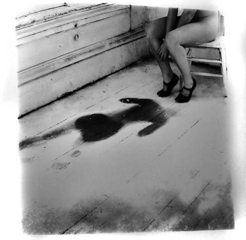
1.5 PHOTOGRAPHIC DISTORTION + EFFECTS
Digital image editors have powerful capabilities to apply effects and distortions to photographic images. Some of these effects have a strong visual aesthetic that can be hard to separate from the tool itself, which can distract from a final piece. Other effects or distortions can be applied in ways that are more subtle, or involve a more complex digital process - that allow the distortion to become an integrated part of the final image.
When I use distortion or effects in my images, I do it as part of a process for achieving a very specific visual goal that is usually related to what I intend to communicate with my piece. I try to never start with an effect, and instead, start with a feeling I am aiming to capture. Below are examples of different artists who have distorted their self- portraits using various analog processes. These artists are manipulating their portraits for a spectrum of different reasons and outcomes - when viewing these portraits, consider how the distortion affects the meaning of each piece? How do you find yourself responding to these different images, and how does that distortion play into your response?


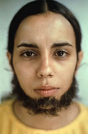


While all of these examples are either hand-painted distortions or transformations done without digital assistance or photographs of faces that are being physically manipulated or otherwise physically changed, they can be a good place to start when brainstorming different ways you might digitally manipulate images because they start more with an idea or a goal, and then develop different methods for producing that effect. These images also exhibit that interesting space between photograph and graphic - they for the most part are rooted in their photographic nature, yet also capture something surreal. This is a theme that we will continue to explore throughout this course, as digital tools truly expand that possibility space.
1.6 FROM PHOTOGRAPHIC TO GRAPHIC
The final grouping of artworks below continue to explore this shift from photographic to graphic. As with many of the artworks in this course, I am hoping to show multiple examples made with analog processes in order to provide context for where certain visual aesthetics developed, and to also demonstrate how these expanding technologies have allowed artists more freedom to experiment and push these explorations. Digital editors like Photoshop open up different possibilities for creating graphic images, whether it be from start to finish, or as some intermediate step.


There are many different reasons that artists might develop images that are not quite photographs, and not quite illustrations. Andy Warhol, for example, utilized the screen printing process to achieve his graphic, signature style. He was interested in creating work that addressed issues such as reproduction, commercialism, and the commodification of culture, art and celebrity. He used the process of screen printing - at the time a mostly commercial process used to mass-produce images - to add to this meaning.


Emory Douglas’s screen prints also explored the territory between photographic and graphic, but for different reasons and with different goals in mind. He produced images intended to capture the ideology of a movement, to inform and also inspire. These images - like Warhol’s - were also screen printed, but because it was the most economical and accessible way to mass produce printed material at the time.


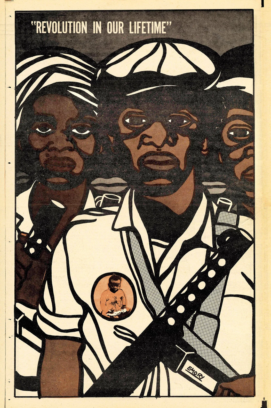

I think it is interesting to note that this screen printed visual aesthetic is still heavily associated with and adopted by contemporary activist movements, even though many of the technological processes that were once completely tied to these aesthetics have changed or improved. It is now much cheaper to print flyers and posters using the 4 color offset process (which produces photo-quality prints with a high color spectrum) and still many artists and designers employ a graphic style more closely tied to screen printing, using components such as high contrast / graphic photos, solid, limited colors and even halftone screen textures (those dots) in their visuals. At this point, the properties that were once simply the affect of technological limits have shifted meaning over time so that they now signify a revolutionary or activist association.


To conclude this lecture, I wanted to show an iconic portrait image known throughout the world that many contemporary artists - such as Sheaprd Fairey - reference in their radical or activist-minded imagery. In 1960, Alberto Korda photographed Che Guevara, and this image has become the basis for an iconic graphic known throughout the world. The meaning of this symbol has certainly shifted with every iteration and version, and changes depending on each individual images context. An image this well-known and iconic, especially one that can still hold so much meaning but is also used to sell merchandise, brings up interesting questions about ownership. Who owns this image? The photographer? The designer credited with first using it as a graphic portrait? The artists who have made new works based on this image? Or is it Guevara’s family - the subject itself?


