MODULE 3: VECTOR EDITORS + POINTS, LINES AND SHAPES
3.1 Intro
This module's exercises will be starting to use Adobe Illustrator, which is a vector editor. Vector images differ significantly from bitmapped or pixel-based images, and vector editors therefore present a different set of capabilities, options, affordances and processes when it comes to creating and developing images. There is a technical component to understanding the ideal uses and applications for vector editors, and for deciding which types of images and artworks should be originally developed as vector-images v.s. pixel-based images.
In this lecture, I will first describe the differences between pixel and vector formats, and then explore three of the foundations of vector images - the point, the line, and the shape - from a broader art-making perspective. After surveying a collection of these different mark-making techniques exhibited in artworks spanning from the Renaissance to today, next week I will describe more specific, contemporary uses for vector editors and vectors images, including a focus on Text-based artworks in the lecture and the exercises. For this week, however, I just want to initiate a conversation around these basic vector components, in order to help everyone better understand how other artists have used these elements - both technically and conceptually - to create artworks. For this portion of the lecture, I will be showing many examples of different artworks - don’t worry about trying to remember every name of every artist, and I will highlight the few that you should take note of. What is most important is to start to understand the different ways these elements have been and are currently being used by artists.
3.2 Vectors v.s. Pixels
Most of you are probably more used to using pixel-based images. This is because they are the standard format for digital photos, and they are the standard graphic (output) format used by most websites (except in the case of SVG graphics, which I will discuss later in the course). JPG, GIF, BMP, TIFF and PNG are all different types of file formats, but their basic building block is always the pixel, and thus all are bitmapped image types. Each of these images, regardless of resolution, is comprised of a grid of pixels, each pixel a percentage of different color combinations.

Vector Image File

Bitmap Image File

Vector Image File - Enlarged

Bitmap Image File - Enlarged
The reason why these pixel-based images and graphics are more realistic and smoother than they were in, say, 1980’s video and computer games, is because these grids can hold more pixels (resolution) and those pixels can show a larger range of colors (this is related to bit-size, the amount of memory that each pixel takes up). This allows for pixels to be smaller and smaller elements of an image (which masks their square geometry), and allows for a rich color spectrum that also smooths the edges between pixels. With these types of images, however, you can never go smaller than a pixel - and for that reason, they cannot be scaled infinitely. A curve or a circle or even a line, no matter how smooth it appears, when enlarged, will at some point reveal its blocky construction, just as a high resolution digital photo will.
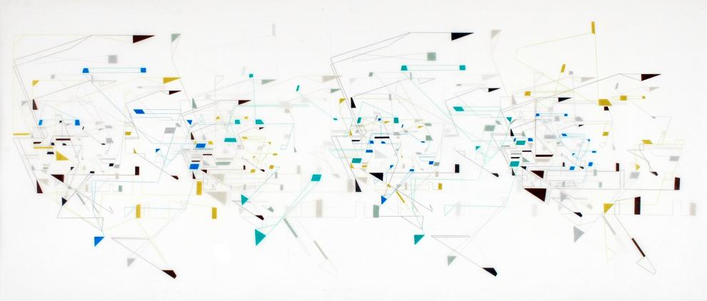
Vector images are built from completely different principles. Instead of a grid of pixels, vector images are comprised of 3 basic components - points that connect to form lines and curves and lines and curves that connect via points to create shapes. These curves, lines and shapes are all derived mathematically - vector images do not construct a line of pixels, they connect a line between two points based on the defined equation. These line and shape objects are tracked individually, and can be layered infinitely on top and behind of other objects in the same plane without loss, unlike pixel-based images, where each spot on the grid can only hold one level of information. Many pixel editors allow users to create files with multiple layers of pixels (like Photoshop), however, this is different. Vector images then assign a group of properties to each object, such as location, order, color, outline color, outline width, brush strokes, opacity, effect appearance, etc.
We will discuss many of these properties in the exercises, but for this lecture, we will focus on what types of artworks and images benefit from the precise control, editing ease and the infinite scalability that the vector file type affords. Before going into these categories, however, I want to show a variety of artists and artworks who work with the 3 building blocks (probably a misnomer, since they are not blocks) of vector images: artists who work primarily with points, lines, and shapes.
3.3 Points
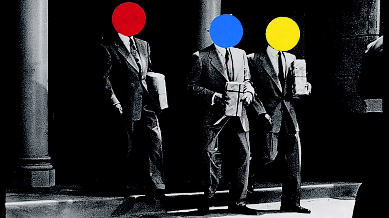
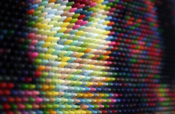
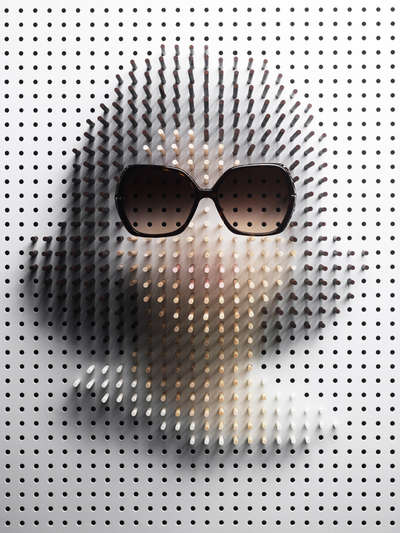
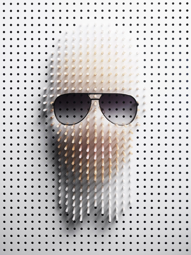
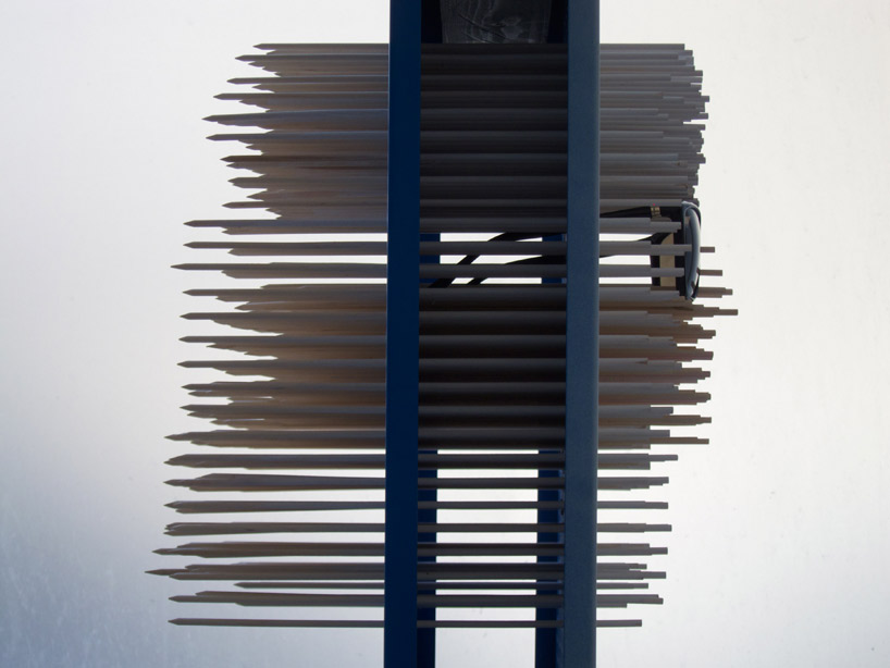
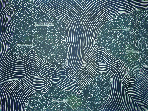
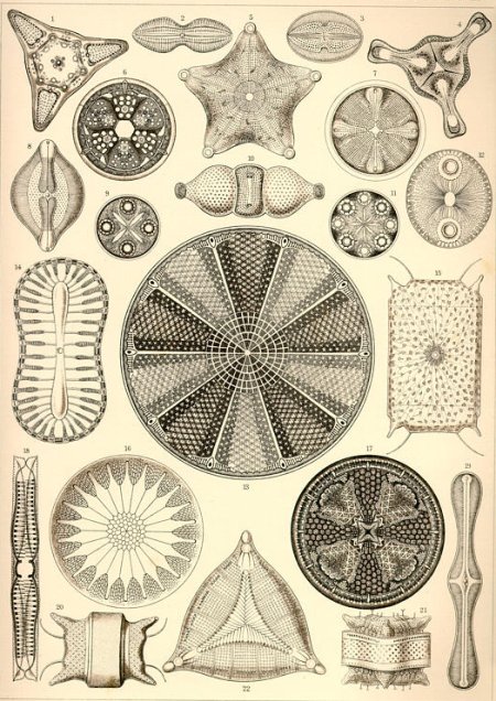
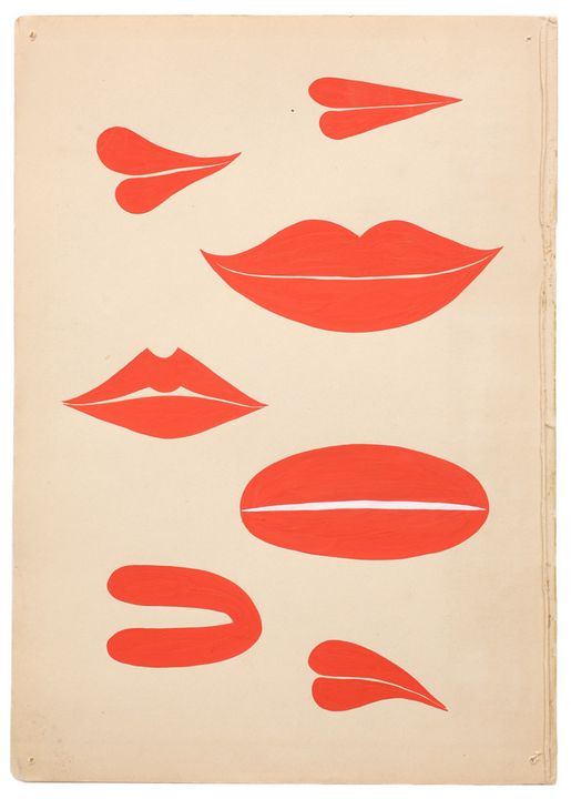
The artists and artworks below show the use of points to create visual images through a wide range of techniques, applications, styles and even movements. Some of these artists work with points as a concept, in addition to a visual effect. Many of these works could just as easily be likened to pixel-based images, since they explore the way that our eyes perceive color similarly to how pixels are able to realistically approximate detailed images. Additionally, some of these works bring up the distinction between a point, a dot and a shape. In vector images, the point is a zero-dimensional coordinate in the image space, however, envisioning that is hard to do without giving it some kind of physicality. As soon as you do that, however, that point becomes a shape. Keep this in mind when looking at the works below, and consider how the grey area between the invisible point and a 2D shape is sometimes merely a question of the scale of our imaginations.
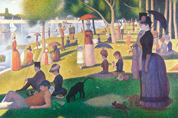
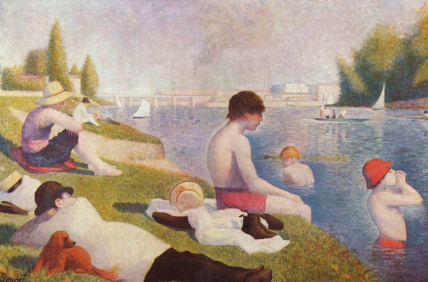
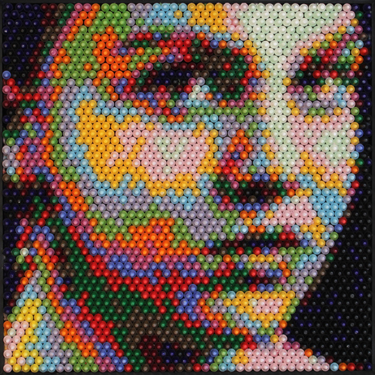
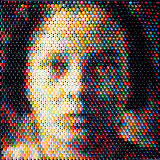
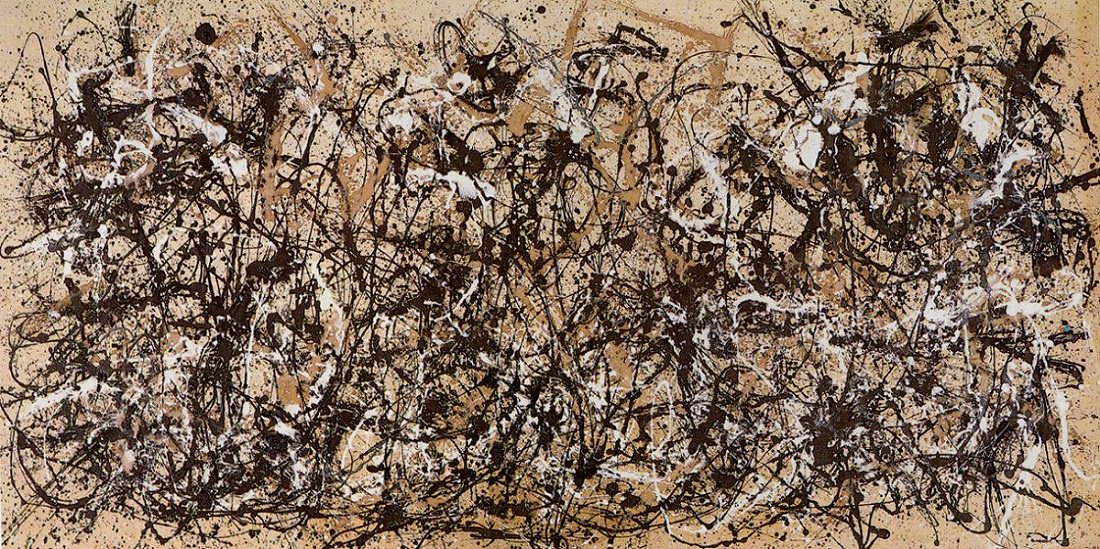
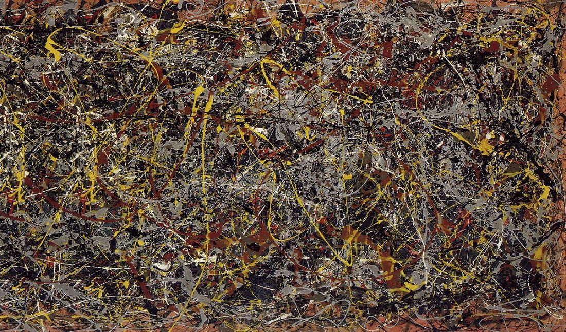
The examples above began with some pointillist paintings, which was an impressionistic technique developed in the 1870s by French painters Georges-Pierre Seurat and Paul Signac. This technique applies patterns of small, distinct points of unmixed color to form an image. In the context of the other artworks above, I think it is very interesting to note that Seurat and Signac believed this method was the most scientific and precise way to record or capture color and light - 150 years later, this is essentially how pixels on a screen and printed CMYK works - once you have enough distance, or the image format has enough resolution, the human eye blends the distinct dots or pixels together to form an image. Again, this is starting to stray from vector points and venture into pixel territory, but, we will circle back with the final works in the above slideshow.
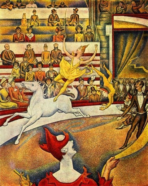
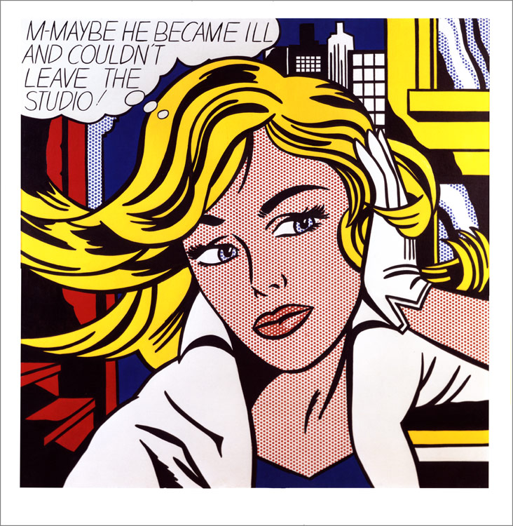
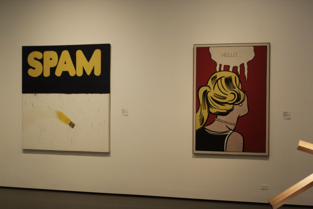
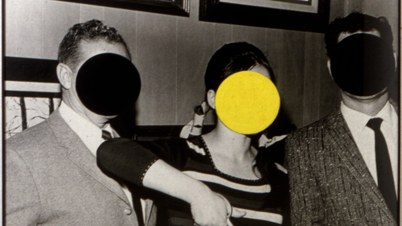
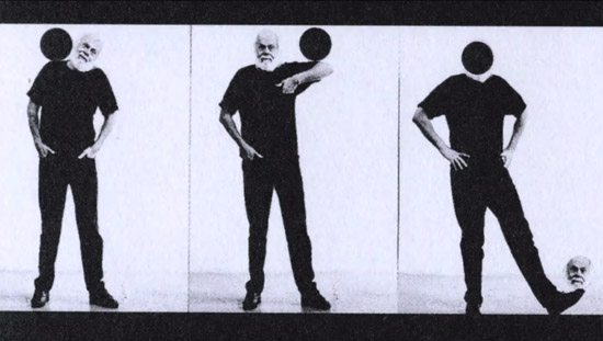
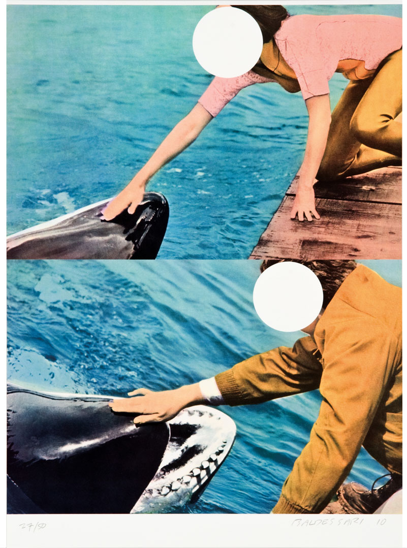
Further along the line, in the 1960s, Roy Lichtenstein began to "deconstruct" these printing characteristics (especially color newspaper and print production) and techniques by developing paintings where the “dots” of the printing process were enlarged into abstracted, graphic fields of shape / color and images. John Baldesarri also explored this scale shift of dots to shapes with many of his paintings - he uses self-described “Dots” in many of his works, but then the physicality of these dots were used to influence meaning by obscuring or blocking out parts of the underlying image - in this way, as much as these were “points” of focus or distraction, their physical shape and characteristics were influencing that meaning.
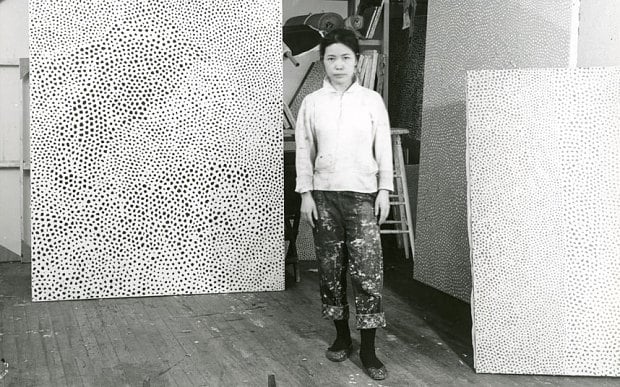
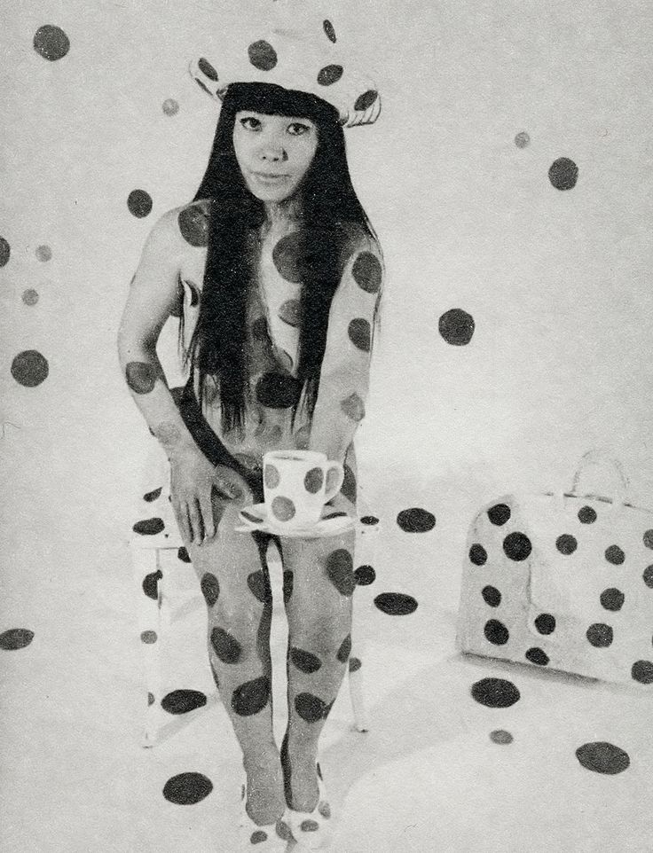
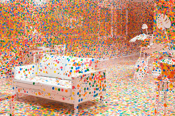
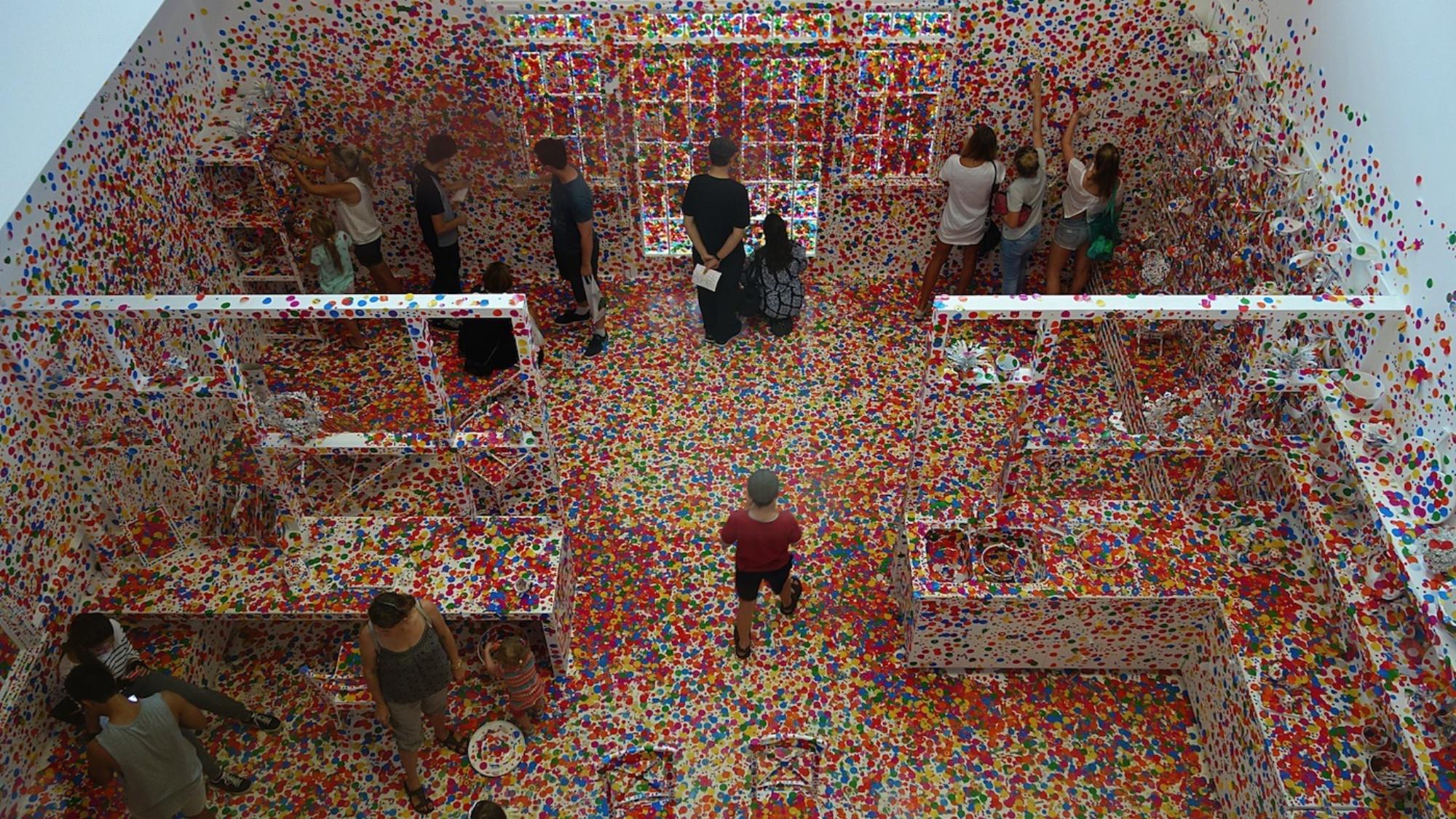
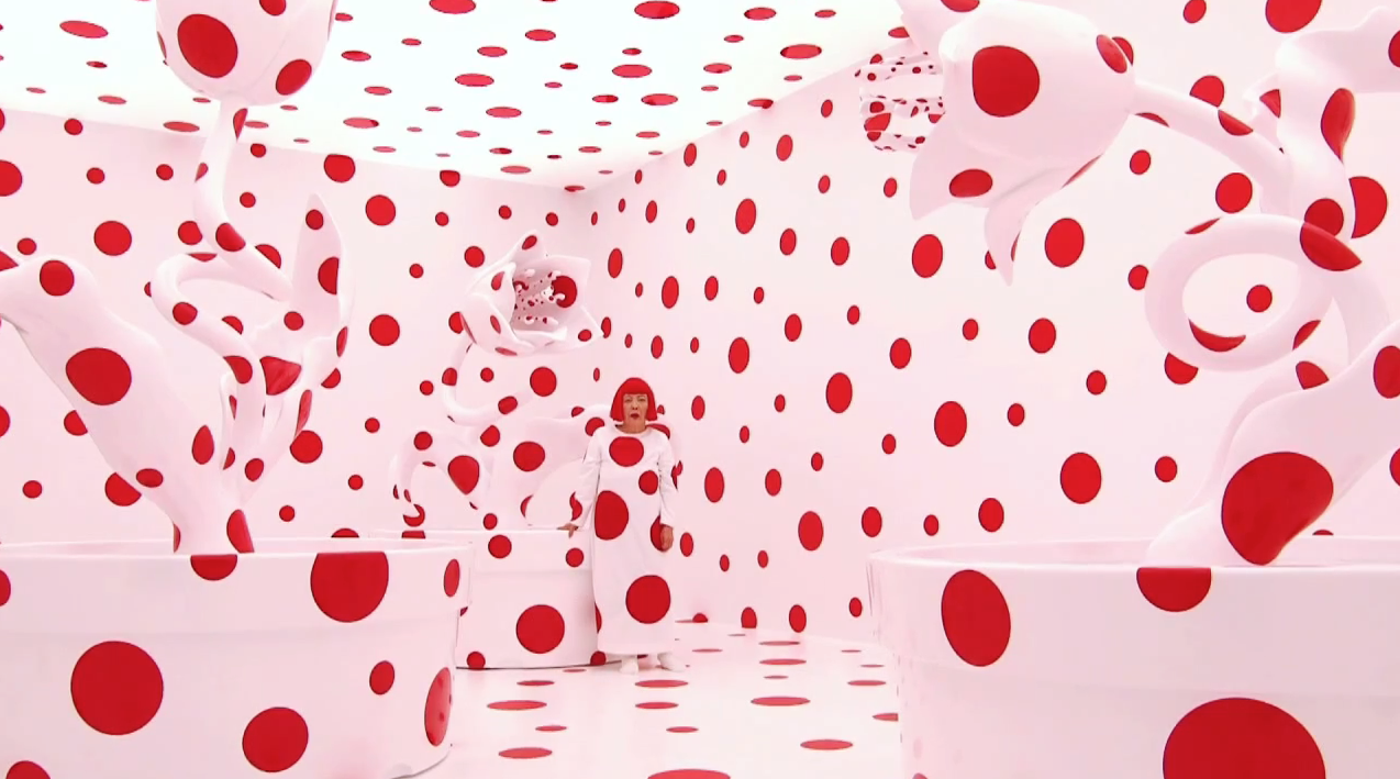
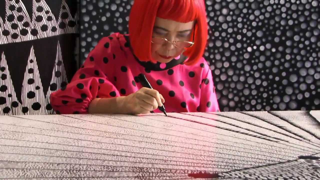
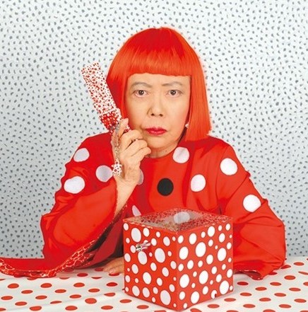
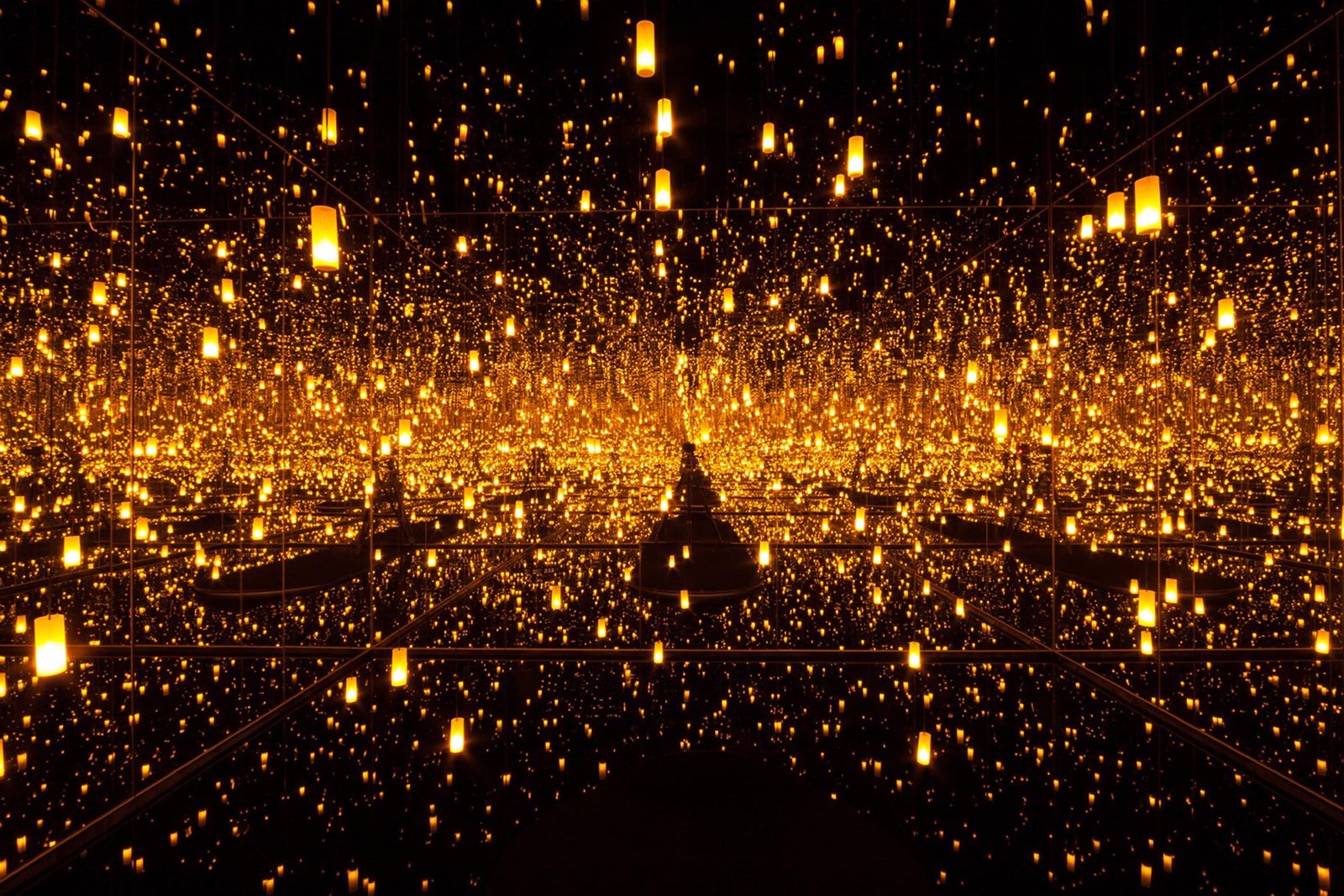
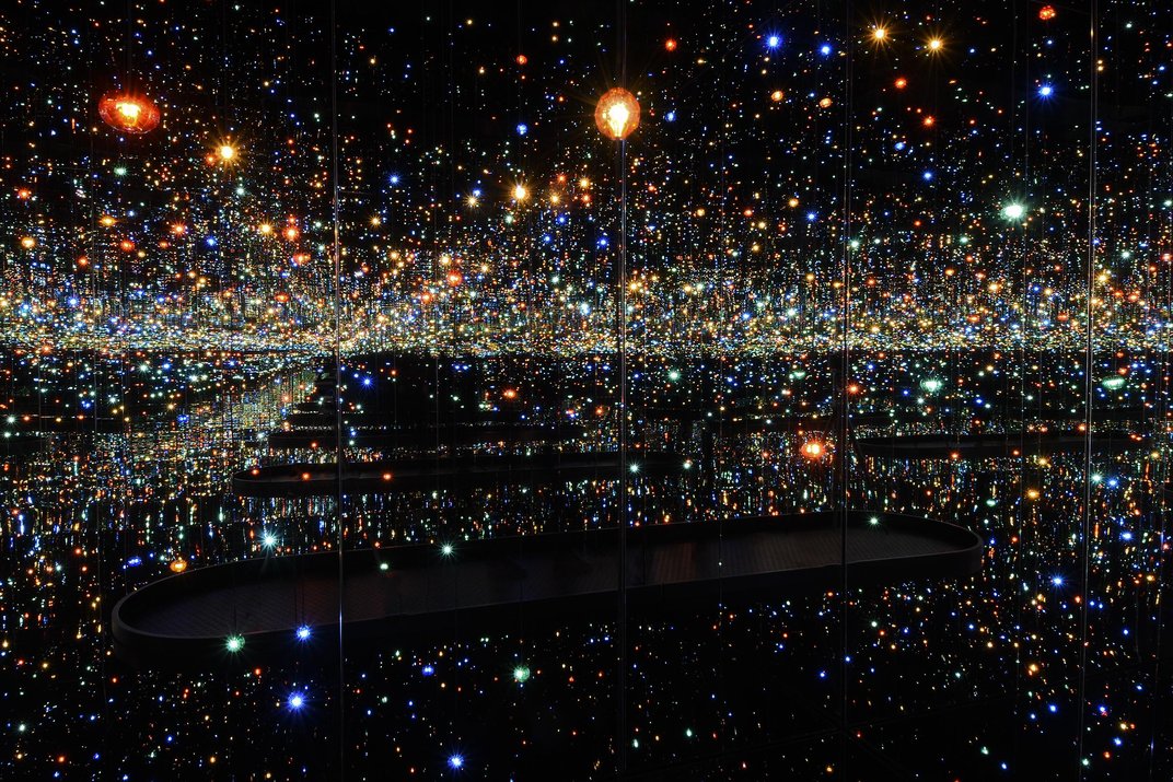
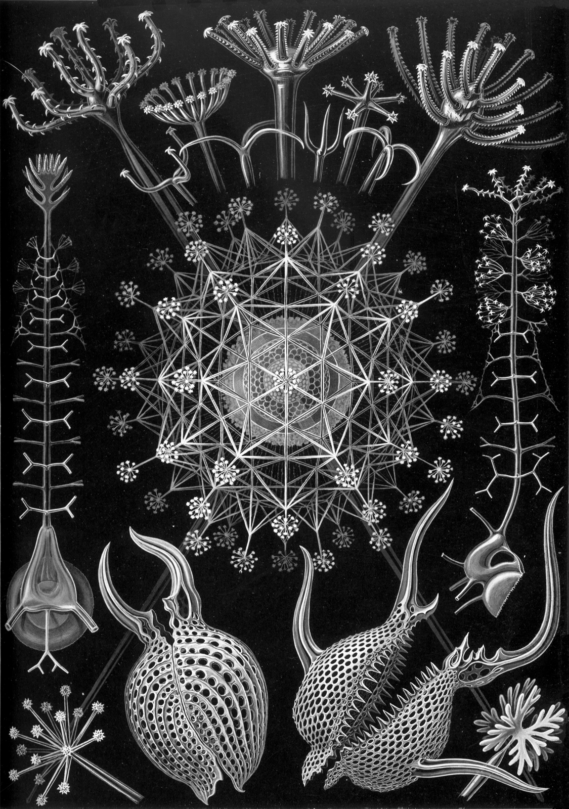
To now return to the concept of vector points, review the works above by Yayoi Kusama. Kusama is a prolific contemporary artist who has been producing visual installations and image that include repeated dots and points since the 1960s. Her works have explored ideas ranging from pop art and culture to mental health and OCD to describing obliteration and the infinite. Her recent Infinity Mirrors series are installations that bring this discussion full circle, and shift dots from shapes back to whatever non-standard dimension light is. These pieces use mirrors to immerse the viewers in a space, field or void of infinite points of light - a great visual to end with when thinking about describing points in vector images.
3.4 Lines
Lines can be used to construct many different visual ideas in art making, in addition to representing more conceptual characteristics as more of a symbol or marker. Visually, lines can signify an edge or outline, as they do in Contour Drawings. In some drawing styles, lines can imply depth of field by altering their weight - heavier, or thicker lines will move forward to the eye while lighter, or thinner lines will recede, and they can imply a sense of tonal quality, or the range of dark to light, using cross-hatching. Lines can also be used in a more organizational sense when developing perspective in images and to create the illusion of depth using a combination of invisible lines of sight and drawn edges and angles.


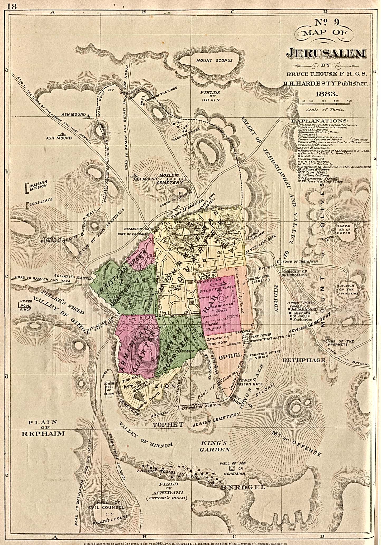
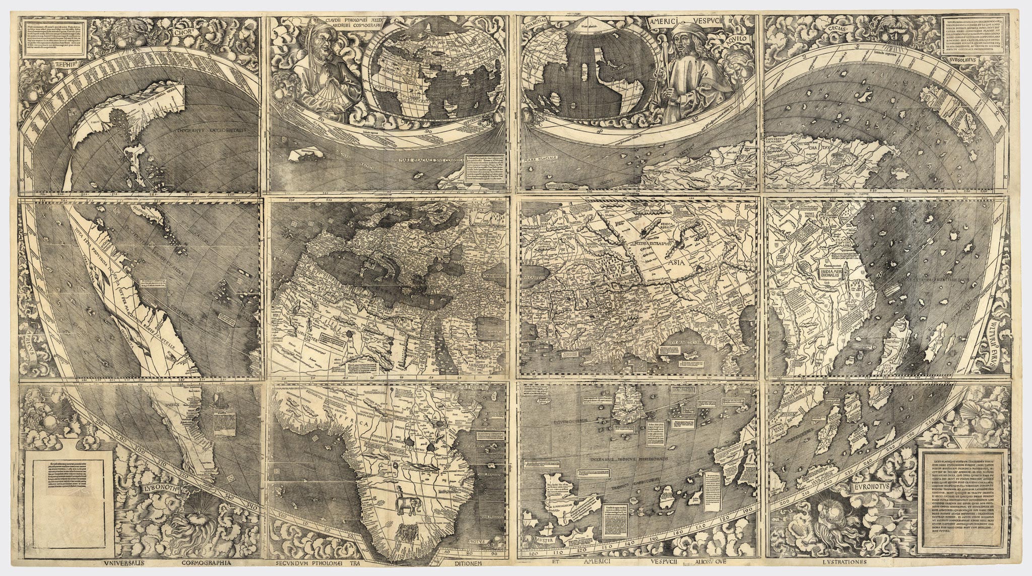
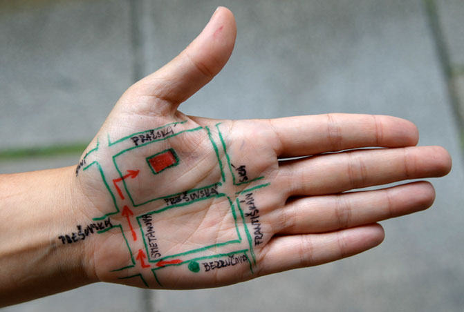
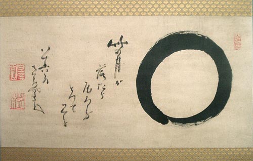
Lines can also be used to represent proportional measurements of scale, in blueprints or technical drawings. Images like maps, grids and graphs use lines similarly in this fashion, where they represent things like paths, routes, boundaries, geographic features, amounts, travel, quantities, etc, without actually visually resembling the objects or ideas they are describing. This symbolic or representative nature goes even farther with the use of lines to draw calligraphic symbols and characters that communicate language - we will look at the use of letterforms in artworks and text-based artworks next week in depth - letters, in their earliest forms, are originally based on handwritten or handpainted characters and symbols constructed mostly of lines.
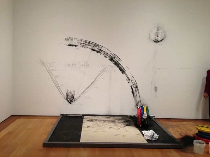
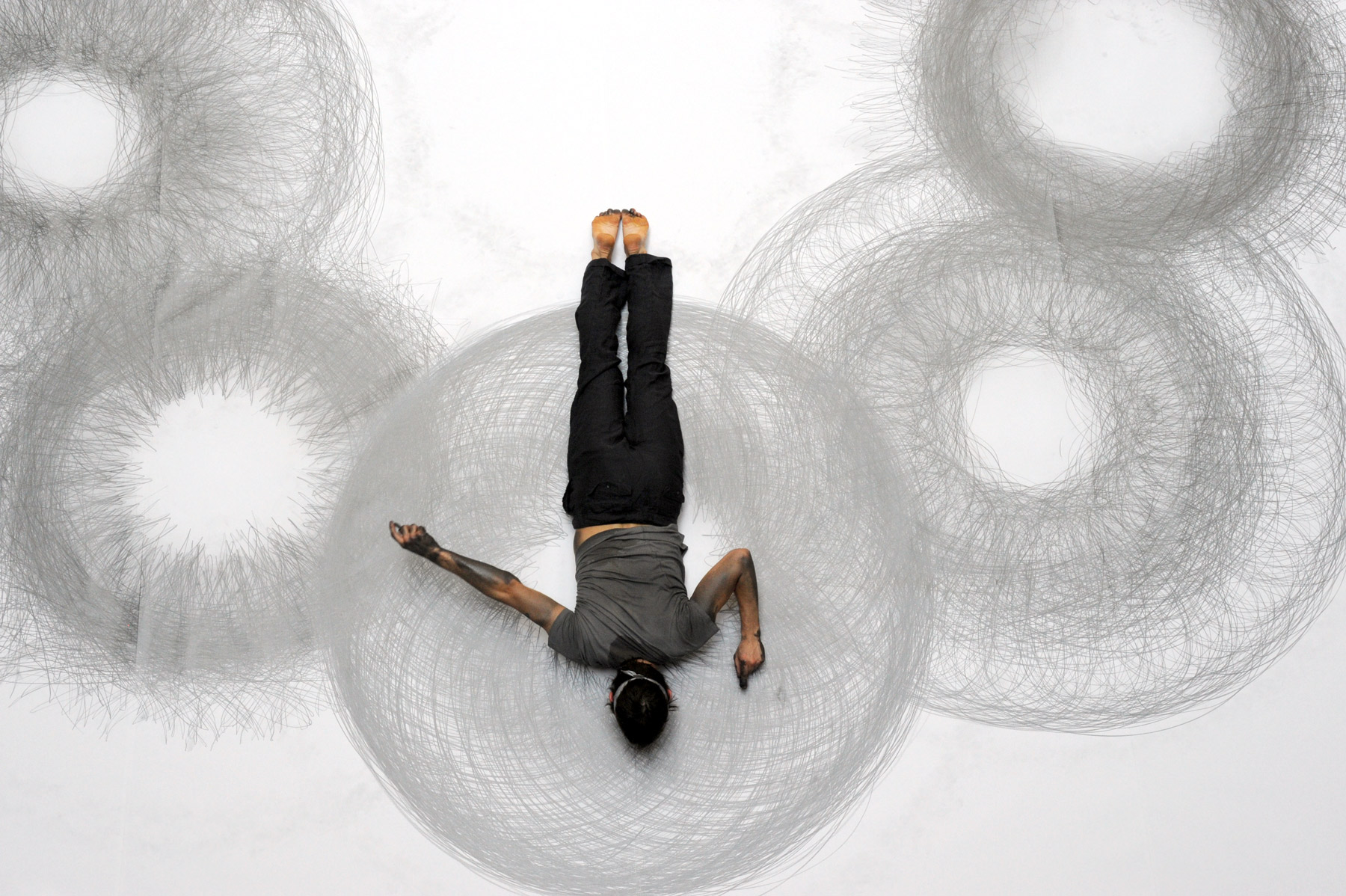
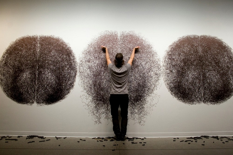
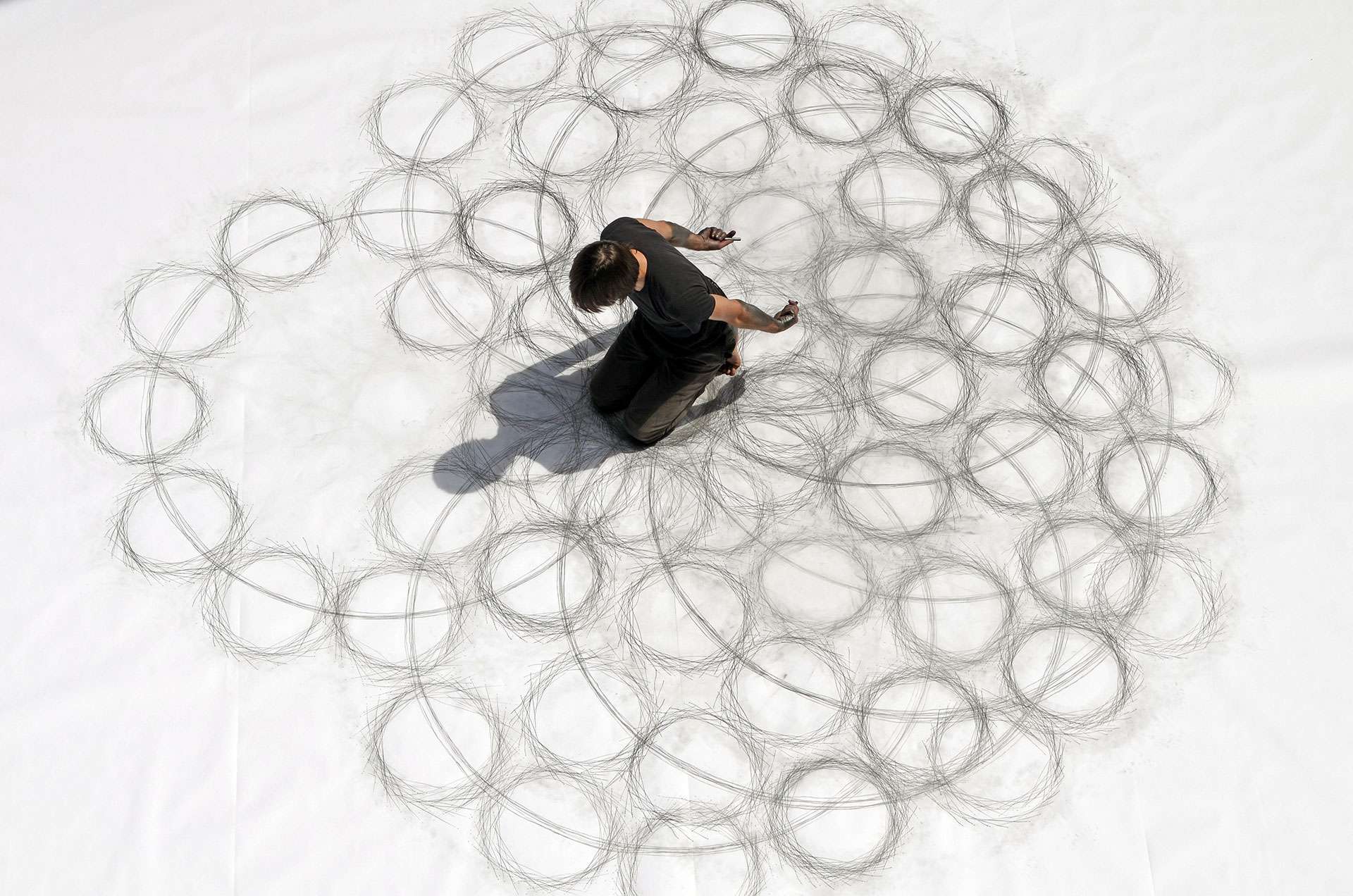
In addition to symbolic or represented objects or ideas, lines can also provide indexical evidence of the path of an artist's hand or body, and how it travels across the drawing surface. While the lines of a trace drawing themselves do not offer the viewer a straightforward visual depiction of how they were made on the page, they do offer some sort of evidence for the viewer to investigate or consider further. In all of these examples, lines are a powerful, versatile elements of image making, both in the past and now.
Finally, physical lines carved into a surface can provide one process for printing and reproducing images, such as woodblock printing and some etching processes. In these examples, a series of lines are used to define the negative of an image, which is printed in positive when ink is applied to the carved or etched surface and then applied to paper - all of the ink, except the carved out lines, are transferred.
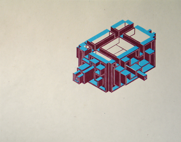
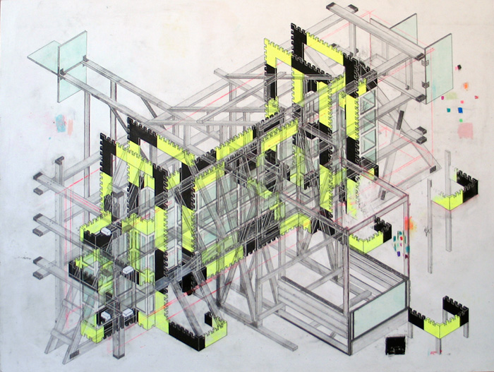
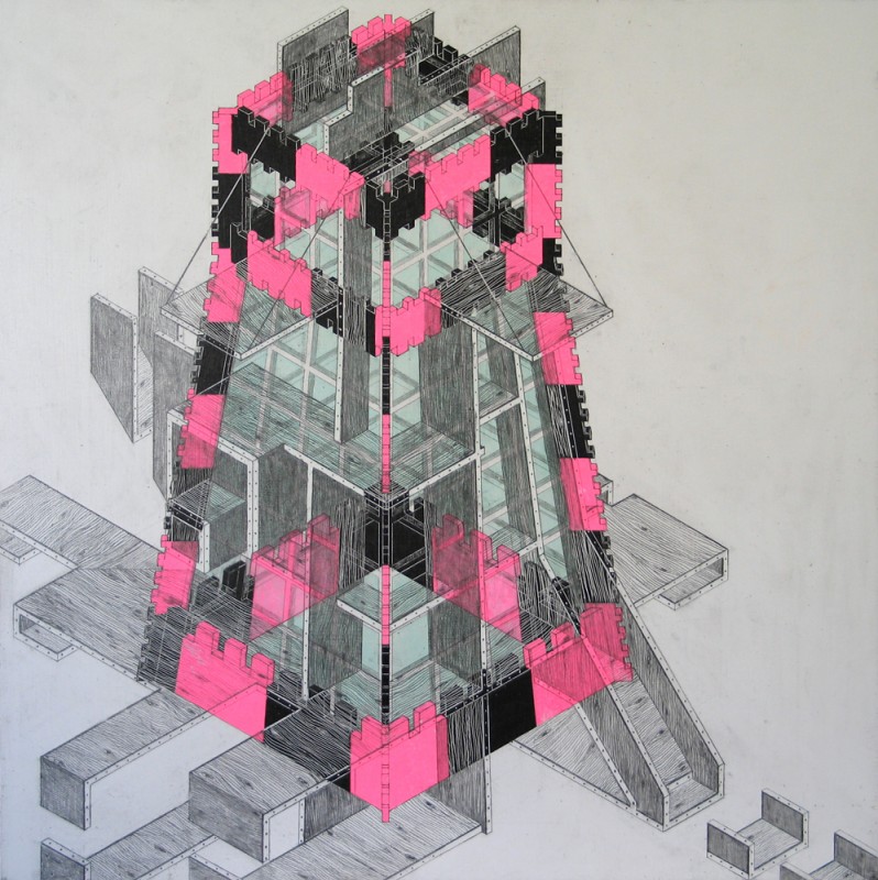
3.5 Shapes
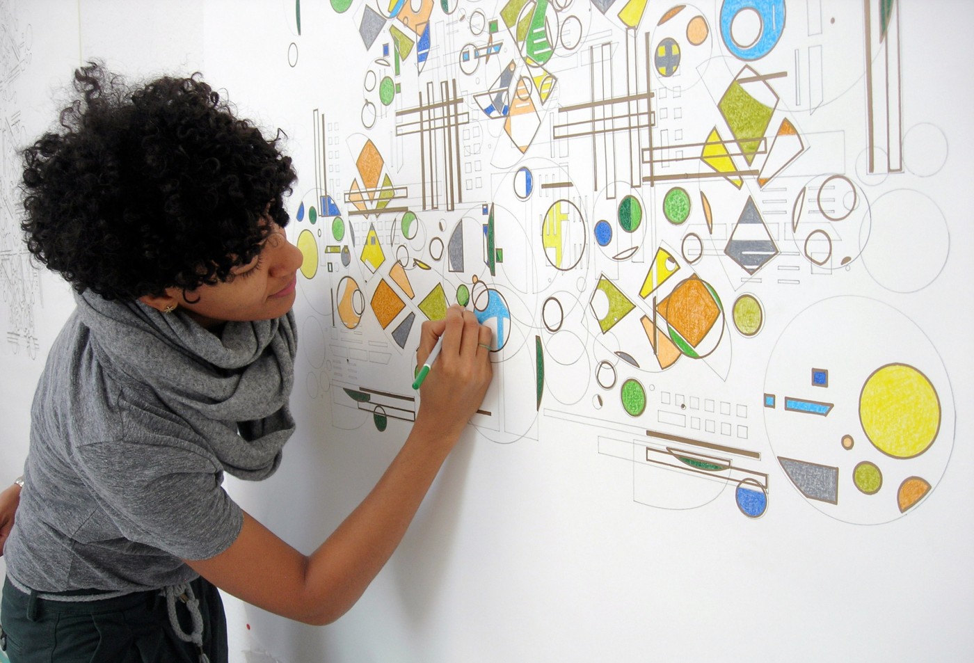
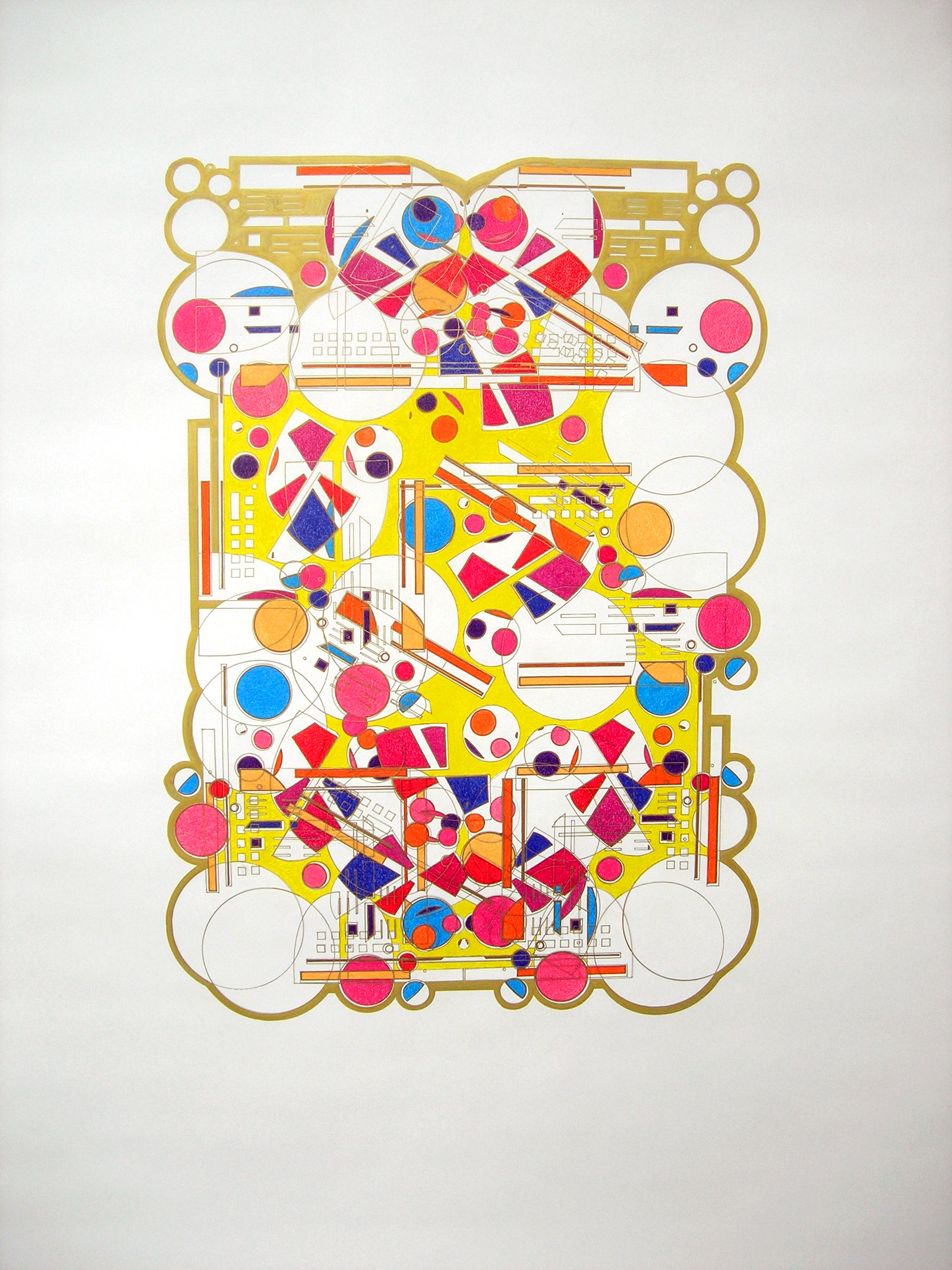
To conclude this progression, connecting and combining lines together creates shapes. These shapes can be solid, or defined by simple outlines, or can contain negative spaces or cutouts. Drawing, editing and transforming shapes are streamlined processes in most vector editors, including Illustrator, however, artists since the 1800’s have explored the used of shapes in a variety of mediums and across many movements.
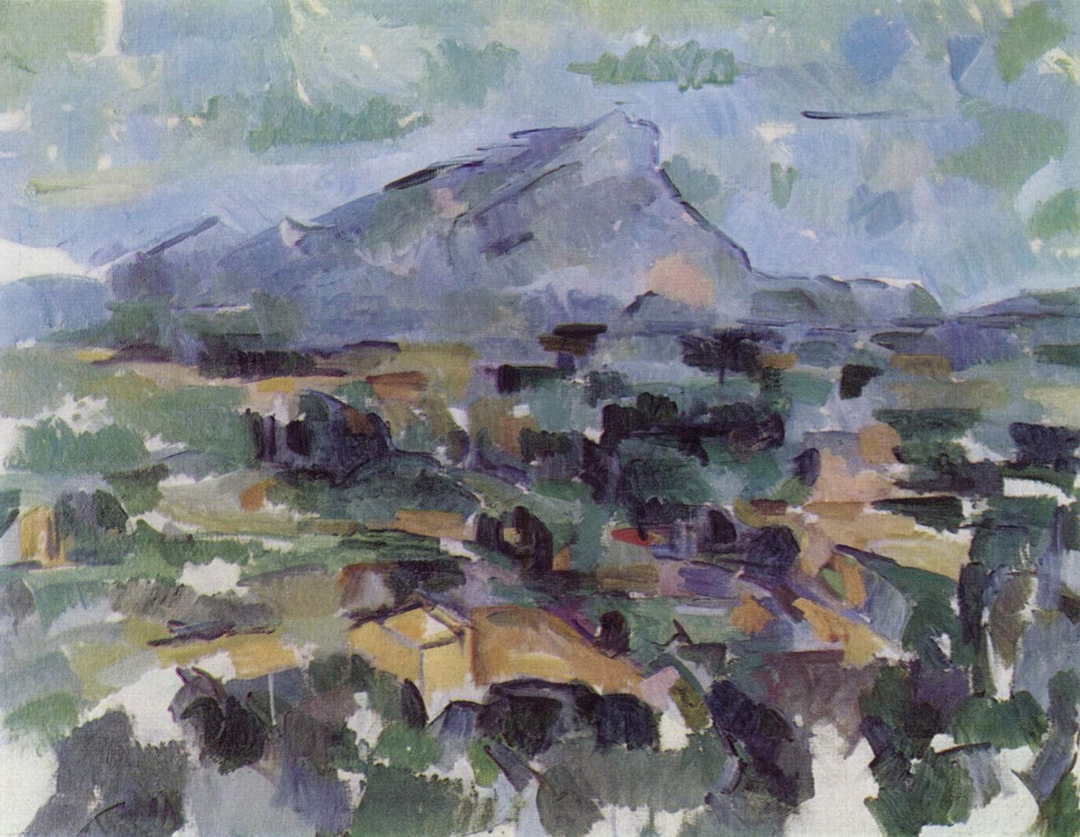
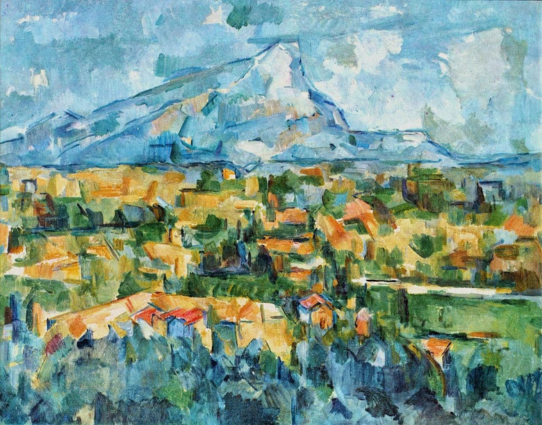
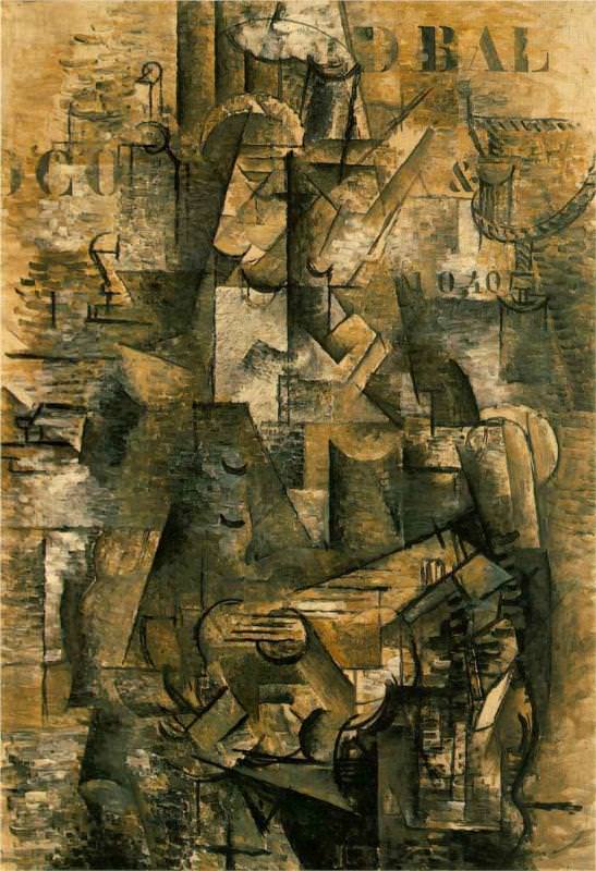
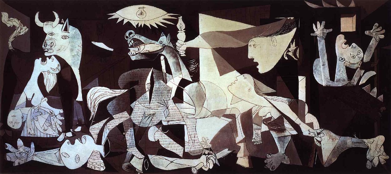
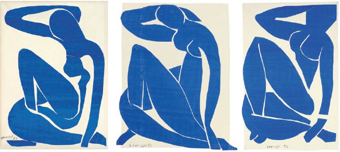
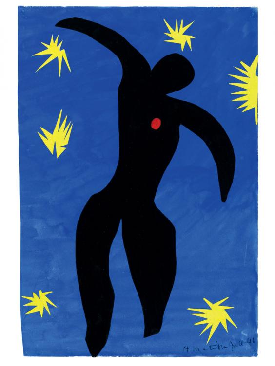
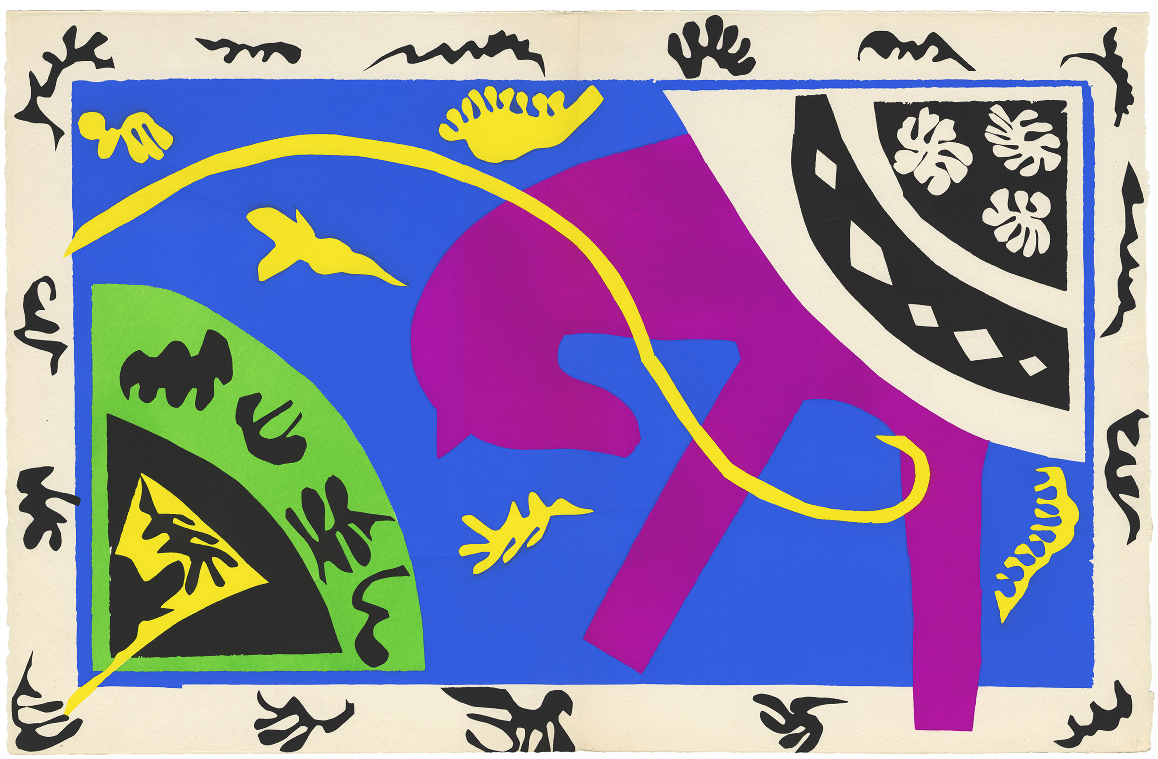
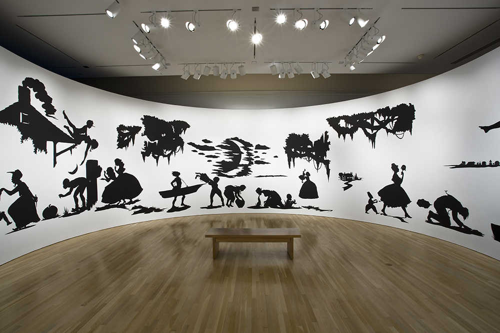
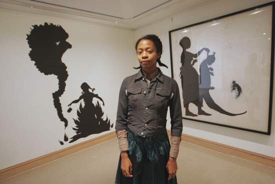
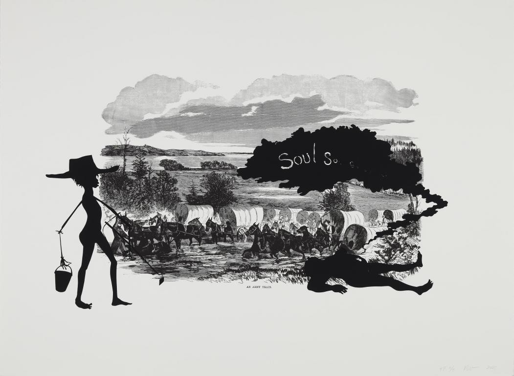
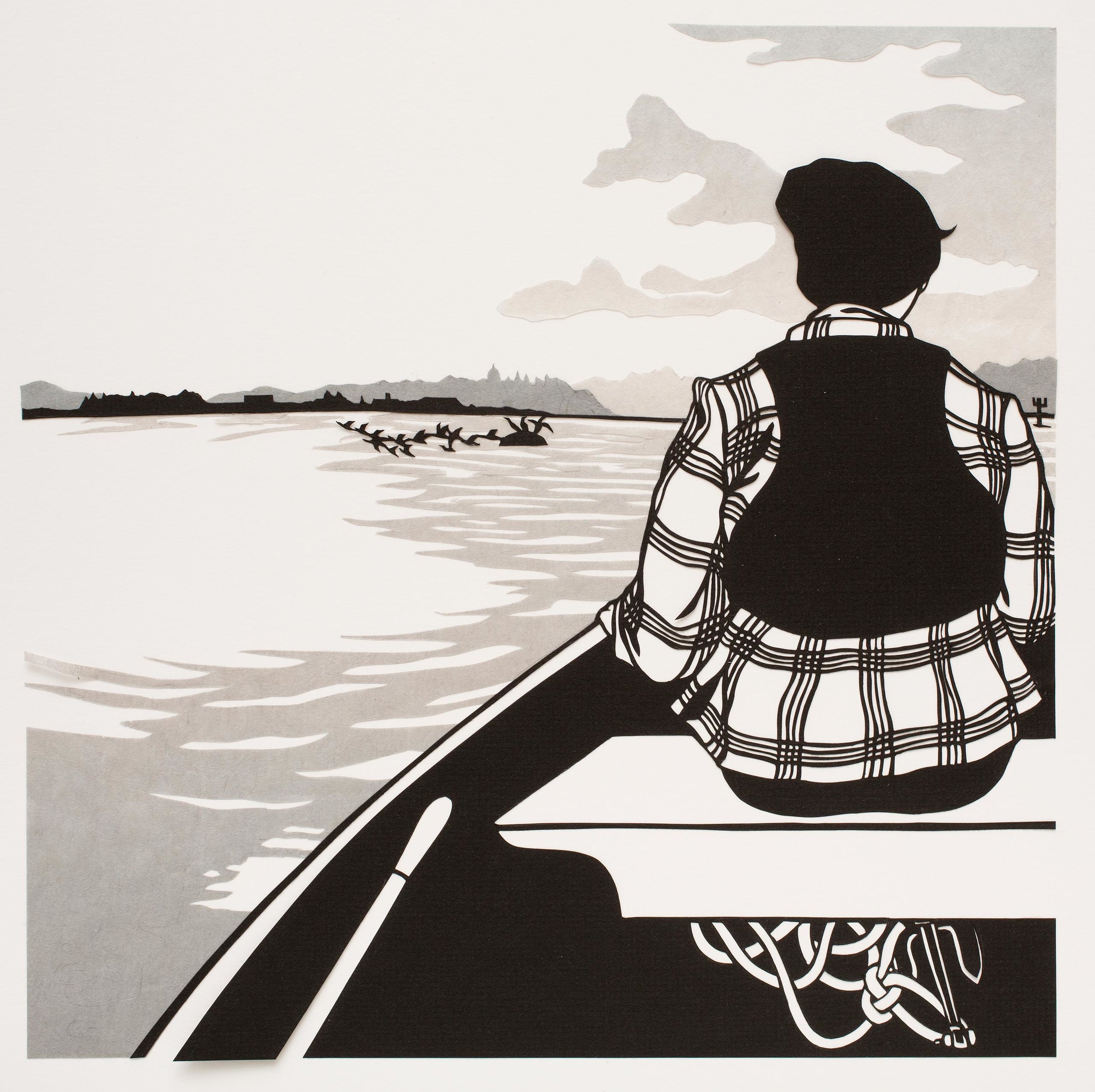
In the late 1800s, Impressionist artists like Paul Cezanne began working with shape in their paintings - by his later career, Cezanne’s represented subjects were becoming more and more geometric and abstract, and his brushstrokes were becoming broader and more angular. This transition and geometric abstraction was further explored by Cubist artists such as Pablo Picasso in the 1910s and 1920, and in Fauvism, also in the early 20th century, especially with Henri Matisse’s most recognizable, cut-out artworks. Similar techniques are used today by contemporary artists for a broad range of purposes, such as Kara Walker and Nikki McClure. Stenciling, a process we explored last week in relation to collage, is the inverse of cut-outs and silhouettes. Instead of an image being created by combining different cut out shapes of color, the negative shapes cut out of a surface eventually produce the final applied image.
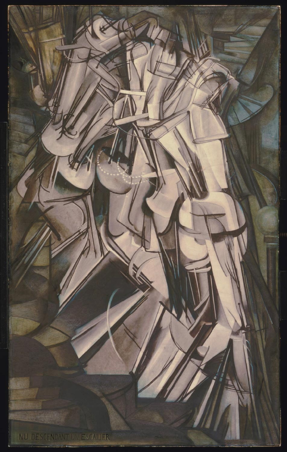


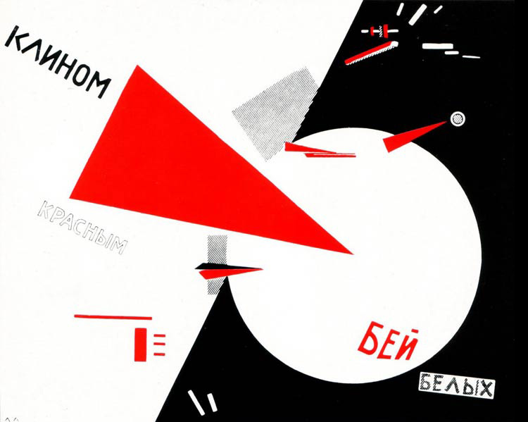
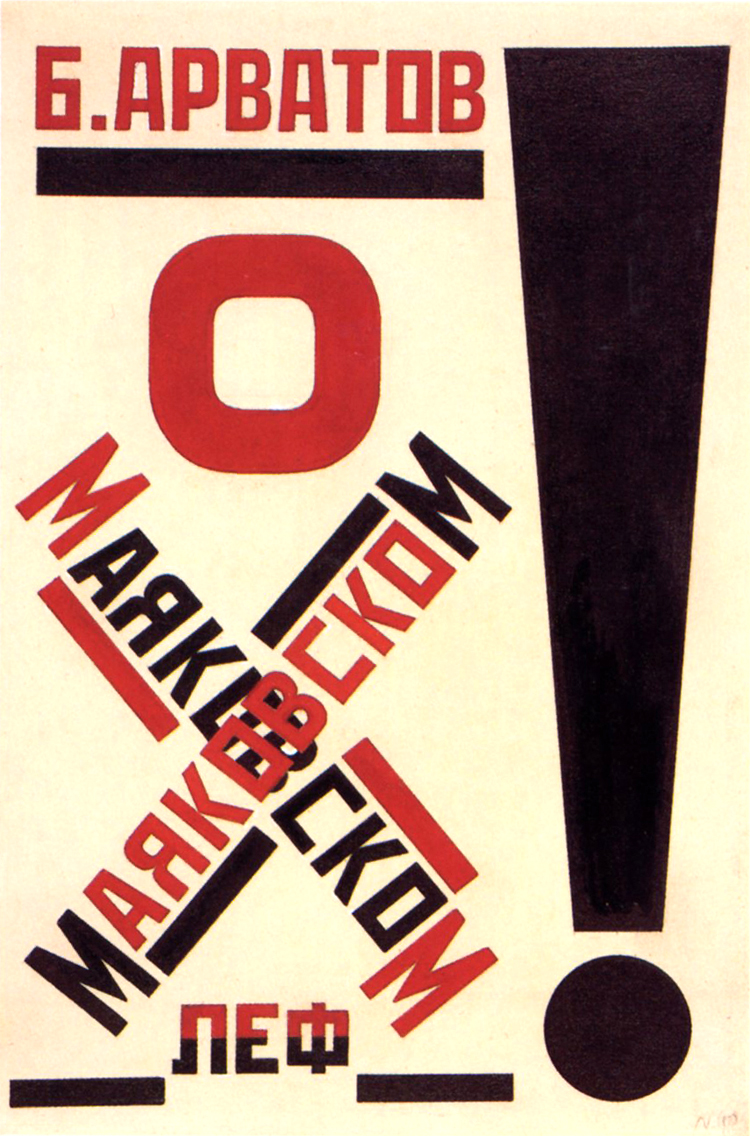
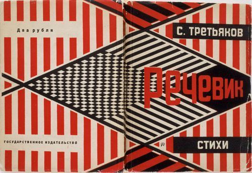
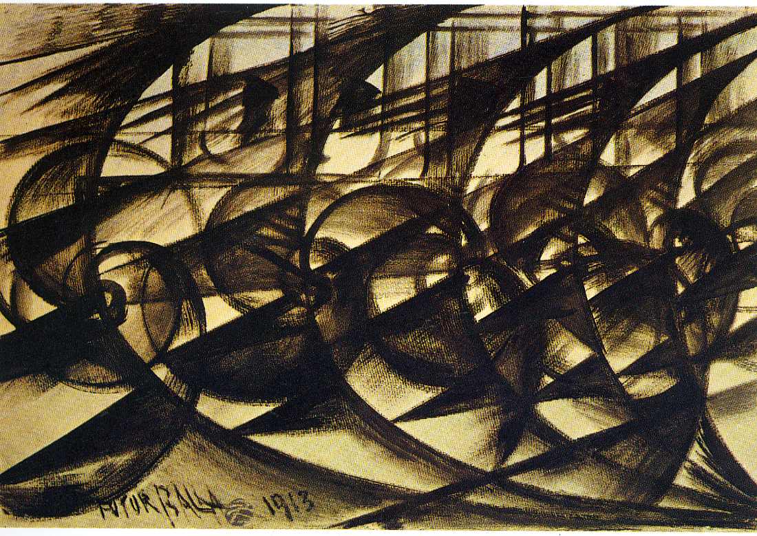
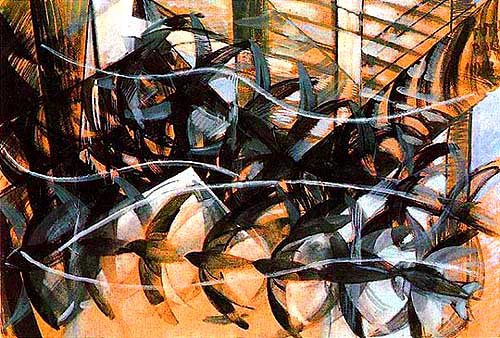
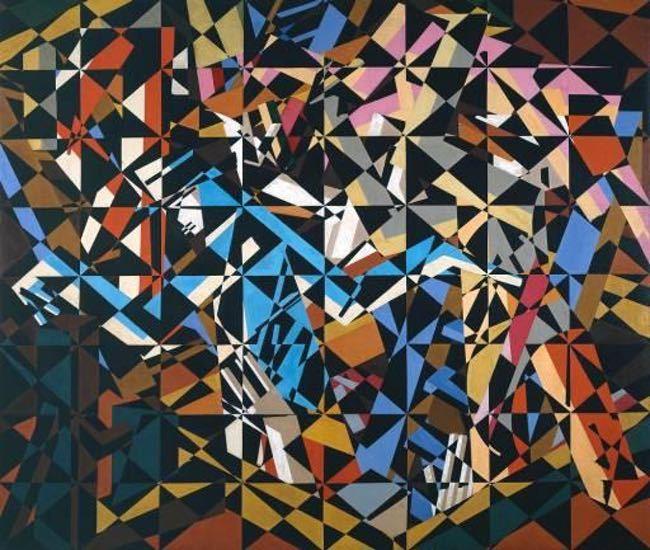
Russian Constructivism, partially influenced by Cubism, used shapes to construct text and graphic images (and sometimes vice versa), which is an aesthetic still heavily utilized today by many artists, illustrators and designers, including artists like Shepard Fairy and Emory Douglas who we have already reviewed in this course. While these more contemporary artists work with a combination of shape and graphic image, and use shapes to describe recognizable images and objects, the Constructivists and simultaneously the Futurists (1920s - 1940 Italy) pushed their imagery to the point of total abstraction, where they were representing intangible concepts like movement, power, dynamism, modernity and speed with shapes. Futurism is often characterized as an oppressive, violent art movement associated with Italy and the other Axis Powers of World War 2 - I think it is important to acknowledge this context when looking at these artworks, and also helpful to understand a larger picture of the social and political events that influenced this movement.

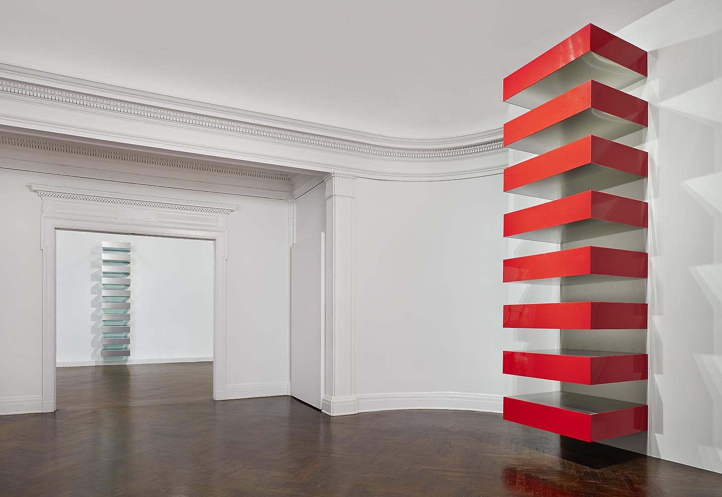
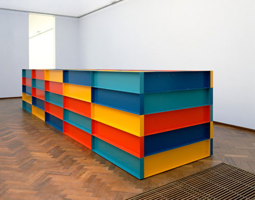
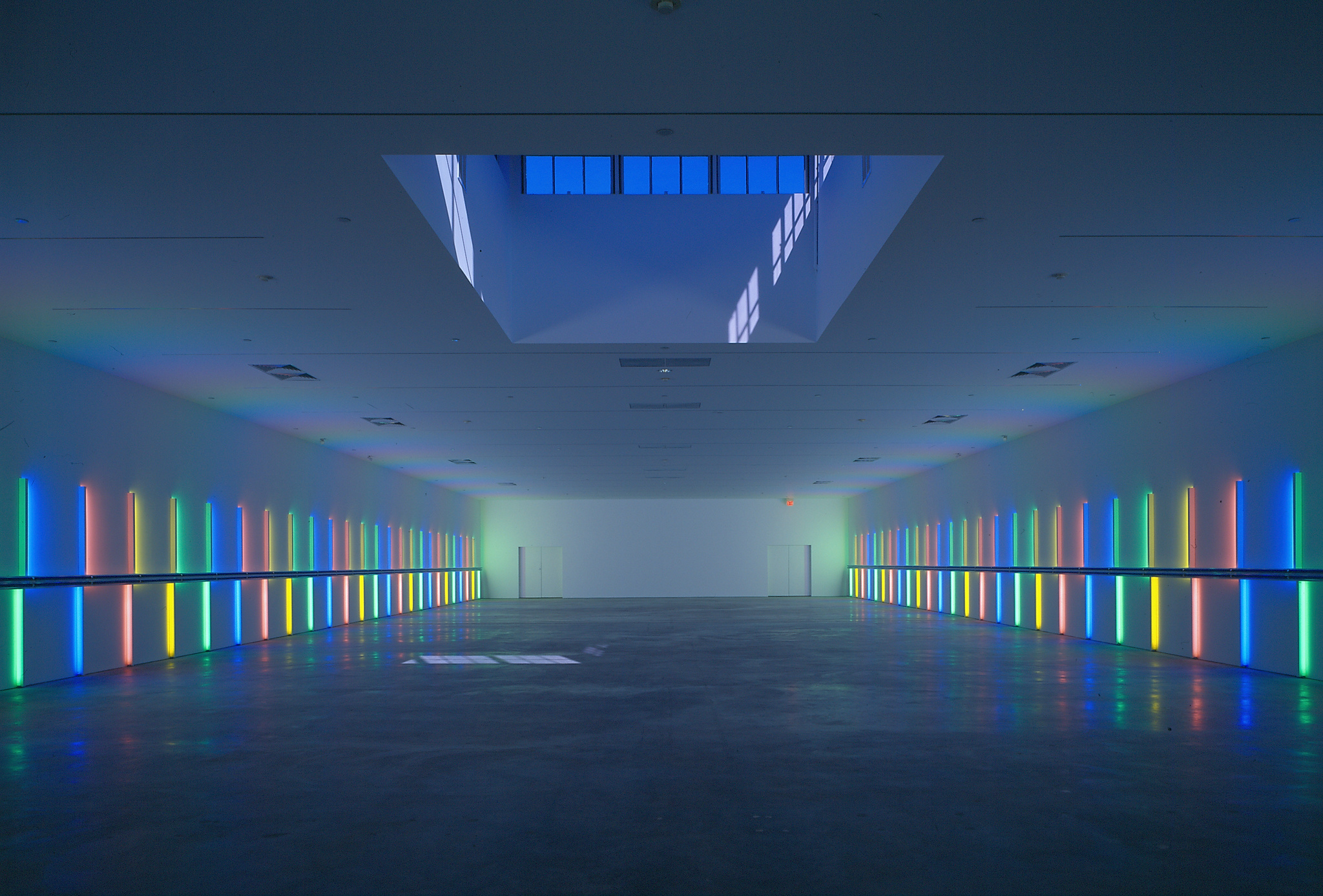
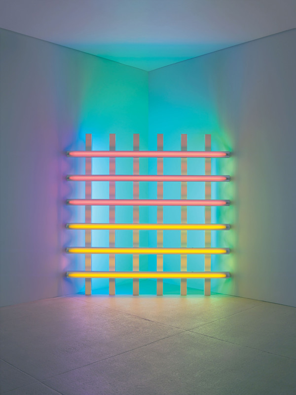
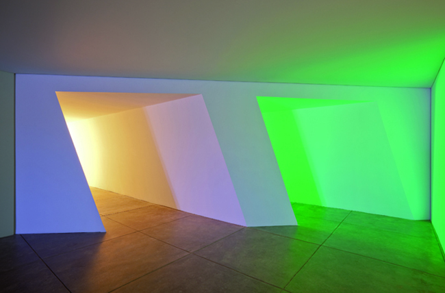
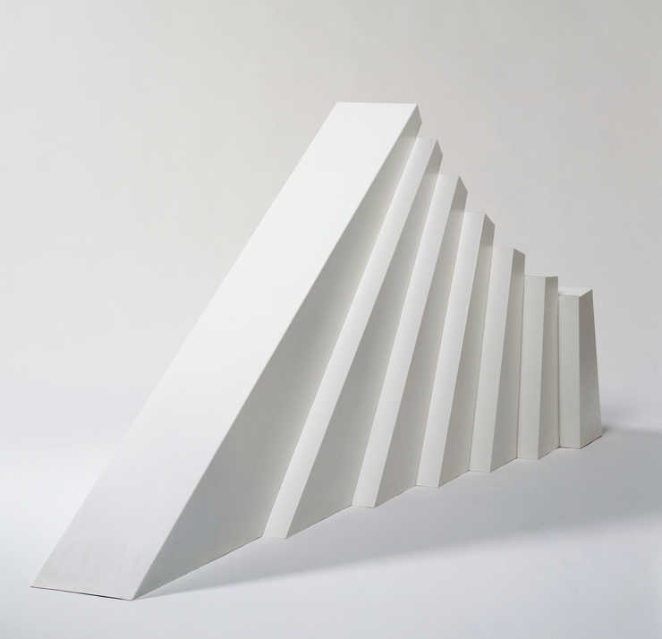
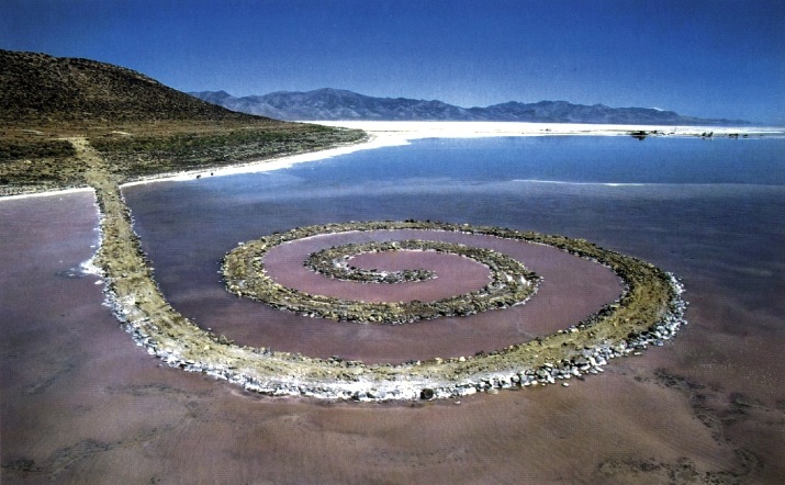
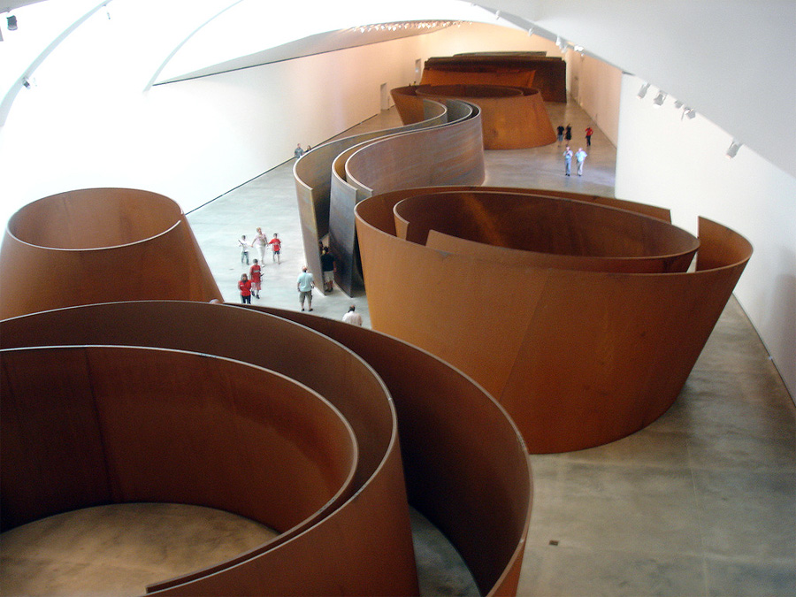
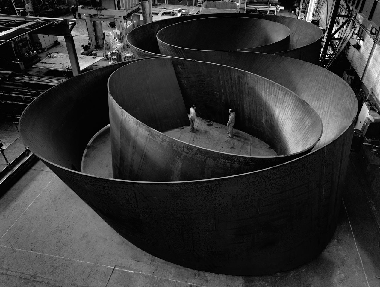
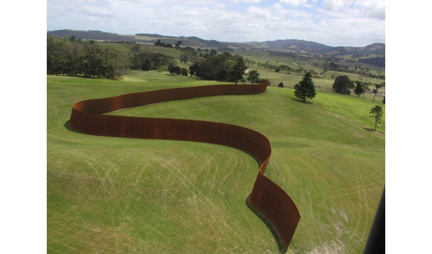
After World War 2 ended, a movement called Minimalism began in the US. Minimalist sculptors such as Donald Judd and later Dan Flavin began creating simple, geometric sculptures that have heavily influenced the past 60 years of 3D artworks, including many of the artworks we viewed last week in the color chapter of the lecture. Artists such as Robert Smithson and Richard Serra, while not considered strictly minimalists, still heavily rely on shape (and in many cases scale and material) in their 3D art making.
To conclude this week’s content, I want to look at a movement that we will be exploring further in the exercises this week. Op Art first emerged in the UK in the 1960s, led by artist Bridget Riley. This movement, to me, is notable for a few different reasons. First, Op artists were interested in understanding the way the human eye interprets 3D spaces, and the way the brain converts these into visuals that we use to navigate our surrounding world. The Op Artists developed drawings and paintings that produced optical illusions and effects - essentially determining visual methods for tricking the brain into seeing a flat image as one with physical depth, or sensing movement in still images.
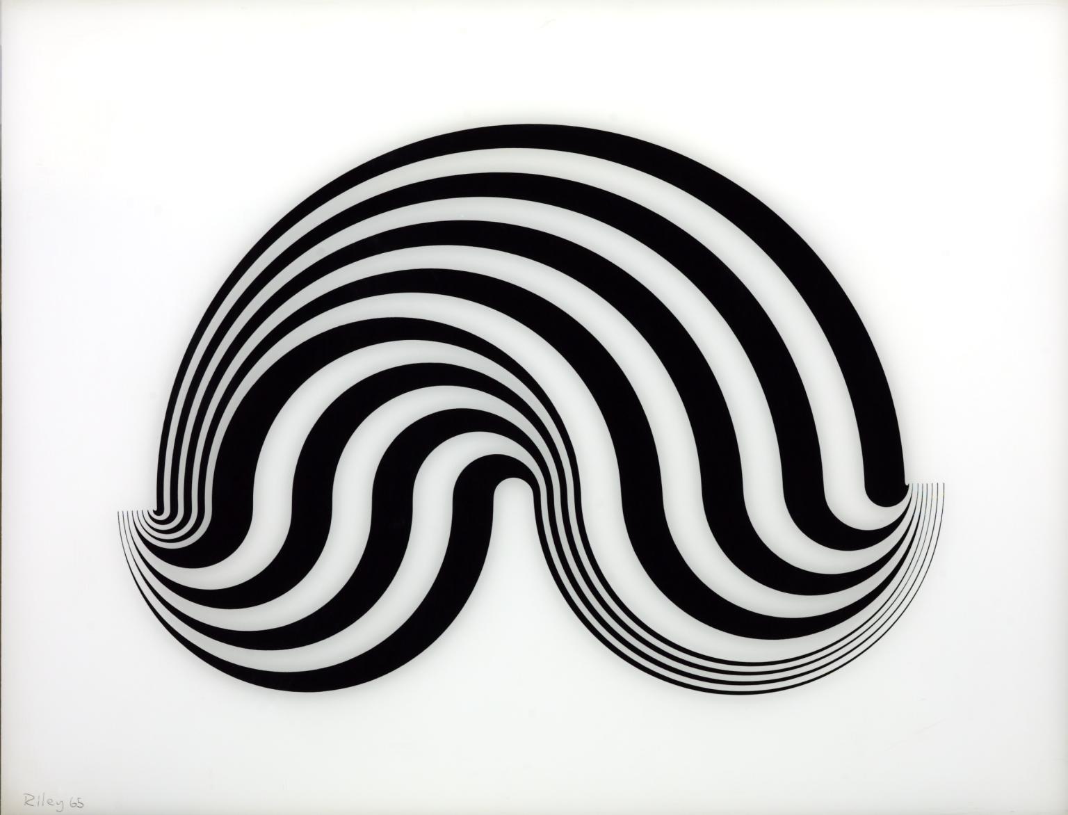
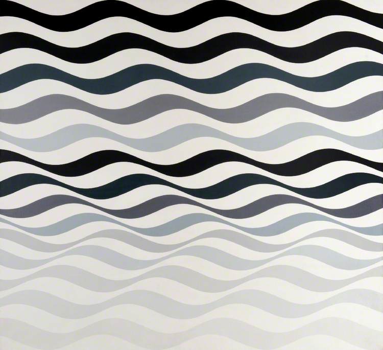
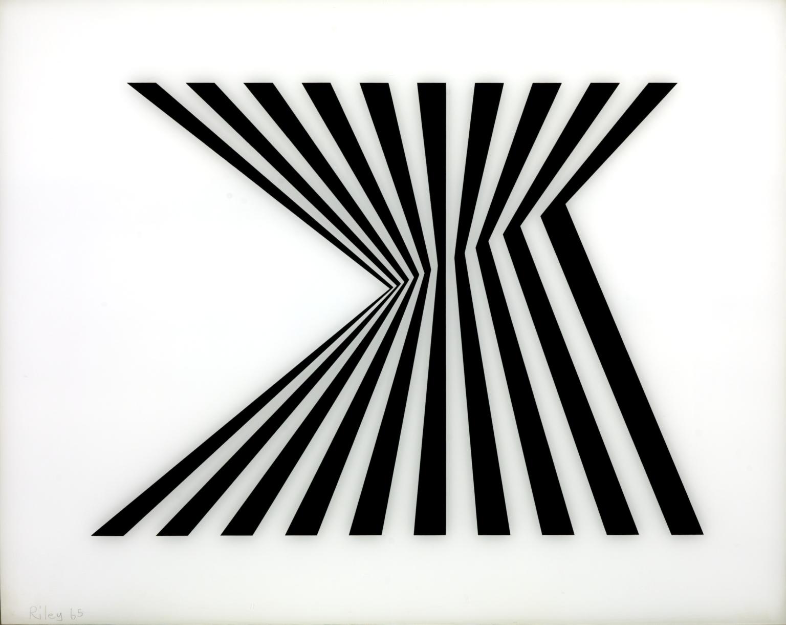
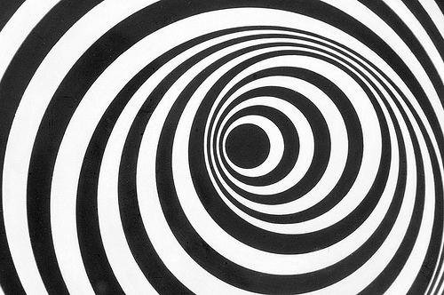
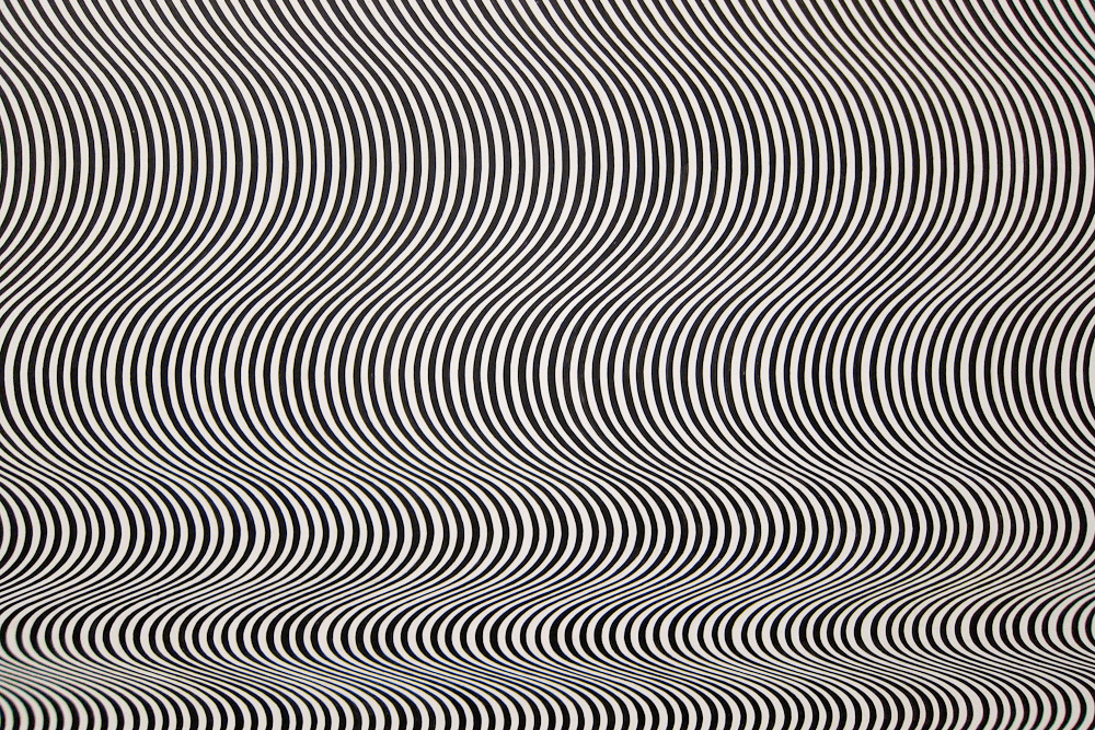
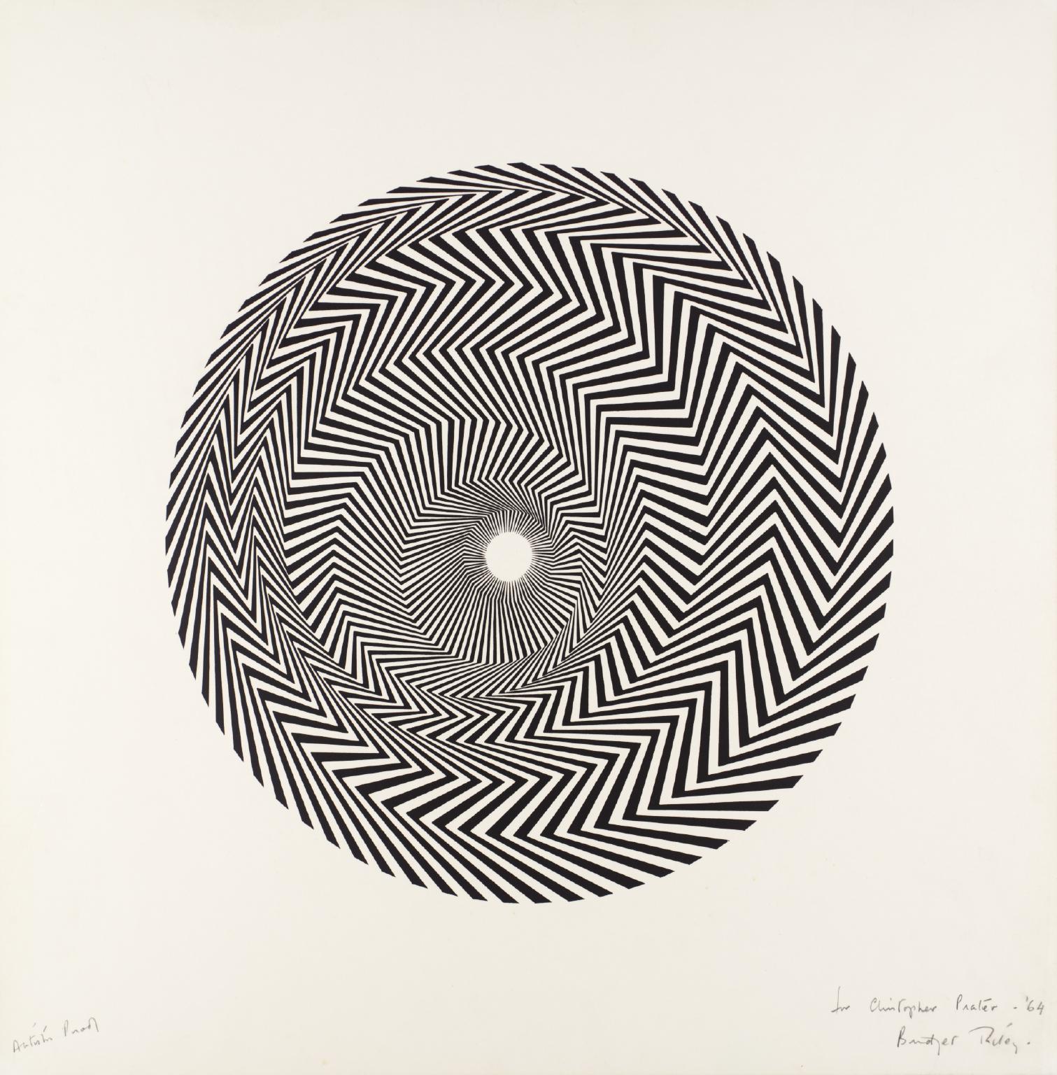
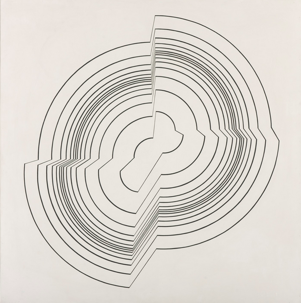
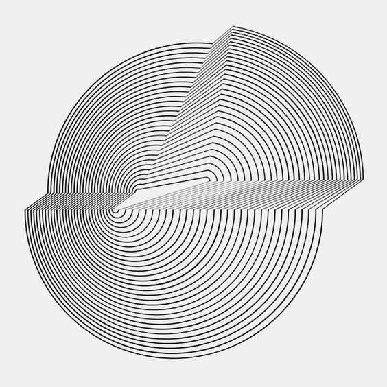
They did this all with shapes and patterns, which is impressive in itself, and also why we are focusing on this movement for the exercises this week. From a technical standpoint, however, this exploration is also significant in that it is a true mix of “art” and “science” with a focus that continues to be relevant today with the emergence of 3D, Hologram and VR technologies. And while the folks who developed the Oculus Rift might not readily attribute their technology to the Op Art movement, the methods and strategies they use to create their visuals operate within the same realm.