MODULE 4: TEXT AND IMAGE, TEXT AS IMAGE
4.1 INTRODUCTION
This module's studio exercises will be exploring using Illustrator to create text-based images and artworks. In this lecture content, we will look at several artists that work primarily with text, their inspirations and influences, and how vector editing tools such as Illustrator can be used to develop and push text-based works. We will also examine a few technical principles, terms and processes that have to do with typography, letter-forms and text.


4.2 TEXT + VECTORS
Vector editors are ideal for creating images and other design compositions or projects that are mostly text-based. While Photoshop does have a Type tool, and it affords some of the same vector editing options as Illustrator, Illustrator offers way more flexibility, control and type-specific processes, especially when it comes to working with complex layouts of type, multiple layers of type, transforming type, and formatting paragraphs of text.
Modern fonts (the files that are installed on computer that different programs use to visually represent input text) are more closely related to vector files than pixel-based images. Because of this similarity, the people who develop Illustrator and other vector editing programs build more tools and functions into them that work directly with text. Working with text in Illustrator also streamlines major format or scale changes. A text-heavy vector logo that is originally sized to fit a business card can be enlarged to poster size without losing any quality with a simple transform operation, and multiple layers of text can be selected and changed at the same time (similar to selecting multiple shapes and turning them all the same color).
I, personally, never use the Type tool in Photoshop, even when I am only overlaying a single word or sentence on top of a photographic image. This might be a bit extreme, but I would suggest that unless you are only working with a few words, AND there is a reason why you need to be in Photoshop (most likely this would be because you are trying to embed text within multiple layers of pixel-based images) that you use Illustrator primarily when working with any kind of text elements. When I need to develop images with both text and photographs, my usual strategy is to create an Illustrator file with all of the text and vector elements, in place, and a separate Photoshop file with all of the pixel-based images. I will then combine the two in one program or another, depending on the final output and a few other considerations. We will be talking about this process a little more in Module 5 and 6.
4.3 Text AND Image / Text AS Image
Before diving into the artists, artworks and movements for this week, I wanted to introduce two concepts to that can be helpful to think about when it comes to looking at more textual / text-based artworks and images. While their are infinite ways to incorporate and use text in images, when looking at these artworks I like to view them from 2 different perspectives.
1. I look at the combination of text with other visual components of the image, and how they interact with one another. This will oftentimes include considering the meaning behind the letters, words or sentences themselves, and how those influence, direct, or change the meaning of the other visual components and/or the entire image’s overall meaning.
2. I look at the text itself as a visual image (which I would argue all letters, words and symbols are) and think of its structure, design and overall composition from a more formal standpoint - the form or visual properties of the image, as removed as possible from its conceptual goals, subject matter, etc. I also argue that it is impossible to do this completely with any image, especially text-based images and symbols, since their visuals are almost inseparable from the meaning they represent. For example, if you read the written text "bird" can you ever NOT imagine a bird in your head? What physical colors are applied to the words below? To better understand this phenomena, take this Stroop Test


After considering the text-based artwork from both of the above standpoints, I like to place it on a spectrum between these two points. Is the work more about the interplay between text and other images, or is it closer to the other end, where the text is so embedded in the visual images that it is creating an additional, more formal meaning? I have discovered that using this system, some artworks are easier to place on the spectrum, while many others seem to exist on both ends at once - so, maybe I need to convert this into more of a quadrant scale.
Regardless of these last minute revisions, I am sharing this approach because not only is it one option for viewing and thinking about a wide variety of text-based artworks, it can be a productive starting point when incorporating text in your own images (beyond the exercises for this class). If you are deciding to include text in your images, or, alternatively, if you are creating works that are driven by text, think about how you want your text to function on this scale. This can help you when selecting more specific formal aspects of the text, including size, scale, font, color, placement, composition, legibility, etc.
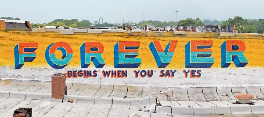
4.4 Text-Based Artworks and Advertising
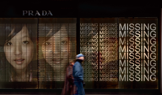
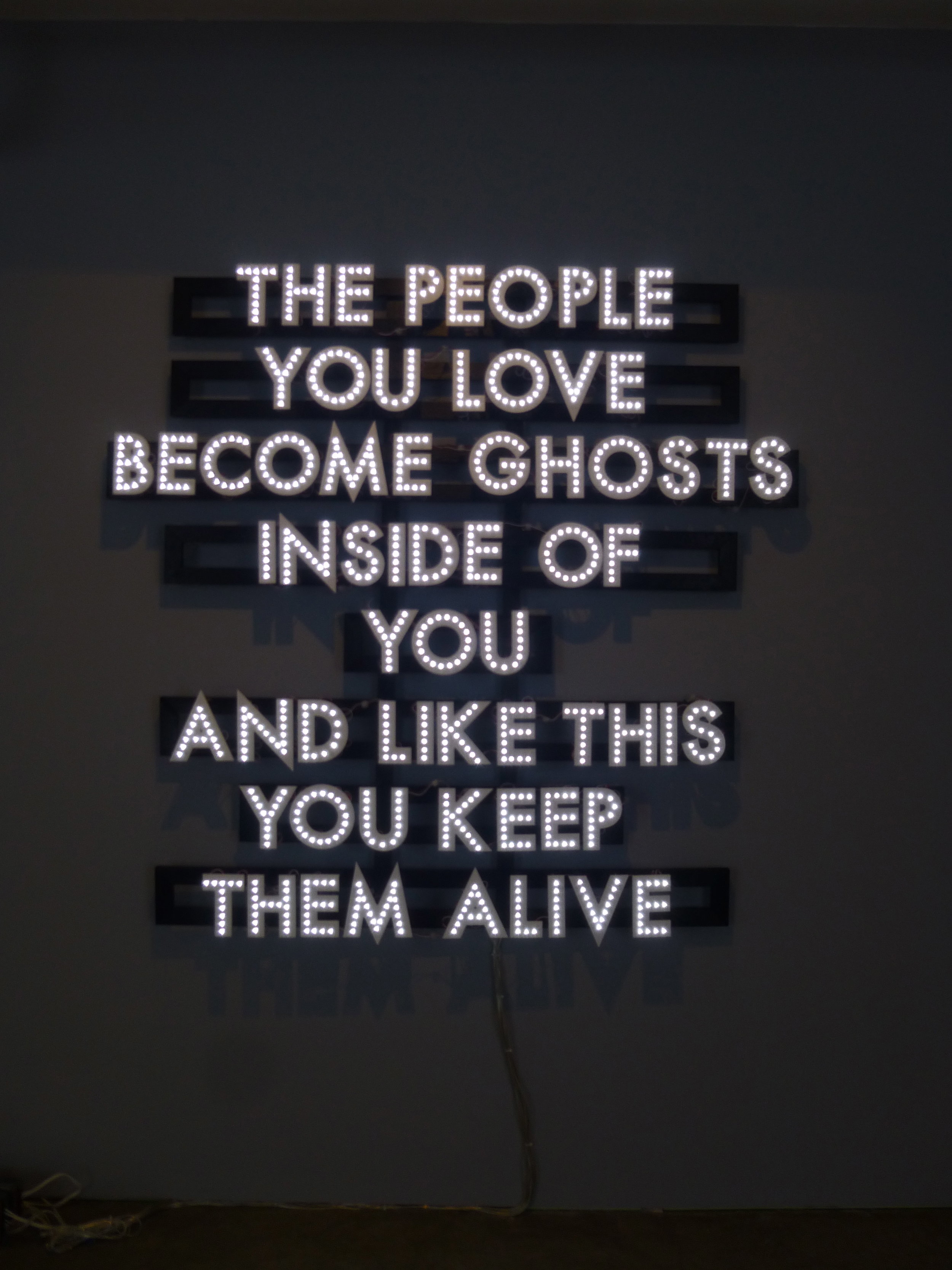
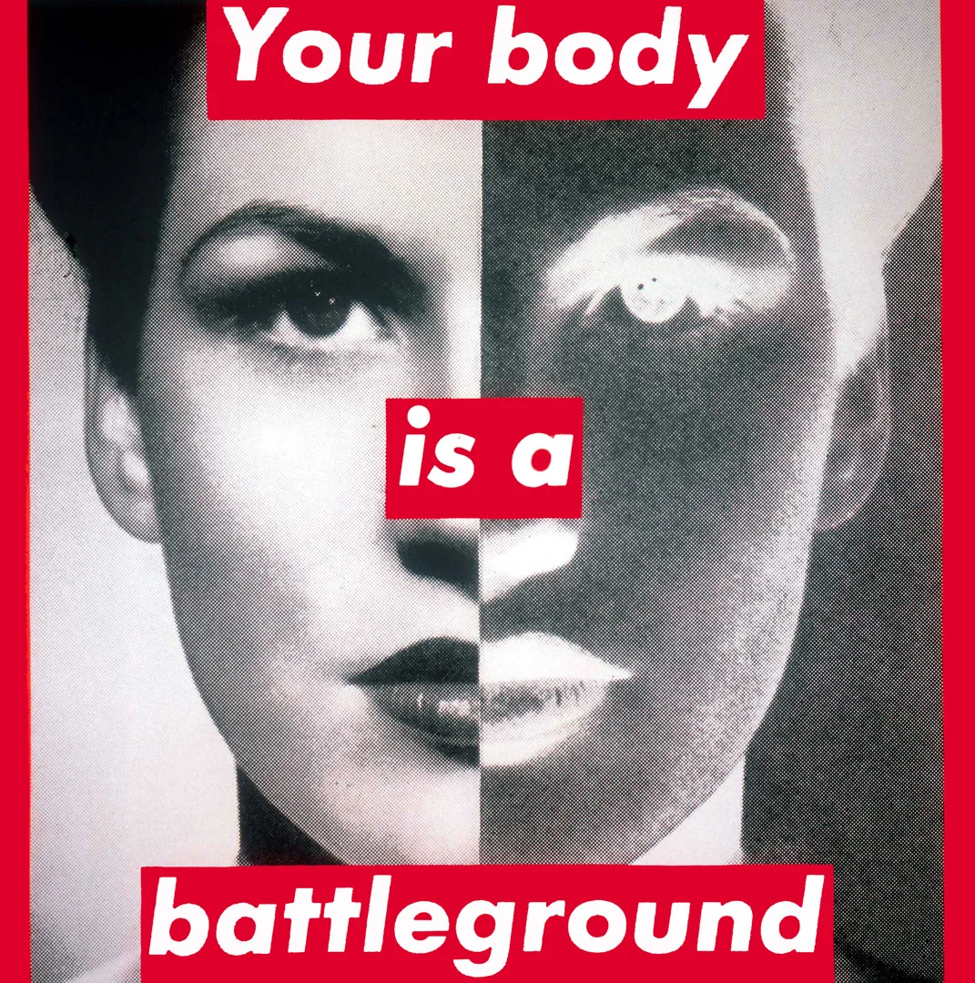
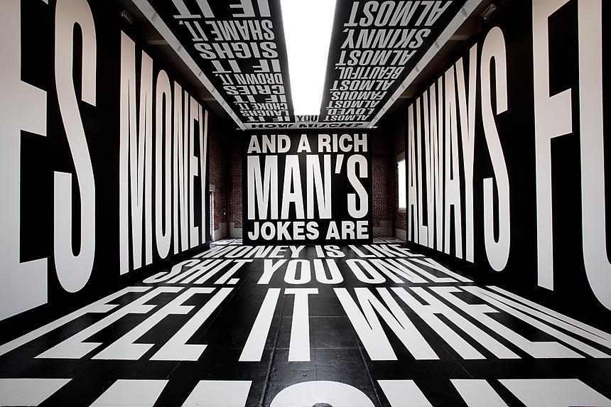
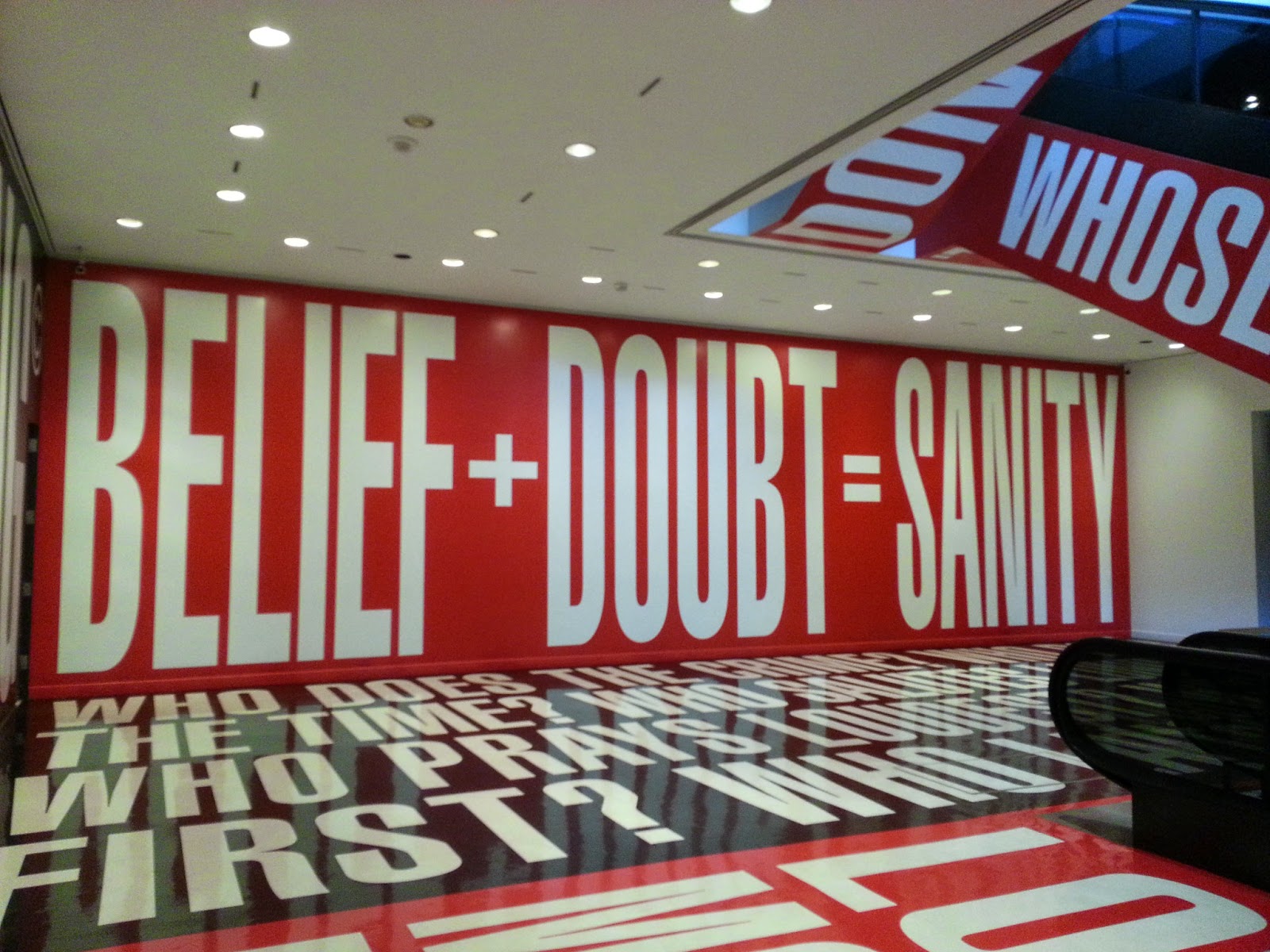
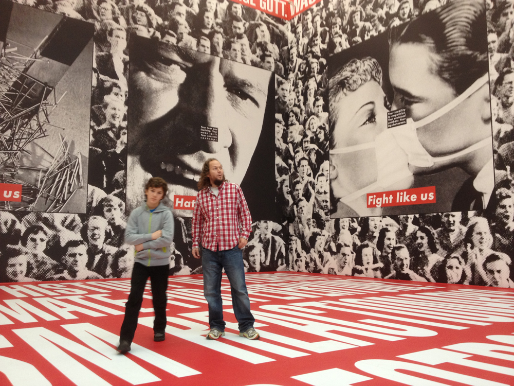
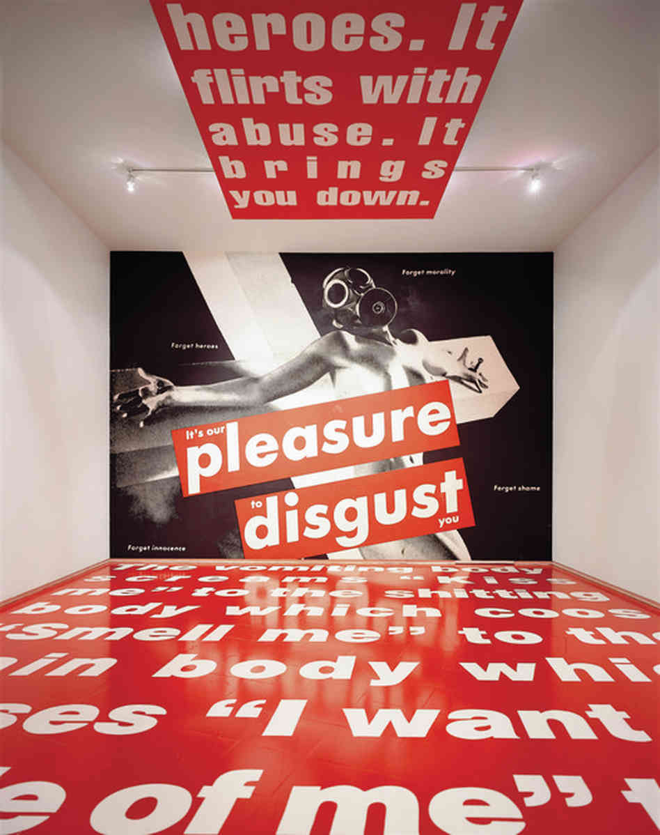
The slideshow below is a collection of the works that are inspired by the style and format of texts in advertisements and other commercial communication mediums. There are many many artists who work with text from this context, across movements and time frames. I believe this is such a common theme because advertising and commercial culture heavily utilize not only text, but other symbols (in the form of logos, for example) and, even more importantly, are widespread and consumed at a global level. Artists like Barbara Kruger utilize the communication strategies that corporations at the time used to sell products. Jenny Holzer used a similar approach, but instead of working with printed materials like Kruger, Holzer uses the large-scale formats of billboards and lit-signs to display her text. Instead of products, however, both were interested in “selling” different radical social and political ideas.
In addition to using these well-tested methods to direct their styles and possibly speak to audiences more effectively, both artists use of this very specific, very recognizable commercial language in itself brings attention to the power it holds to sway public opinion and social discourse. Other artworks made in this style and/or addressing these themes also share this dual nature - they utilize the visual language of advertising to not only communicate the content of their message but also comment on the media and medium itself.
The works below by Jenny Holzer and Barbara Kruger are mostly from the 1970s thru 1990s, except the ones that are noted as current (from the past few years). Many of these are drawing from advertising styles from the 1950s - 1980s, some examples which I have also included. These advertisements were developed from their own set of art and design inspirations and foundations, including the Bauhaus design school in Germany in the 1920, which I will discuss later in this lecture. Other design and advertising pioneers, such as David Olgilvy (whose impact on the advertising world is still significant) were just as integral to developing and forming this visual advertising language starting in the 1950s. All of these factors, combined, shaped the choices the artists made in terms of selecting things like font, format, position and scale.


I have also included a few more contemporary artists who work with these types of concepts. Of these artists, Shawn Wolfe and Shepard Fairy are interesting to compare to one another - while both initially started creating artworks that adopted visual strategies used by advertisements, Wolfe gravitated towards more mainstream styles to “Sell” radical and/or functionless products, while Fairey was more influenced by things like radical / propaganda based communication materials. Additionally, both are also designers that create advertisements. This bring up a few more ideas to consider - does the fact that both artists sell actual products change the effectiveness and/or the meaning of their artworks that use similar formats and styles?
Sean Hart


Shawn Wolfe


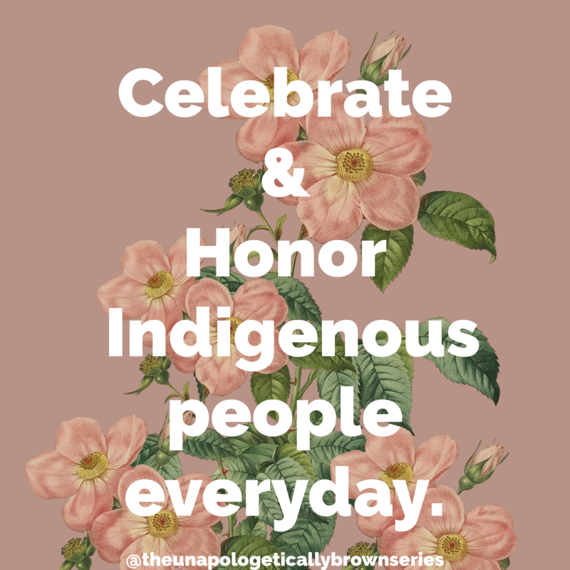
Johanna Toruno / The Unapologetically Brown Series
Finally, the very recent works below are excellent examples of an artist adopting the visual aesthetic and design of commercial advertising to create radical messaging. The artist, Johanna Toruno, works with these visual, primarily text-based forms to communicate very clear and powerful ideas centered around racial and social justice. Similar to Shepard Fairey, Barbara Kruger and Jenny Holzer, Toruno’s images utilize a recognizable and well-known visual language to present ideologies that are in direct opposition to the commercial and capitalist intentions of conventional commercial advertising.


4.5 Textual Constructions, Objects + Images
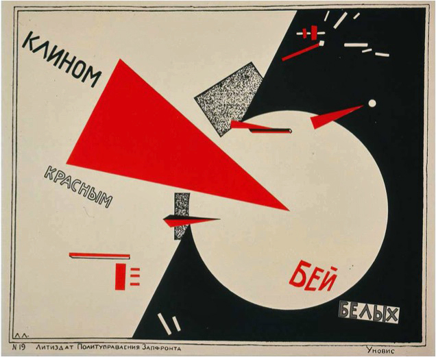
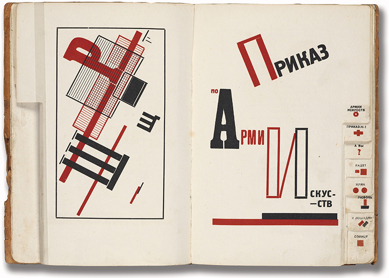
Next up, we will be viewing contemporary textual images that are visually similar, in some or multiple ways, to artworks and designs developed by members of the Bauhaus School (Germany, 1910s - 1930s original) and the Constructivist movement (1910s - 1930s originally). These images are interesting to view in relation to their older influences - think about what has changed, and what is different. These two movements are still prime influencers for contemporary designs and artworks, and while many of the technologies have changed significantly, I am always amazed by how modern these original artworks and designs - some more than 100 years old - still appear.
In my opinion, most of these artworks are closer to Text AS Image rather than Text AND Image. When I look at these visuals, the styles, constructions, shapes, colors and overall combined compositions create forms that resemble abstract or actual objects that hold additional meaning (other than the meaning of the text itself). When viewing them, make a note of your own interpretation.
The original Bauhaus and Constructivist works below are from roughly between 1910s to 1950s. I have noted which images are contemporary for comparison.


4.6 Invented Typographies
For the most part, the artworks we’ve been viewing utilize fonts and text that the artist did not exclusively create. Even in some of the works where the fonts themselves are heavily transformed or distorted by the artist, they will usually start with a chosen typeface (another word for font) to work with. The artists, below, however, use text that they have designed and produced completely from scratch.
Every font (well….almost...click here to see how some fonts are being generated using other methods..) was at some point created by an individual or group of people known as a type foundry. These artists and designers are in an artistic class of their own, although some still consider this work more technical than artistic. I completely disagree with this notion because there are numerous challenges and considerations that come with developing a complete font, from how to combine all possible combinations of letters to their ideal spacing down to points and pixels. On top of these problems, type-makers also need to develop the shape and style of each letter (and in many cases, multiple iterations of each letter) according to what uses they imagine the font being best suited for.
In the 1990s David Carson was one of the first contemporary font designers to really bridge this gap between technical designer and artist. Many of his fonts push the visual aesthetic and prioritize form over function. Compare this to a font like Helvetica, which also has a long and interesting backstory, and is still a celebrated and revered font for its versatility and extreme functionality.


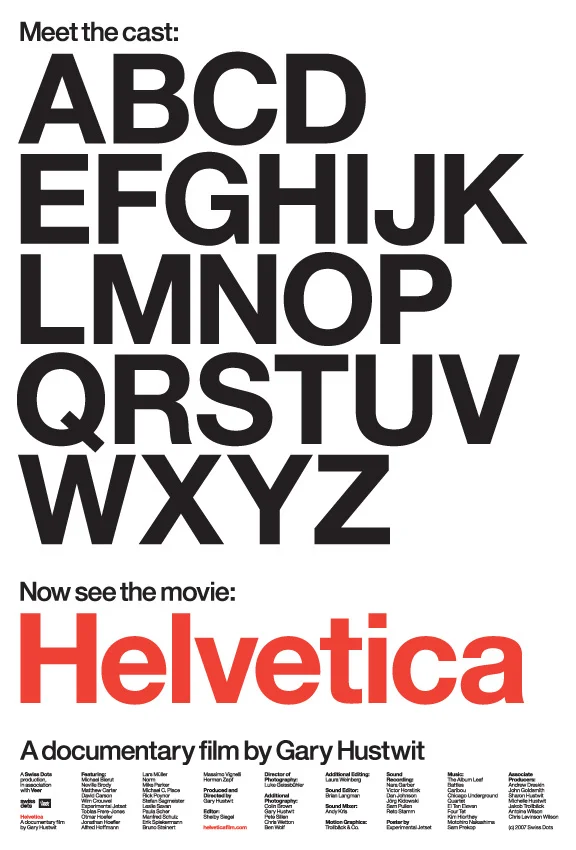
Below, a trailer for a documentary film based on the design of the popular, versatile and widely used font Helvetica. Below that, an SNL sketch about another well-known (but less beloved) font.
VocalType Studio - Tre Seals
Below are some images of the Typeface designs made by artist and designer Tre Seals for the font foundry VocalType. These designs are all based on hand-lettered posters from past social justice and civil rights movements. Use the link below to jump to the studio’s about page for more information on this process and inspiration, and review at least 2 of the specific typefaces.
https://www.vocaltype.co/story-of


One great resource for finding new fonts is www.myfonts.com - some of them are very affordable, but even if you are planning on painting or developing your own letterforms, this can be an excellent site to gather inspiration images.
The other grouping of artworks featured in this chapter exhibit hand drawn or hand painted text incorporated as unique components. In the case of many graffiti artists, these letterforms are the center of their artworks and images. There are several reasons why artists choose to develop and incorporate their own fonts into images. With graffiti, it helps connect images to personal identity, and makes space for this identity to exist in public or private spaces.


I’d like to focus on one graffiti artist in particular, Tempt One, because his story is very inspiring and also because he uses digital tools and technologies to create unique, hand drawn letterforms with a radical, new method. In 2003, Tempt One was diagnosed with ALS, which over the span of a few years paralyzed him so he could not continue making artworks in the conventional ways. In the face of this challenge, he and a collaborator developed a device and program which tracked the minuscule movements of his eye, allowing him to digitally paint with his eyes. These artworks (along the technologies that produce them) are groundbreaking on so many levels - they represent a completely new technique for creating person-drawn images, they make physical creation possible for people with limited motor movement, and, on top of this, they visually expand the boundaries of graffiti art.


Another very important artist and pioneer in what is sometimes labeled as the “street art” movement or scene is Margaret Kilgallen. Margaret Kilgallen’s works share visual properties and styles with graffiti lettering, and also include hand painted, unique typefaces that are integrated with other images. Similarly to graffiti artists, Kilgallen was interested in the connection between artwork and artist that forms when incorporating hand-drawn elements, especially with more recognizable symbols such as text. From this standpoint, her artworks exhibit several layers of meaning, such as the literal meaning of the words, and then how the artist might effect that meaning by creating imperfect and uniquely styled letters. When viewing these works, think about these different layers of meaning. Do the unique typefaces change or influence the meaning of the words? How do the different visual styles change the way you read the pieces?


Before concluding this chapter, a quick but important contextual and historical diversion: Kilgallen was a core member of the group of artists in the 1990s and early 2000s (she passed away in 2001) who helped push skate, surf, and “street art” styles into more traditional art spaces and conversations. Alongside artists such as Evan Hecox, Barry McGee (TWIST), Thomas Campbell, Stephen Powers (ESPO), Clare Rojas and many more, Kilgallen’s artworks expanded the public and even critical notions of what art in galleries “should look like”. As a design and art student in LA and SF at this time, this shift was very tangible and inspiring - I remembering seeing artworks like this in galleries and then museums for the first time, and it really felt like this radical change was in process. These artists helped make it possible for exhibitions featuring street artists and graffiti to have a place at in the Tate Modern or the MoCA, such as the ones below.
4.7 The Complex, Complicated Textual Artwork
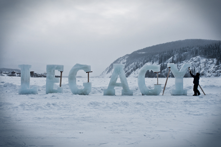
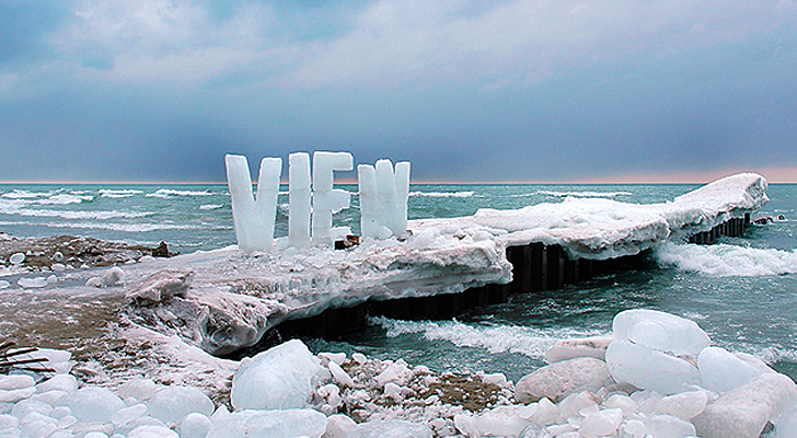
To end this module's lecture content, I want to show a group of artworks that circle back and somewhat disrupt the classification system I outlined up top, although I realize a little less so now that I have turned that two point line scale into a more dimensional quadrant. I perceive and interpret many of the artworks below as both Text AND Image and Text AS Image. Take contemporary artists Nicole Dextras words built out of ice and photographed in location as they melt - this piece is all about the interplay between the text and the surrounding images (Text AND Image), and the literal text conveys critical conceptual meaning for the overall piece. On the Text AS Image side of things, the letterforms themselves are sculptural and their material also communicates a strong set of meanings. I would argue that even if these letters spelled out nothing or were otherwise unreadable, the physical forms could still describe similar ideas and concepts to viewers.


This duality is further explored by many of Ed Ruscha’s paintings. He began these textual artworks in the 1960s, and continues to create them today. When viewing them, I am always unsure if I am “making sense of” or finding meaning in the words because they are contextualized by the other visual elements of each piece, or if the visual and and literal properties of the words themselves are constructing the meaning and context of the piece.


Mull this over when viewing this final section (there is definitely no right or wrong answer), and also consider all of the different ways you might connect with and discover meaning in text-based artworks. This type of explorative interpretation and meaning-making can be very helpful when developing your own text-based artworks, as it can inform decisions ranging from what words to include to what font to use (or even if a font should be used at all).
Design Projects + Hand-Drawn fonts
All designed using Adobe Illustrator


Additional examples of layered meanings in artworks containing text: each of these pieces work with visual characteristics of fonts and letterforms as well as the literal meaning. In the works by Tsang Kin-Wah, note how the visual properties do not necessarily match the literal meaning of the words.