MODULE 5: VECTORS IN ART + DESIGN
5.1 Introduction
The past two modules, we’ve looked at some of the visual principles that drive vector graphics. We have also focused on artists who work with text in (and as) their artworks, since vector editors are ideal tools tools for working with text (as opposed to digital pixel-based editors).
This module, we will be doing more of a survey, and exploring a variety of different processes and applications in contemporary art making and design that utilize vector editors, vectors tools, vector file-types and vector-based processes. For this module, the majority of artworks and designs I show will be more about the process or technique utilized, and less about the artist (unless noted in the text or linked to in an outside article). This will carry over into the practice quiz and the final exam - if an artist or designer is not noted in this lecture in reference to an artwork or design being shown, just be sure to note which technique it is related to. I will also be showing several of my own projects since I know for certain the processes I used in order to achieve the final pieces. I always try to show a variety of different styles in lecture, but this module, it might be a little heavy on my particular aesthetic - please just keep this in mind, and know that there are an infinite number of ways to work with the concepts and techniques I am presenting this week.
5.2 Logos
As I might have mentioned a few times, vector graphics are fully scale-able and offer an extensive degree of editing flexibility with no quality or information loss. Editing and transformation is also streamlined. Hopefully you are all at least starting to experience this working with Illustrator in the studio exercises, after dealing with the sharper learning curve and the general frustrations that are very commonly associated with using a vector program for the first time. I don’t think I have mentioned this quite as much as I have mentioned scalability, but, if any of you have felt compelled to throw your computer out the window in the past 2 Modules because of Adobe Illustrator, that is completely normal.
Below: A series of Adobe Illustrator Memes, most likely NOT made in Illustrator


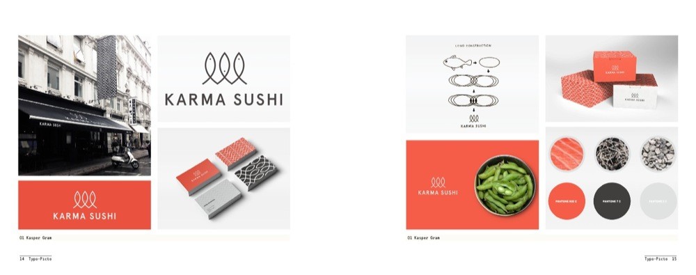
Anyway, circling back to logos: vectors are the ideal format for logos. Starting to create a logo in a vector environment allows a designer the ability to iterate quickly, which loosely defined in the tech / design world means making multiple similar versions - or iterations - of a few ideas. The vector environment can be utlized to layout these multiple versions to present for feedback, or easily to export them to different development applications that are used to share art and design workflow processes. After sharing, testing, and otherwise receiving feedback, vectors make editing and changing these starting designs more streamlined than pixel based applications.
For example, to change the color and size of a shape in Illustrator, the designer would only need to select the shape (even if it is complex) assign it a new color property, and then scale up or down with a simple transform. In Photoshop, to do the same thing, one would need to use the selection tool to select only the pixels of the desired shape, and re-fill the selection. If that selection wasn’t already isolated on its own layer, there would be the chance of losing the pixel information above or below it, and there’d be some quality loss with the fill (mostly around edges or any pixels that weren’t the exact same color). In order to enlarge, the selection could be transformed, but the pixels would become more and more jagged with every up-scale.
And, if this hasn’t been convincing enough, consider that most anyone who might be needing icons or logos from a designer change their minds all the time. Most logo and branding development processes have multiple rounds of back and forth like this, and vectors graphics are more ideal for these constant changes and make the turnaround time much faster. Even if a designer is only spending 10 minutes extra to change an orange shape to red in Photoshop, consider how that begins to multiply exponentially when they are suddenly asked to change it back to orange and also maybe a darker red and also blue. The logo and graphic iterations below take you through some of my more extensive development jobs, from the initial designs to the final products. I can attest to the time that was saved on each of these because I was using vectors.


Starting with a vector format also allows designers to easily and more precisely work with geometries, exact shapes, text, measurements and lines, which are heavily used as either actual composition elements or as composition guides. For example, many logos include an actual physical circle shape, while others might have text follow the path of an invisible circle. The images below are from a series of design books entitled Los Logos, which document logo designs from around the world - looking at these images, think about both the visible and invisible geometries present in all of these logos, even ones that are more organically styled.


In addition to all of these factors, vectors are ideal for logos because of the range of printing and other production options they afford. Bitmapped logos with a high enough resolution can be printed CMYK with little to no quality loss, but as soon as a client wants to put that image on a shirt or any other kind of merchandise, the designer will be dealing with an extensive conversion process, especially if the logo contains gradients, shading, or any kind of non-solid colors or lines. Additionally, while many logos start small, there is usually a reason that it will need, at some point, to be enlarged, whether it is for an advertisement, merchandise or some type of signage or promotional material. Vectors make this a simple process.
Since this course is all about digital tools and art making, I also wanted to mention a few online / cloud based apps and resources that are examples of a relatively new trend in the graphic design field that makes logo design and branding materials somewhat more accessible. The Noun Project is a website that offers free and membership paid options for searching and utilizing crowd-sourced logos and icon art. These can be excellent, more accessible resources for businesses that cannot afford to contract with a professional designer, and can also offer newer designers a place to showcase their work and potentially market themselves.


From my professional standpoint, this is also a very useful resource for tracking different visual designs trends, styles and shifts. The flip side of sites and resources like this is that some believe it is devaluing the role of the designer and the artist. This is also a sentiment that many direct towards “logo design” tools such as the Squarespace Logo Designer. This web app certainly makes logo design more accessible to more people, with the drawback that the logos it produces all share a similar style and visual characteristics.
One potential outcome with the proliferation of design resources like this is that while more people can create logos and brands for their own businesses, these logos will all be slightly branded towards the design apps “parent” company brand or designer, almost subliminally promoting those businesses and that single “style” while making those who do not follow the same visual style or language appear to stand out in a negative way. But this is only one possible result - explore these tools for a moment, and as you do, consider these different perspectives. How does your experience working with more advanced, powerful, but also complex editors such as Photoshop and Illustrator change or affect your viewpoint?
5.3 Graphic Print Materials
As with logos, scale-ability and ease of editing is the primary reason why most other printed design materials, including flyers, posters and business cards, and even type heavy projects such as magazines or books are better suited for vector editing programs. As discussed during Week 5, fonts files are optimized to work best with vector text editors such as Adobe Illustrator and, for more text-centered, printed material such as books, catalogs and magazines, Adobe InDesign. These programs allow designers to fine-tune and control text, handle large volumes and multiple pages of text, apply styles to text that can be changed in one spot and then applied to the entire document of text (similar to CSS styling with HTML Websites), create complex guides and layouts that text can flow through consistently across multiple pages and also provide processes for importing and placing bitmap images within these files. For these types of files that include both high volumes of text and bitmapped, photographic images, I will edit the images in Photoshop first and then import them into Illustrator or InDesign.


5.4 UX / UI Wireframes
One of this week’s Studio Tutorials and its corresponding exercise focus on UX/UI design. UX/UI stands for “User Experience” + “User Interface” - it is basically the visual interface that allows users to control, navigate and use websites, apps, programs, digital games, tools, etc. In the final stages of interface development, these graphics are usually implemented with programming specific to the API and final platform, (such as using CSS with HTML and Javascript to control functionality, navigation and appearance of websites), however, most UX / UI designers start their initial designs - called “wireframes”, “storyboards” or “sketches” - in vector programs and continue to develop them in this environment up until or through the final prototyping process (right before the graphics are “programmed” into the actual interface). Below are various UX/UI wireframes and prototypes.


Many projects will push this parallel process even further - working prototypes with very basic wireframe graphics will be programmed to test functionality and usability, while at the same time more finalized and polished UX / UI designs, still in their vector format, will be tested in a different environment from a more visual standpoint. This type of two pronged process allows both sides of UX / UI design (the functionality side and the visual side) to be more fully developed and still cohesive without having to reprogram final graphics multiple times.
If you are working on a few screens for a simple app or a page or two for a portfolio site, Illustrator can be a fine option for developing UX / UI designs - this will also be the easier program to use if you decide to go with the UX/UI option for Studio Project 5 for this course. If you are doing anything more extensive, however, consider switching to a more robust, UX/UI design-specific application, such as Sketch App or Adobe XD - you are also welcome to try out XD for Project 5 as well.
Article about how AirBnB's unconventional approach to UX/UI design ended up changing the industry
5.5 Data Visualizations, Infographics + Maps
I mentioned these different categories a few weeks ago when talking about point, line and shape principles, and would like to expand on them further now that everyone has had a chance to work with vector graphics a bit more. Not only are all of these related to some basic vector “building blocks”, vector editors are usually ideal for their creation and development based on several factors, ranging from their intended visual outcomes or effect to their final applications.


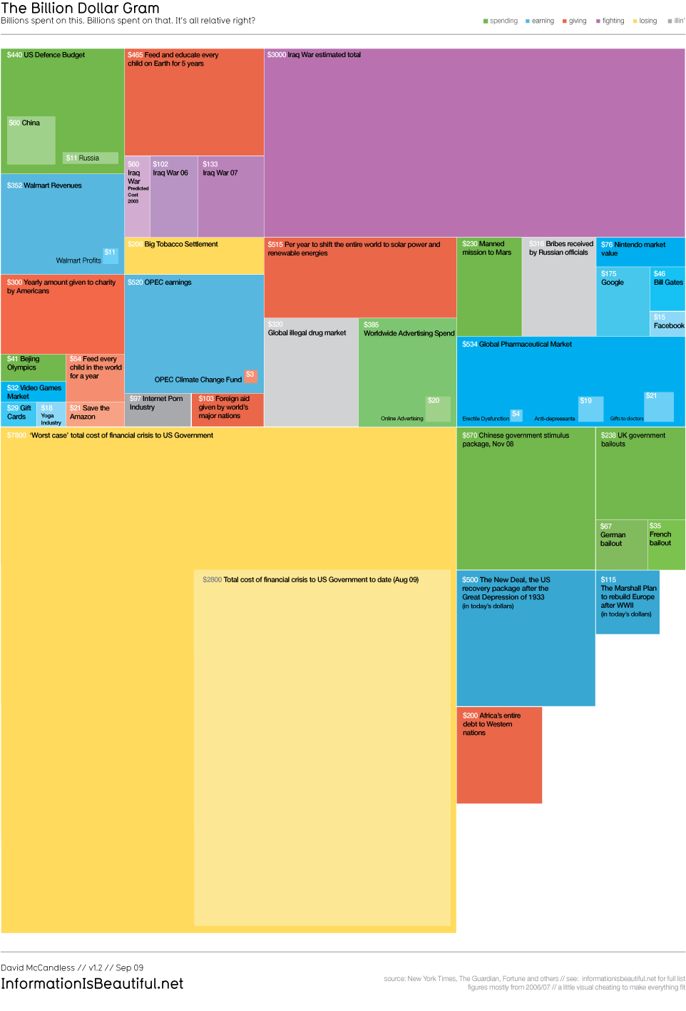


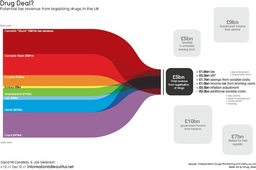
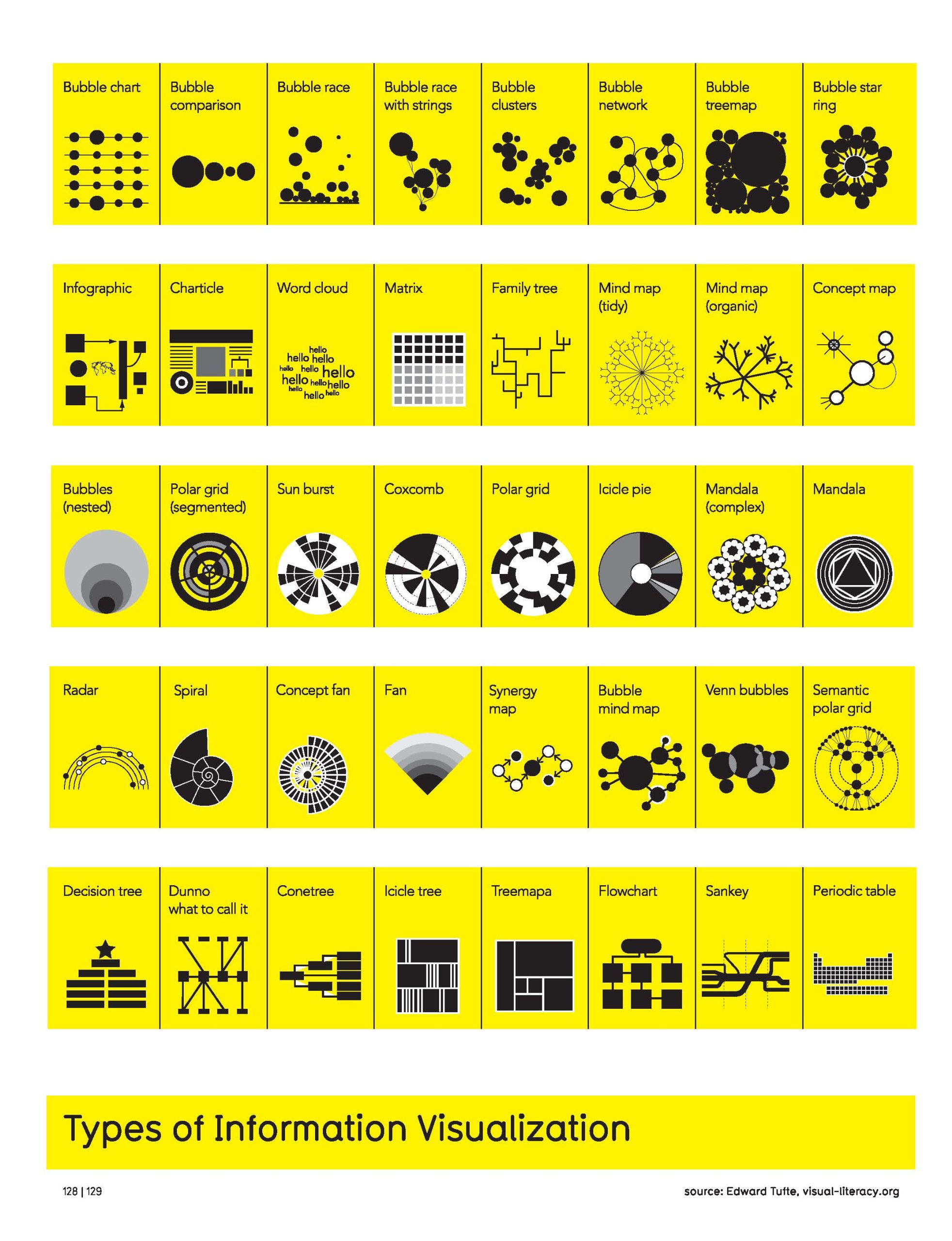


Data visualization is a quickly growing design and art form and method that merges an infinite number of fields with art and design approaches. With the amount of data that is being amassed by companies, governments, agencies, researchers, etc, the ways in which we are able to “see” and understand or access that data is becoming as valuable, if not more than, the data itself.
Artists and designers work with data visualizations from multiple perspectives. Some, like David McCandless, approach data vis projects as visual-design challenges. Others use these types of visual tactics to better understand or describe complex systems or narratives - this could range from mapping out the events in the film Pulp Fiction to exploring multiple factors driving climate change.
Trevor Paglen, who’s work is featured below, is interested in exploring the implications of this type of data collection. He not only creates data visualization graphics, but also photographs and examines sites of this type of data collection.


Regardless of their ultimate motivations and conceptual intentions, vector graphics are ideal for creating data visualizations because of their exact geometries and ability to layer without information loss. Think about a bar graph (a very simple data visualization) - using Illustrator, an artist can create rectangles with exact heights and widths, align them exactly along the x axis, and then easily assign and change the colors and patterns assigned to each. This type of flexibility extends into complex data visualizations, making them easier to edit and adjust for additional data.
On top of these production factors, most modern maps are digitally created, compiled and edited by programs known as GIS (Geographic Information Systems). Some of the maps that these systems use are raster (or bitmap graphics) but the majority are actually constructed of vertexes, lines and shapes - essentially vector files - because they are able to more exactly correspond to geographic measurements. These maps usually do not have a native vector format that can be read by vector graphics editors, however, they can usually be converted relatively easily.
Another main reason why vector graphics can be ideal starting places for working with data visualizations is because they share the same building block as SVG (scale-able vector graphics), which are essentially vector graphics that can be displayed through websites utilizing HTML5 and JavaScript. This format allows designers and artists to control and create vectors “on the fly” in a web environment. In other words, a designer can build a program that takes in and processes data in real time and then generates and even animates graphics based on that data and the program’s coded instructions. Much like UX/UI graphics, these processes ultimately go beyond the scope of Illustrator or other vector editing tools, however, these tools can be used to plan, prototype and visually build these projects to a significant point.

Above and below are screenshots and video documentation of a 2014 Data Visualization Project Called Serendipity. Artist Kyle McDonald utilized Spotify's listener data to drive an animation describing the global locations of two Spotify users playing the same song at the same time. This project is no longer live, but it is another great example of how vector or SVG graphics can be used to generate animations "on the fly" in real-time.
MapBox is a new web-based platform that allows developers to work with “live location data” and create mapping functions and grpahics for things like websites and applications, as well as stand-alone geospatial maps and data visualizations. As with other GIS applications, MapBox does not work with only vector graphics, and the platform is much more complex in terms of the file-types it produces and the Application Programming Interface it enables developers to work with, however, there are many similarities between vector files and some of the files and images this system can output.
Additionally, some of these output files can be further adjusted within a vector graphics editor. An example of this would be if someone used MapBox to output a detailed map of coastline topography threatened by rising sea levels. If this map were output as a vector file format, it could be set up in Illustrator to create a physical wooden cut-out of these coastlines using a Laser Cutter. This will be described more in the next section.
Below are some examples of maps created using MapBox. These examples all come from a post by MapBox about some of the most “Inspirational Maps” made in 2018 - be sure to jump to the full post and read through some of the examples in more detail.


5.6 Vector-Driven Production Tools
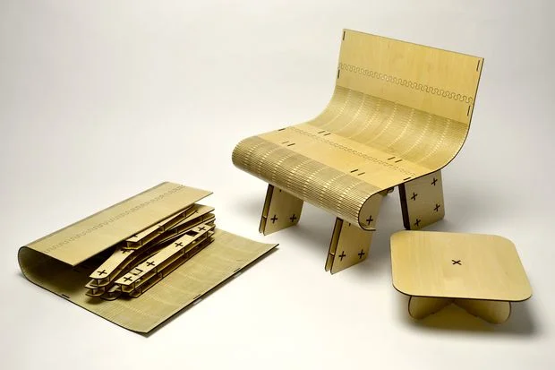
There are a few production tools available that are becoming both more affordable and more accessible to artists that run operations based off of vector files. These include bladed cutting machines that can precisely cut through materials such as paper, vinyl and fabrics and laser cutting machines that can cut through denser materials such as wood, plexi glass and even some metals. Many of these tools can work directly with Illustrator files, and can even be controlled and cut directly within Illustrator using it “Print” function. This allows an artist to set up files in illustrator with different layouts, layers and artboards, and make edits in a familiar environment versus having to learn a whole new piece of software in order to print. There are a few entry level laser cutters popping up this year, such as the Glowforge based out of Seattle, and there are already several highly affordable bladed cutting machines options available, some of which are cheaper than inkjet printers.
Below are a variety of works created with these production tools. Note how with many of these, even cut paper works, the use of layering, folding and other construction techniques shift 2D vector files from flat, digital points lines and shapes to physical pieces with volume or in some cases, to fully 3D sculptural artworks and objects.


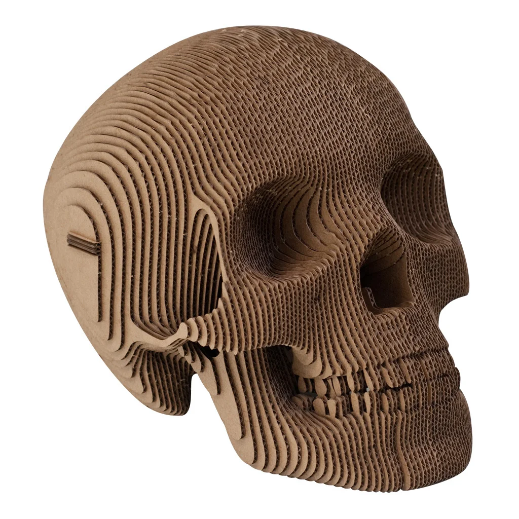
This shift becomes even more interesting when looking at some of the artworks and objects created using a slice-based construction process. This process has become significantly more streamlined with programs like Autodesk’s Slicer (formerly known as 123DMake), which will take digital 3D object files created in Fusion 360 or another 3D program and then automatically create a 2D vector cut template that will assemble into a physical “print” of that object. While 3D printers and C+C routers are also able to print from 3D files with more accuracy and precision, this type of sliced production can be cheaper, more time and cost effective, allows for a wider variety of materials to be used in production, and, in some cases, is conducive to projects that need to be more lightweight (such as cardboard surfboards).


Textile embroidery and quilting machines also run primarily off of vector files. There are many artists that work with embroidery and quilting - using both digital and analog processes. When looking at the works below, including the paper-cut artworks that are expressly hand-cut, think about how these digital tools and processes might have changed your perception of these different works. Do hand-produced artworks have less impact or more? How do you perceive artworks that could be produced digitally or by hand when the actual process is unknown? With the advent and spread of these types of tools, these are all important questions coming up for artists right now.


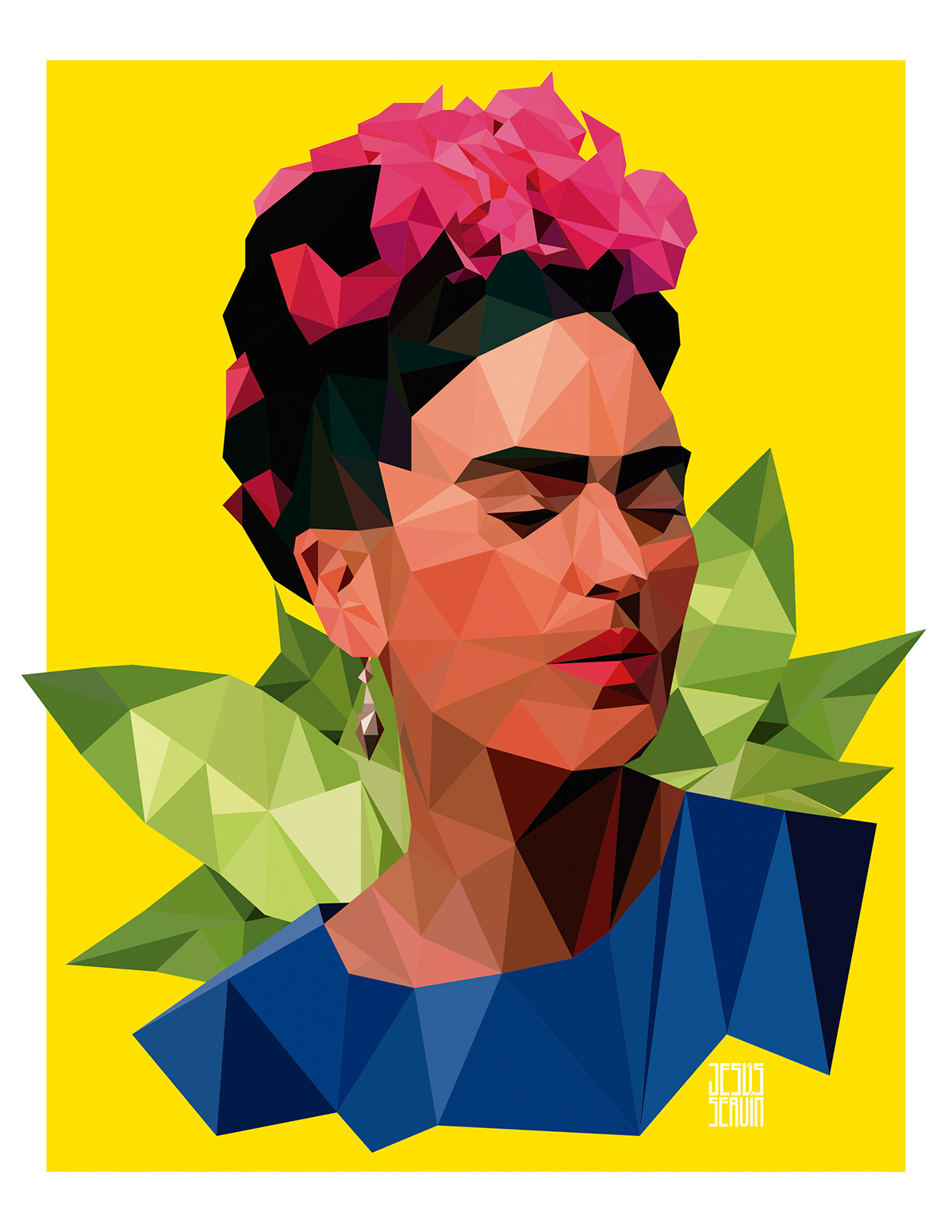
5.7 Illustrations / Graphic images
I am ending with the process I started with in the Studio Tutorials this week because I wanted to wrap up this section with a few questions for everyone to think about as they expand their use of these types of tools. As I demonstrated in the Midterm Project Tutorial video, and hopefully as you all are able to begin to explore, Adobe illustrator can be a powerful illustration tool for certain styles. These illustrations can be more freehand, or more directly traced, and this affordance starts to bring up interesting questions of ownership, creative license and even originality that we will discuss even more during Week 9 when looking at digital video and sound.
If you trace an image to create an illustration, is that illustration original? Do you own it, or does the person who originally captured the image own it? Or are you both collaborators? How does this change if the illustration is produced freehand, instead of a direct trace? How much does the illustration have to be altered to be considered original? And how does all of this change if you are creating the image with commercial goals (i.e. selling it, using it to sell something else).


These are questions that resurface and renew with every major advancement in image reproduction processes, now including digital reproduction and editing. Just as we discussed this in regards to the Che Guevara graphic image from the 1960s, now there are similar, renewed issues and legal controversy surrounding a similarly iconic contemporary graphic, the Obama Hope poster and graphic created by Shepard Fairey.
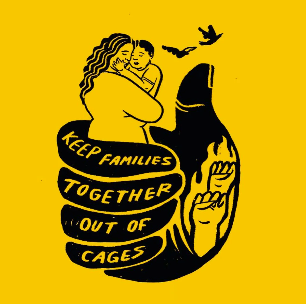
The artworks above and below are examples of different styles of illustrations and artworks that COULD be produced using Adobe Illustrator or other vector graphic editors. The artists in question did not necessarily use a vector editor to make them, but I want to point out some of the visual elements and components that are conducive to working with a vector editing environment. Many of these go back to the principles covered in Module 3. These aspects include:
Illustrations that utilize line work, especially line work that must be detailed, variable and/or precise. In vector editors, this line work can be easily adjusted and edited very quickly, by changing the properties associated with the lines. This can also happen without losing visual aspects of any of the other elements.
Illustrations with numerous shapes or silhouettes, either geometric or organic. These shapes can be combined with lines, without either overwriting the other. As with the lines, the shapes can all be independently altered, or changed all at once as a group - which can allow the artist to quickly adjust things like colors and shading.
Illustrations that require precise gradients.
Illustrations with many complex elements, precise geometries and patterns, or illustrations that require multiple layers - scientific illustrations are a good example of this.
Illustrations that are going to be reproduced via screenprinting processes, or using stencils.


Ashley Lukashevsky Instagram


Cristy C. Road Instagram


